
Glassmorphism in 2026: A Practical Playbook
Glassmorphism en 2026 : Comment utiliser le verre dépoli sans nuire à l’expérience utilisateur
Glassmorphism is having another moment - not the “design-only screenshots” kind, but real product UI you can actually use.
Apple’s latest visual direction leans heavily into translucency, depth, and motion, nudging the ecosystem toward modern frosted layers again.
The challenge: most glass looks premium in a screenshot but collapses in real use:
- Text becomes unreadable on changing content
- UI hierarchy gets muddled
- Contrast fails accessibility
- Blur tanks performance on lower-end devices
- The interface feels cool but harder to use
This blog explores how to do it right, like we do at Orizon when turning cutting-edge aesthetics into functional, scalable systems.
🎨 Great glass effects need great UX thinking behind them. Let's build yours the right way →
What is glassmorphism (really)?
Glassmorphism is built on translucent surfaces that blur and tint what’s behind them, creating depth and separation like frosted glass.
Key word: separation.
Good glass isn’t decoration. It creates clear hierarchy between:
- Background context (soft)
- Active surfaces (what matters now)
- Foreground actions (what users are about to do)
At Orizon, we treat glass as a functional tool, not a visual gimmick - every layer serves clarity and hierarchy first.
3 moments glass actually works ✅
1) Contextual overlays
Use glass for elements sitting on top of changing content:
- Navigation bars
- Floating toolbars
- Mini players
- Quick settings panels
- Map overlays
Glass lets users perceive the world behind while keeping focus on the controls.
2) Short-form “preview” surfaces
Great for:
- Cards with 1–2 lines
- Quick stats
- Category chips
- Compact summaries
Avoid long reading surfaces: forms, documentation, dense tables.
3) Premium brand moments
Use glass for hero areas, onboarding reveals, or upgrade modals - highlights, not everywhere.

10 rules for usable glass 🧠
1. Blur is not enough - add tint.
- Stabilize readability across changing content with subtle tints.
2. Never put body text directly on raw glass.
- Use a gradient scrim, solid text container, or layered background.
3. Pick one thickness per surface type.
- glass-sm (chips), glass-md (cards), glass-lg (modals). Stay consistent.
4. Limit overlapping layers.
- More than two blurred layers? Visual noise + performance hit.
5. Clarify hierarchy, don’t replace it.
- Make interactive elements, primary actions, and current layers obvious.
6. Maintain stable contrast.
- Test against five extremes: bright photo, dark photo, textured, saturated gradient, plain white.
7. Add subtle edge highlights.
- A faint border or highlight helps the brain lock onto boundaries.
8. Respect reduced-transparency preferences.
- Offer a fallback theme for accessibility.
9. Avoid glass in form-heavy flows.
- Clarity is critical; use glass around the form, not on it.
10. Don’t rely on gradients alone.
- Your glass should work on photos, dashboards, messy content, and future states.

You can quickly check whether a glass layer is usable in real product conditions.
Think of this as a lightweight guide, not a strict formula:
Key checks:
- Text readability - Can users read text clearly on typical backgrounds?
- Primary actions obvious - Buttons and CTAs stand out, even over blur.
- Blur + tint consistency –- Similar surfaces maintain consistent blur and tint levels.
- Layer count - Avoid excessive overlapping blurs; more than 2 layers can reduce performance.
- Interactive clarity - Users can identify interactive elements easily.
- Edge definition - Subtle borders or highlights help separate surfaces.
- Strategic usage - Glass appears only on overlays, navigation, or highlight areas.
- Long-form content - Use solid surfaces for extended reading or forms.
- Performance awareness - Test on lower-end devices to avoid lag.
- Transparency fallback - Support reduced-transparency or accessibility modes.
If multiple checks fail, your design may look premium but not function well in real usage.

Glassmorphism is a contract
Good glass tells users: “This is modern, premium, effortless.”
If readability drops, hierarchy blurs, or performance lags, the contract breaks.
The best glass feels invisible; the worst fights the user.
Ready to design glass that actually ships? 🚀
If your team is exploring “Liquid Glass” aesthetics, we can help you turn that vibe into a real design system that holds up across every screen, state, and accessibility requirement.
Let’s bring glassmorphism into your UI without sacrificing usability. Reach out to us today! 🚀
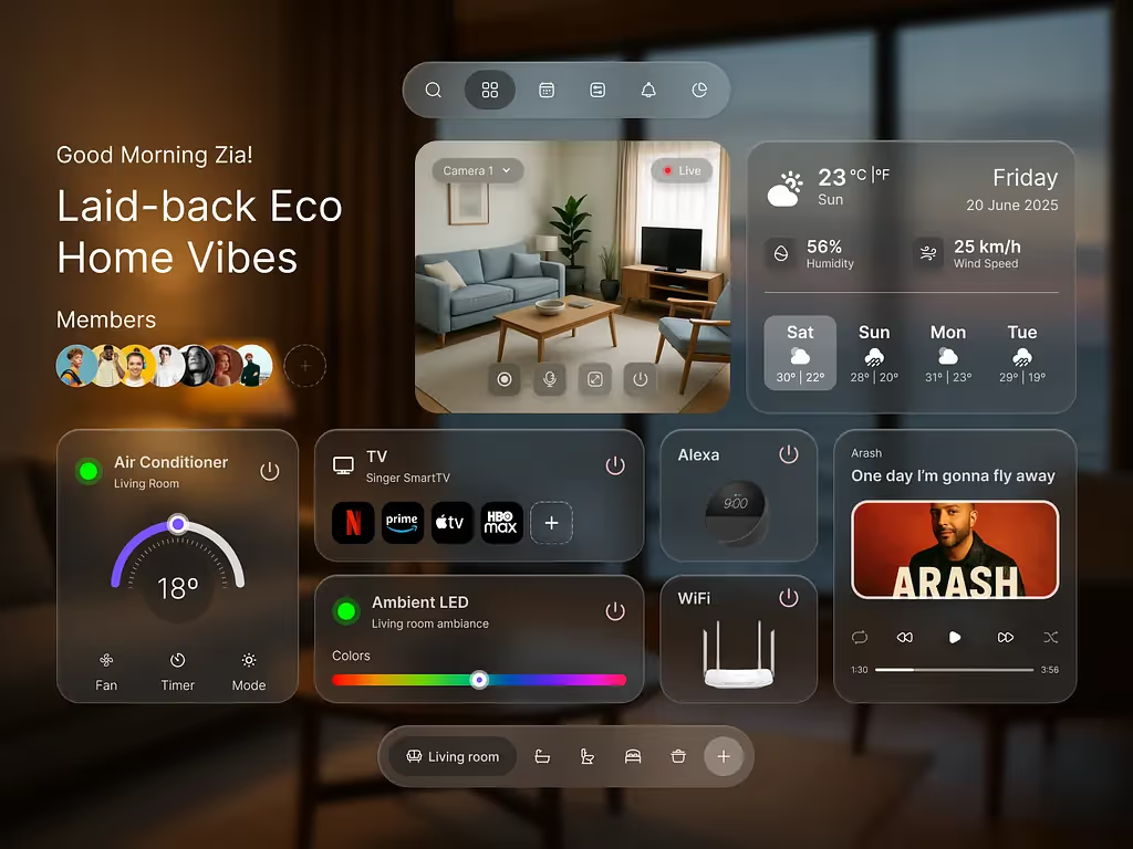
Header image: Photo by Md Zia Uddin / Dribbble – “Apple Liquid Glass meets Smart Home Vibes” (Shot #26174948).

Keep Reading
More from Orizon

Parlons-en
Un design bien fait et rapidement par des gens en qui vous pouvez avoir confiance.

%20(1).png)


.svg)
.svg)

.svg)