.avif)

.avif)
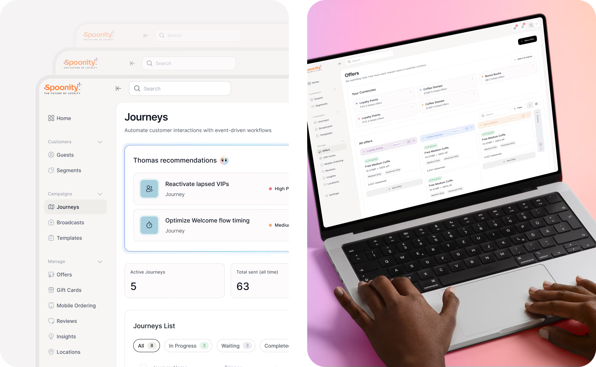
Spoonity had earned real trust as a loyalty and payments platform for QSR and retail brands. But as it repositioned toward a customer data platform, the interface was showing its age: flat, static, and organized around features instead of the work merchants actually do. Every new capability made the product harder to navigate. The company needed a design language and structure modern enough to carry the next chapter, without losing the users who already relied on it.
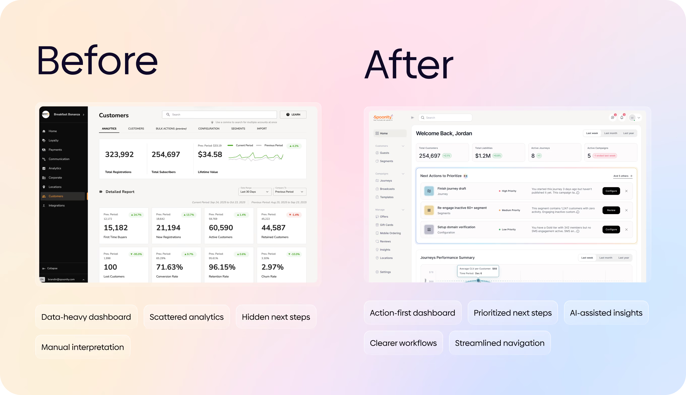

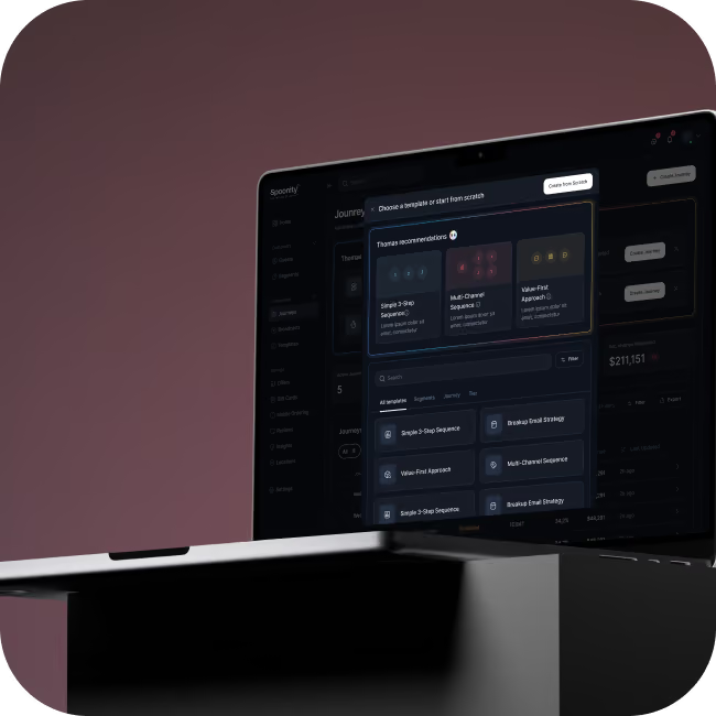
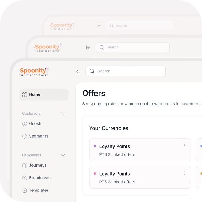
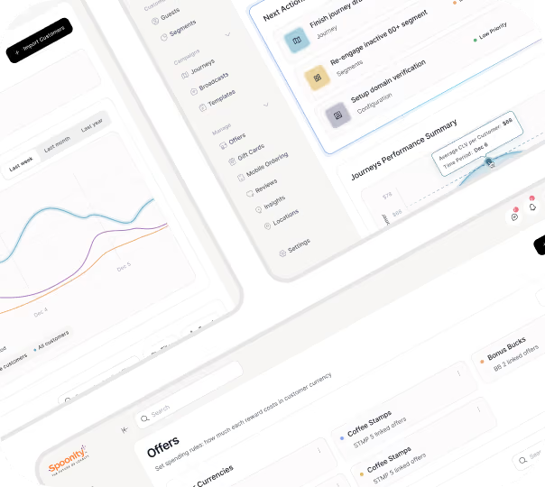
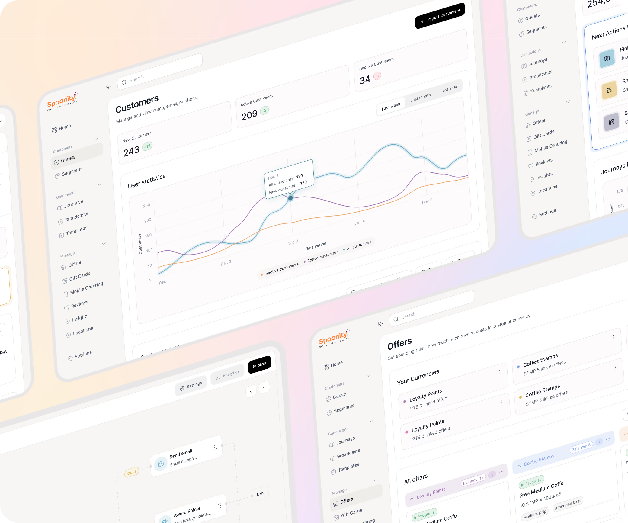
We explored several visual directions before landing on a warm, restrained system: subtle neutrals, color reserved for Al moments and callouts, and a considered dark mode. The harder work was structural. We rebuilt the navigation around merchant workflows, then took the platform's most intimidating tasks and made them feel simple, turning automation setup into a guided canvas that asks for one thing at a time, and giving the customer profile a tabbed structure that holds a hundred data points without feeling crowded.
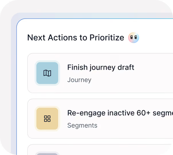
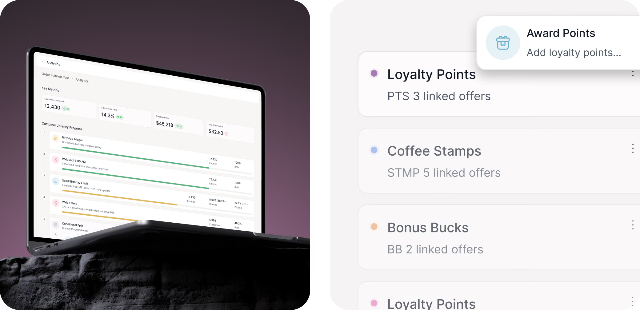
Al runs the experience, recommending the next best action and explaining the reasoning behind it rather than demanding attention. To make it all scale, we built a tokenized Figma design system and a variable library, so the client's team could extend the language across the platform and switch themes with confidence.
.avif)
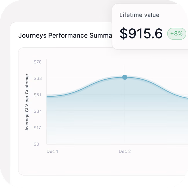
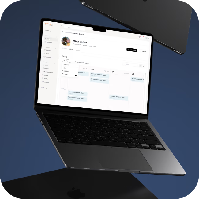
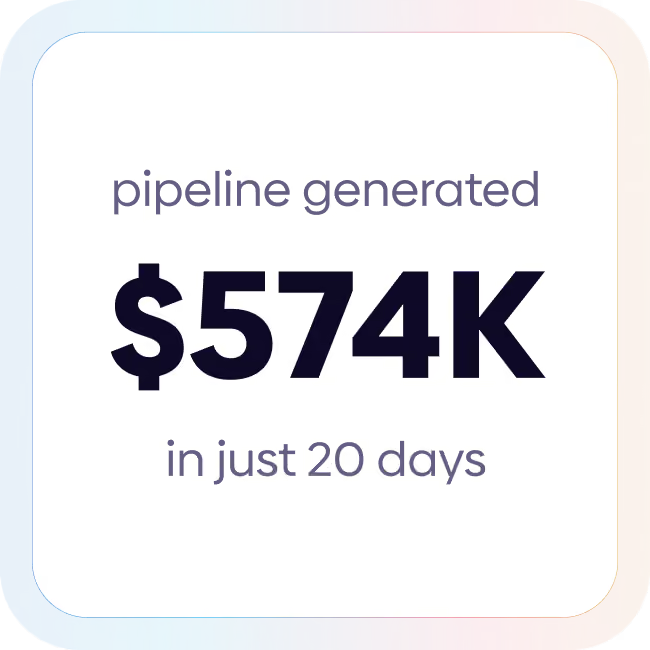

The work gave Spoonity a coherent, modern design language and a system engineered to grow, built close with their team and structured so their engineers could take it straight into production. Complex workflows now read as simple, guided steps, Al feels genuinely helpful rather than ornamental, and the tokenized library lets the design extend across dozens of screens. A legacy loyalty tool now looks and behaves like the platform the company is becoming.
.avif)
.avif)

Parlez-nous de votre projet et nous vous répondrons dans les 24 heures 🚀

.svg)


.svg)