.avif)
%20(1).png)
%20(1).avif)
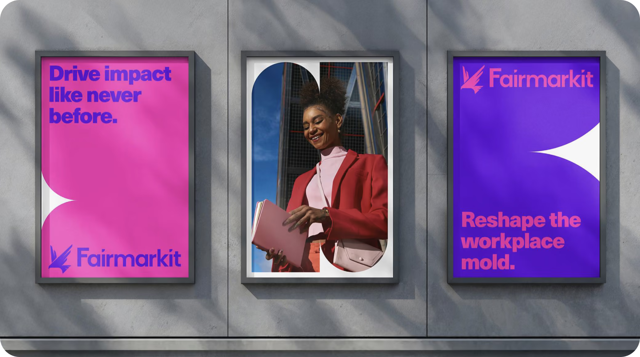
Fairmarkit had just launched a bold, multi-color brand and rebuilt its platform to be AI-native, but the product still ran on a four-year-old design system. The result was a real gap: a marketing site full of personality, and a product that felt dense, technical, and heavy on tables and borders. In a category where nearly every tool now looks the same shade of AI-generated, Fairmarkit wanted a product experience with a distinct point of view, one worthy of a leader powering sourcing for enterprises like Boeing and BP.
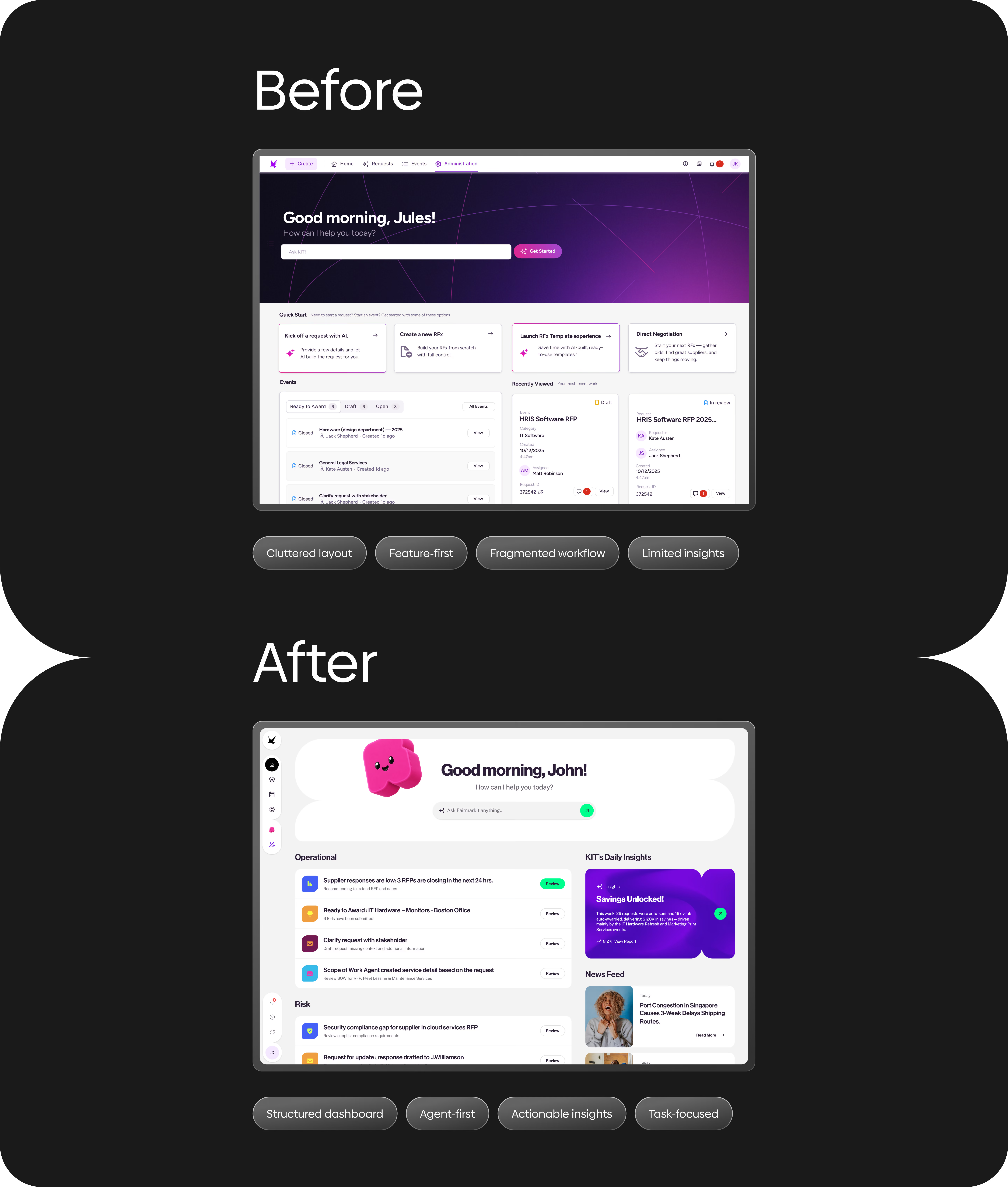
We opened with a focused audit of the brand and core screens, then pushed a wide range of visual explorations rather than one safe option, from conservative to deliberately bold. We rebuilt the Home around a single question: what should users see and do first, without feeling overwhelmed. From there we elevated the flows that matter most, giving bid comparison and scenario analysis a clearer, more premium structure, and reworked dense forms into guided, delightful steps.
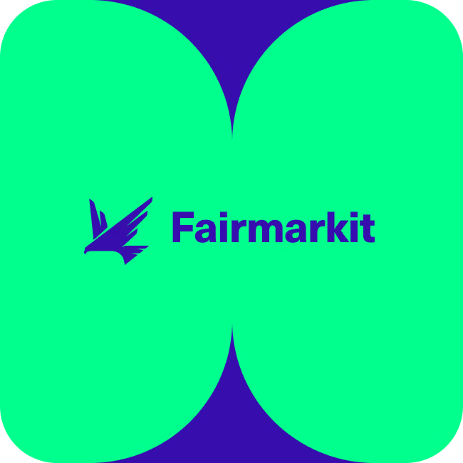
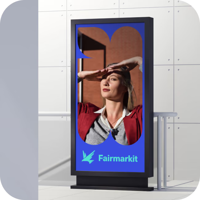
Throughout, we treated color as a system: green reserved for action, hot pink for AI, brand shapes and 3D moments used with intent rather than decoration. We closed by handing over a starter UI kit, color, type, buttons, fields, and icons as reusable components, so Fairmarkit's design systems team could scale the direction on their own.
.avif)
%20(1).avif)
%20(1).avif)
.avif)


Orizon delivered a North Star direction that finally put Fairmarkit's product on the same level as its brand and its AI ambition. According to the team, long-standing customers shown the new direction responded with real enthusiasm, and the work has supported Fairmarkit's efforts to attract new customers while delighting its existing base. Just as importantly, the direction gave their internal product, engineering, and design systems teams a clear, scalable foundation to build the next iteration of the platform on.

.avif)
.avif)
.avif)
.avif)
.avif)
%20(1).avif)

Parlez-nous de votre projet et nous vous répondrons dans les 24 heures 🚀
.svg)


.svg)