
The UI pattern that's survived 30 years - and still wins.
The Psychology of Tabs: Why This UI Pattern Still Dominates
In 1995, Netscape Navigator introduced the browser tab. Thirty years later, tabs are everywhere - browsers, dashboards, mobile apps, design tools, AI interfaces. Skeuomorphism came and went. Flat design had its moment. Glassmorphism too. Tabs survived all of it.
That's not an accident. Tabs endure because they solve a cognitive problem no other pattern solves as cleanly: they let users hold a mental map of related content without leaving, scrolling, or reloading.
At Orizon, we've designed digital products for companies like TELUS, Red Bull, and Netflix. Tabs appear in nearly every single one - not for lack of creativity, but because they work.
Why the Brain Loves a Tab
Humans naturally group related things. Tabs mirror that instinct, creating labeled categories users understand immediately with zero instruction.
A few reasons they work so well:
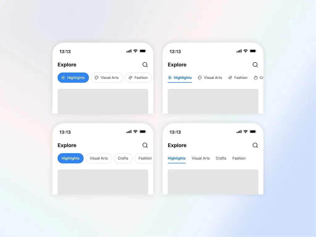
Mental models. Gmail's Primary, Social, and Promotions tabs need no tutorial. The metaphor is just obvious.
Spatial memory. You don't re-read "Settings" every visit - you remember where it lives. Nielsen Norman Group research shows consistent tab placement improves task completion speed by 20–30%.
Reduced context switching. One click lets you peek at a related view and snap right back. Figma's Design / Prototype / Inspect tabs are a masterclass - same file, different lens, zero friction.
When our UX team at Orizon maps information architecture, reducing switching cost without hiding context is always the goal. Tabs are one of the cleanest tools for doing exactly that.
⚡ Every extra click costs you a user. Let's design your product's information architecture to feel effortless → Talk to Orizon

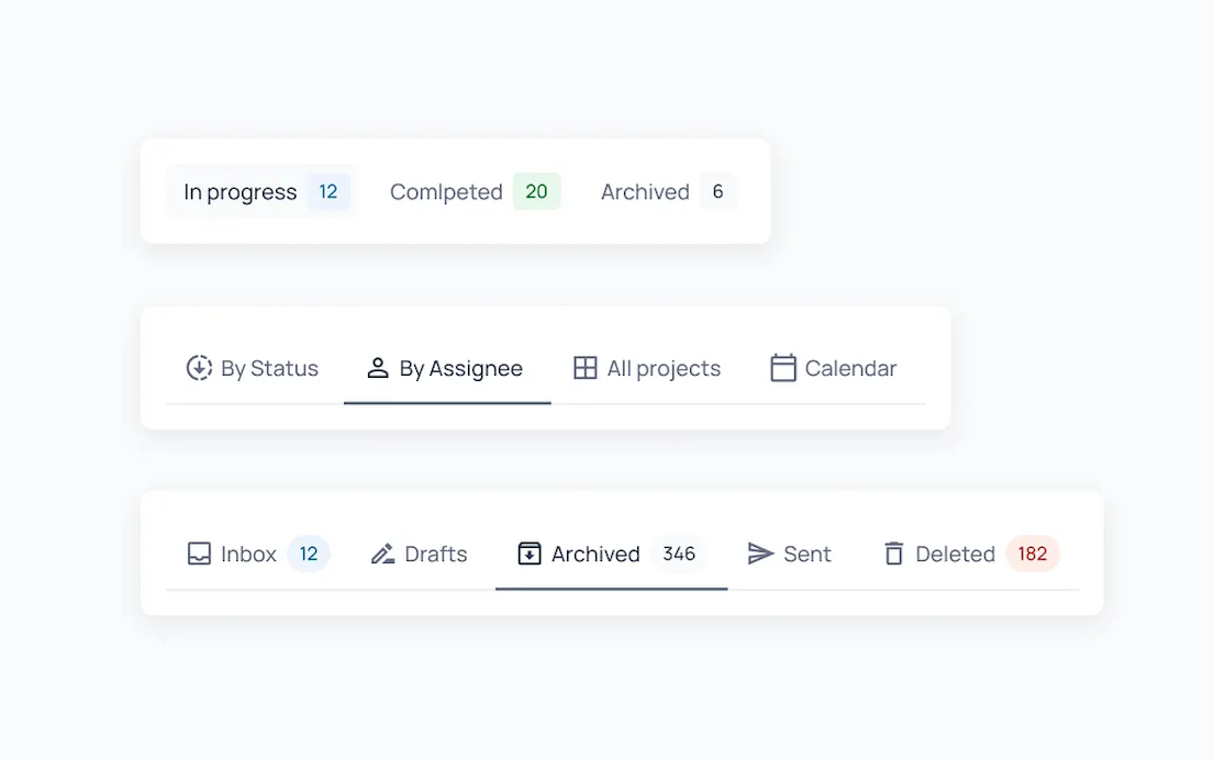
Tabs vs. Accordions: Knowing the Difference
Both organize content into sections. The difference is structural - and mixing them up creates real confusion.
Tabs sit horizontally, swap content in the same panel, and work best for a small number of equally weighted, frequently accessed sections. Accordions stack vertically, expand inline, and suit longer labels, mobile layouts, and FAQ-style content where users browse rather than switch.
As Nielsen Norman Group puts it: tabs suit a few long sections; accordions fit many short ones.
The other distinction worth knowing: in-page tabs swap content without changing the URL (product specs, reviews, Q&A). Navigation tabs move users to a different page entirely. Both can look identical - but mixing them without clear visual differentiation breaks user trust.
At Orizon, a navigation audit is often where we catch this first. A product that "feels off" usually has in-page and navigation tabs living side by side with no differentiation.
When Tabs Work - and When They Don't
Use tabs when:
- Users switch between views frequently
- Content is bounded (3–7 options max) and parallel
- You want to build spatial muscle memory across sessions
Reach for something else when:
- Users need to see multiple sections simultaneously → use split view or single scroll
- Options multiply beyond 7 → use sidebar nav
- You're designing for mobile with complex navigation → bottom nav wins (thumbs can't reach the top of a 6-inch screen)
Instagram, Twitter, and Tinder all move primary nav to the bottom bar for exactly this reason. Tinder turns the tab switch into a swipe gesture. The interaction becomes the navigation.
The Details That Make or Break It
Knowing when to use tabs is half the battle. Execution is the other half - and this is where most products quietly fall apart.
Active states must be obvious. Bold text, colored underline, clear background shift. Test on a dim mobile screen - that's where low contrast fails first.
Never reorder tabs automatically. Users trust position more than labels. Google Sheets lets you drag-to-reorder manually, but never moves tabs on its own. Automatic reordering destroys spatial memory.
Keep labels short and distinct. "Details" and "Info" side by side is a UX failure. One or two words, clearly differentiated, every time.
Build in keyboard shortcuts. Ctrl+Tab, Ctrl+1 through Ctrl+9. Linear surfaces these in tooltips. Without them, the product feels unfinished to power users - and fails basic accessibility. ARIA roles (role="tablist", role="tab") are how screen readers understand tab structure. Not optional.
Show loading states. A tab click that produces silence feels broken. A skeleton screen keeps users oriented.
Real Products Getting It Right
Figma locks Design / Prototype / Inspect in the same spatial order, always. Icons plus labels, crisp active states. Users build muscle memory within minutes.
Notion limits itself to three sidebar tabs - Workspace, Templates, Settings. That restraint is intentional. No tab creep, no overload.
Google Sheets maps to a familiar physical mental model and layers power-user affordances - drag-to-reorder, color coding - without disrupting the core pattern.
Linear combines instant switching, locked spatial order, and keyboard shortcuts into something that feels native to how developers think.
Before You Ship: Tab Design Checklist
- Tabs are one type - in-page or navigation - never mixed without clear differentiation
- Active state is readable on a dim mobile screen
- Labels are 1–2 words, specific, and distinct from each other
- Tab count is capped at 7 desktop / 5 mobile - overflow collapses to "More"
- Tab order is fixed - no automatic reordering
- Keyboard navigation works: arrow keys, Enter/Space, ARIA roles in place
- Loading states exist - no silent moments after click
- Tap targets are minimum 44×44px on mobile
Tabs Have a Future
AI is already making tabs smarter - dynamic labels ("Dashboard (3 alerts)"), AI-generated groupings in email clients, collapsible tab groups in Chrome. The interface is evolving, but the principle doesn't change: organize content in ways that match how humans think.
At Orizon, we design navigation systems built to hold up as AI-native experiences layer in around them. The pattern that executes that principle best - tabs or otherwise - is always the one that wins.
Ready to turn a deceptively simple pattern into a product people love to use? Contact us today 🚀
FAQs
Why are tabs so common in UI design?
Tabs align with how humans naturally organize information through categorization and spatial memory. Research shows consistent tab placement improves task completion speed by 20–30% because users develop muscle memory for tab positions. This cognitive efficiency explains why tabs have dominated interface design for over 30 years.
When should I use tabs instead of accordions?
Use tabs when content is mutually exclusive and switching between views is frequent. Use accordions when users might need to see multiple sections simultaneously or when vertical space allows expanding content in place. Example: tabs for dashboard views (Analytics, Reports), accordions for FAQ pages.
How many tabs is too many?
Limit tabs to 5–7 maximum. Human working memory holds approximately 5–7 items, so beyond this threshold users struggle to remember tab contents and scan efficiently. If you need more options, consider dropdown menus, sidebar navigation, or search instead.
What's the difference between tabs and sidebar navigation?
Tabs work best for related content within a bounded context - 3–5 options, frequent switching, spatial consistency. Sidebar navigation scales better for deep hierarchies, many options (10+), or nested menus. Example: tabs for user profile sections, sidebar for admin panel settings.
Why do tabs use both icons and text labels?
Icons improve scannability and recognition speed, while text labels prevent ambiguity and aid first-time users. The combination serves both expert users (who recognize icons quickly) and novice users (who need label clarity). On mobile, space constraints sometimes require icon-only designs with labels on long-press.
How should I design active tab states?
Use high-contrast indicators - bold text, colored underlines, or distinct background colors. Subtle differences like slightly darker backgrounds fail on dim mobile screens. Test active states in different lighting conditions to ensure they're immediately obvious when users scan.
Should tab order change based on user behavior?
No. Keep tabs in the same order across sessions. Users develop muscle memory for tab positions, so dynamic reordering based on usage frequency breaks this mental model and causes disorientation. Position matters more than optimization.
When should I use bottom navigation instead of top tabs on mobile?
Use bottom navigation when you have 3–5 primary sections that require thumb-friendly access. Top tabs work for content-switching within a single view. Research shows users reach bottom navigation 35% faster than top tabs on phones over 5 inches.
How do tabs reduce context switching costs?
Tabs keep related content visually grouped but logically separated, letting users peek at other content and return instantly without deep navigation. This reduces the cognitive load of remembering "where was I?" and maintains workflow continuity compared to navigating away to separate pages.
What's the future of tab design with AI interfaces?
AI is enabling adaptive tabs that organize content based on user behavior - auto-creating categories like "Urgent" or "To Read" - and dynamic labels that update with context ("Dashboard" becomes "Dashboard - 3 alerts"). The core tab pattern remains, but becomes smarter about organization.
Header image: Photo by Bardia Adibi / Dribbble – “Explore Tabs - UI Component” (Shot #25540374).

Continuez à lire
Plus d'informations sur Orizon

Parlons-en
Un design soigné et rapide, réalisé par des professionnels de confiance.

%20(1).png)


.svg)
.svg)

.svg)