.avif)
Design strategies that make digital experiences simple, clear, and accessible for all
Accessibility Beyond Checklists: Designing for Real Users of All Abilities
Most discussions about accessibility start with standards and compliance. Teams talk about WCAG (Web Content Accessibility Guidelines) levels and checklists ✅
But real accessibility isn’t about checking boxes ❌ it’s about creating products that work beautifully for people who interact with the world differently, including those with disabilities, neurodivergent users, and people who have low vision, are deaf, or have motor or sensory differences.
💡 Accessibility is a mindset, not a task.
It starts during strategy and research, not at the end of a project.
Within Orizon, we see accessibility as a core part of creating meaningful digital experiences. Every interface we design is built to be usable by real people - not just compliant.
Accessibility guides how we build real, meaningful digital experiences.
♿ Real accessibility goes beyond compliance. Let's design for every user from the start →
Accessibility begins with content, not code
Before we think about color contrast or ARIA labels (Accessible Rich Internet Applications), clarity comes first.
Most accessibility barriers arise from confusing content:
- Vague buttons
- Unclear microcopy
- Labels that assume prior knowledge
Tip: The simplest improvement is to write in a way that requires no interpretation ✍️
- Instead of “Submit,” say “Create Account.”
- Instead of “Learn more,” say “View pricing.”
Inclusive design starts with language. At Orizon, our design and content teams collaborate early to ensure every word and interaction is intuitive before a single pixel is drawn.
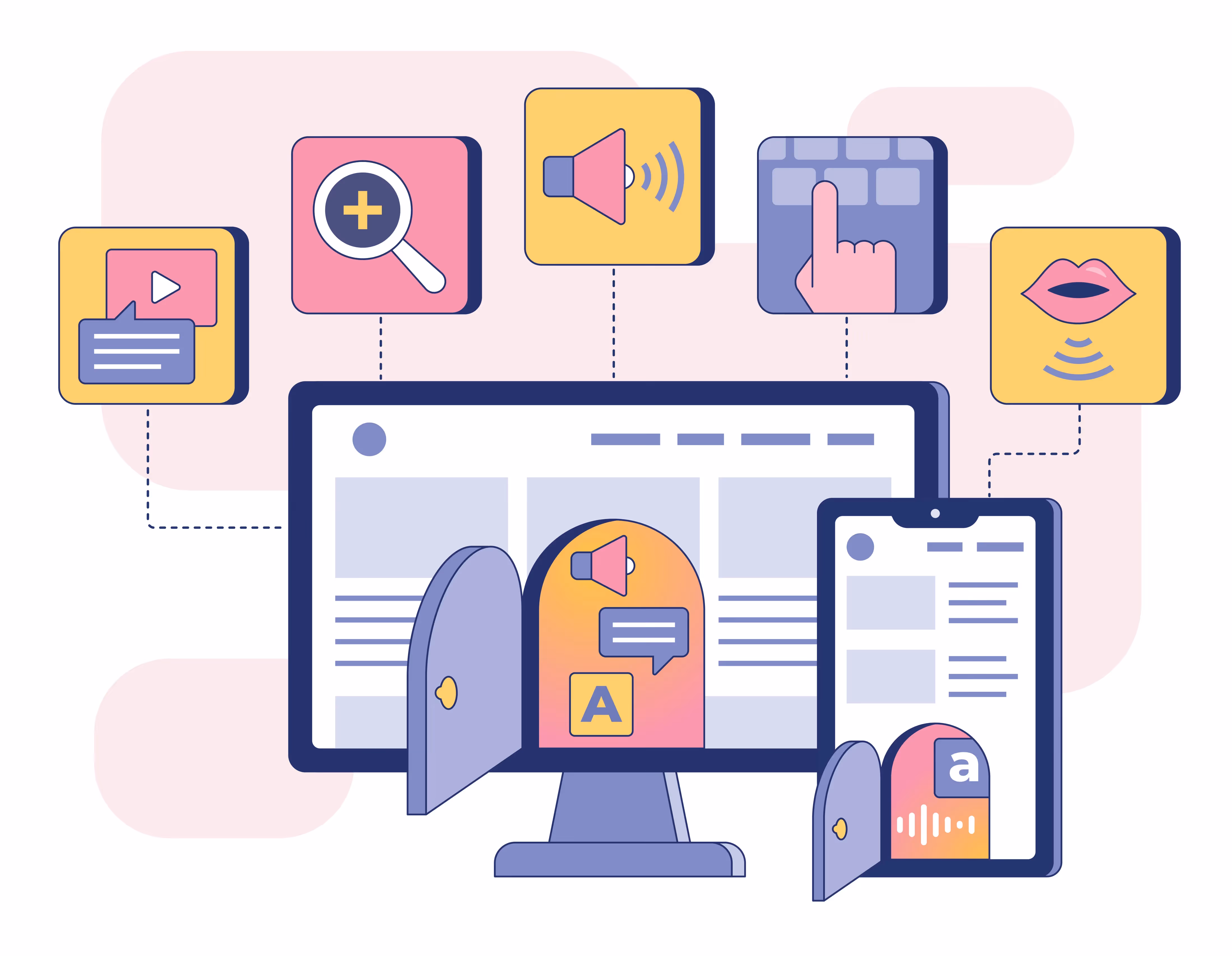
We also design for features like voice commands, screen readers, high contrast, and haptic feedback, ensuring that our apps are usable by as many people as possible.
Visual contrast determines emotional comfort
Contrast ratios affect readability and emotional ease. Low-contrast text may look sleek, but it makes products harder to use, especially for:
- People who have low vision
- People with color vision differences
- People with neurological differences affecting visual processing
Good contrast says: “Your effort matters to us.”
For our designers at Orizon, legibility and comfort are key principles, not afterthoughts. When people feel comfortable, engagement improves 👍
Accessibility is also about cognitive load
Accessibility is often associated with physical or sensory needs, but cognitive effort matters too. Users with...
- Neurodivergent conditions (ADHD, autism, dyslexia)
- Cognitive fatigue or executive function challenges
- Mental health considerations (anxiety, decision overload)
- Sensory sensitivities (photosensitivity, migraines)
…benefit from simple, predictable, and linear designs.
Our team at Orizon intentionally reduce cognitive load in every product we design. Clear layouts, consistent feedback, and simple flows make the experience easier to understand for everyone 🧠
Accessibility includes designing forms that don’t overwhelm, flows that don’t surprise, and interfaces that don’t demand constant interpretation.
The brands that invest in accessibility build trust
Accessible products:
- Reach more people
- Convert better
- Reduce liability
More importantly, they signal care: “You were considered here.”
Accessibility is not extra work. It is good design - for everyone 🌟
At Orizon, we build products that people with disabilities - including visual, auditory, motor, cognitive, and neurodivergent users - can actually use and enjoy.
Accessibility isn’t just a standard - it’s part of how we define great design.
Need help building a product that’s not just usable, but truly accessible?
Our UX and product design team specializes in creating inclusive, real-world digital experiences. In the past, we’ve even partnered with UserWay - the #1 provider for digital inclusivity - to redesign their website and user journeys.
Contact us today to build something everyone can use! 🚀
Photo by Andrii / Adobe Stock - “Digital accessibility, flat vector illustration, product or function” (File #520562636).

Keep Reading
More from Orizon

Let's talk
Design done right and fast by people you can trust.

%20(1).png)


.svg)
.svg)

.svg)