.avif)
iOS 26: The Highlights
iOS 26: Key Design Changes and What They Mean for Your App
Now that Apple has officially unveiled the iOS 26 update at WWDC, we’re excited (but not surprised) to say: we got 4 out of 5 right - and the fifth is starting to take shape.
🚀 Here’s what we guessed right.
From Apple’s new Liquid Glass UI to smarter, more context-aware AI, and even tighter Vision Pro integration, iOS 26 marks a bold step forward in how users interact with digital products. Personalization got a bump too. And while Apple didn’t fully lean into wellness-aware UX, we’re starting to see the early building blocks - like motion cues and energy-adaptive UI.
For designers, founders, and product teams, this launch isn’t just cosmetic. It reshapes how your app should look, feel, and function - especially if you're focused on conversion, retention, and staying one step ahead.
📱 Your app needs to feel native to iOS 26. Let's make sure it does →
What’s New in iOS 26 - and Why It Matters for Product Design
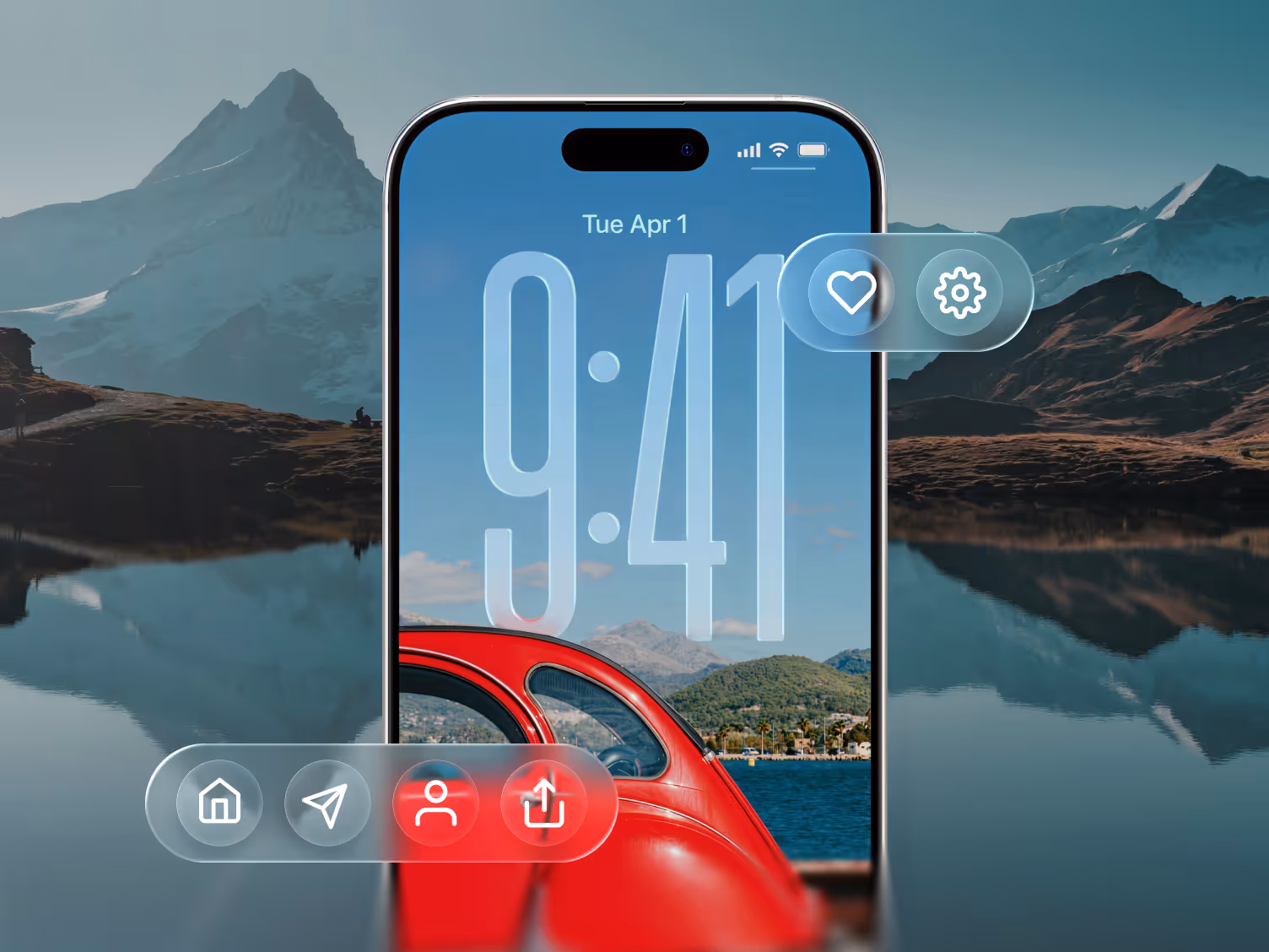
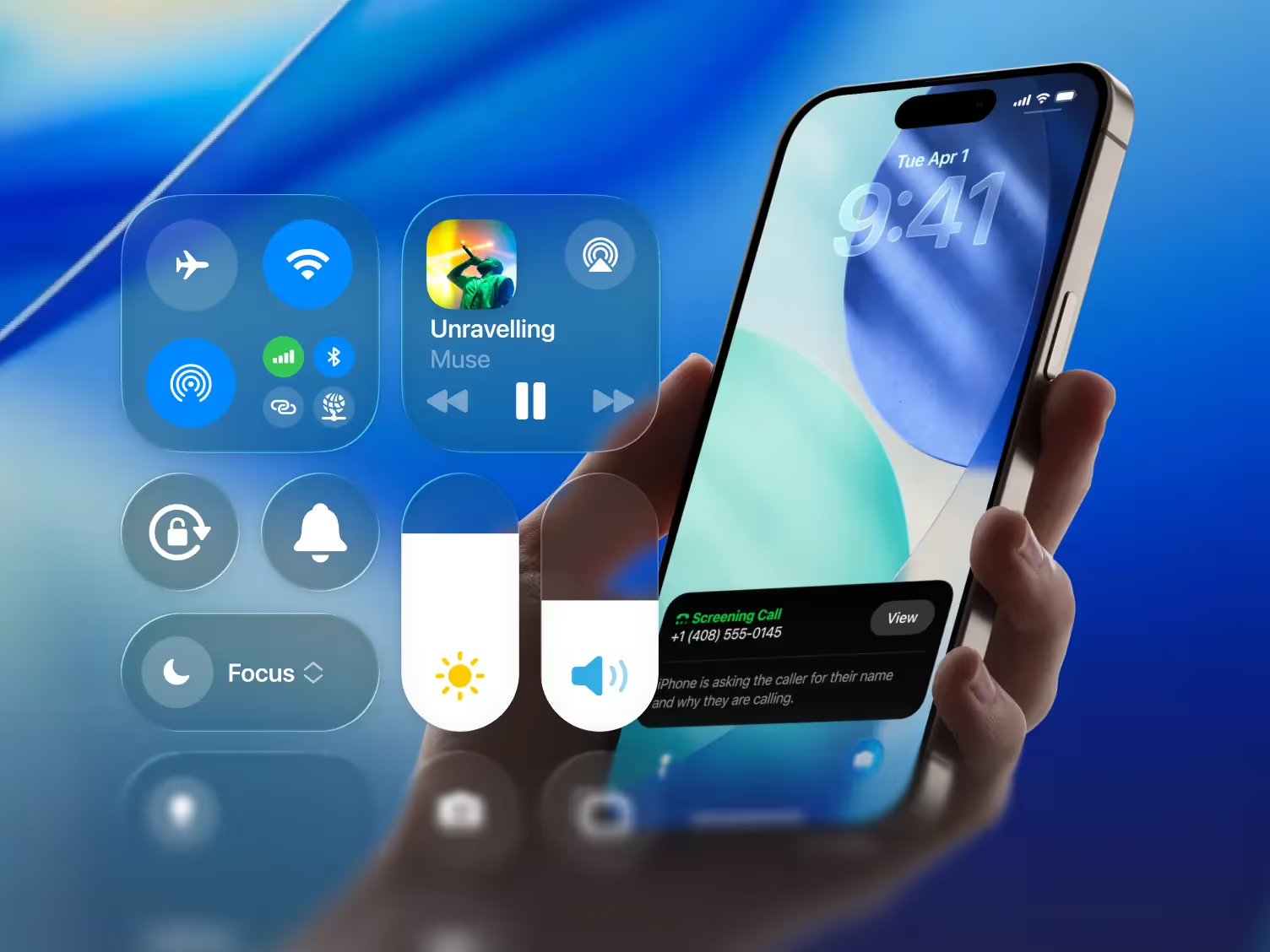
1. Liquid Glass Aesthetic
A new design style built around depth, translucency, and soft edges. It’s showing up across iOS, iPadOS, macOS, and even visionOS.
🚀 Design impact: Interfaces that don’t match this shift will start to feel outdated fast. This is the moment to modernize your visual language so your app feels native and polished.
2. AI Baked into System Flows
From auto-replies in Messages to content-aware suggestions in Photos, Apple is integrating on-device AI into everyday UX.
🚀 Design impact: Users will expect smart, contextual experiences. We help teams map out where AI can reduce friction - especially during onboarding, checkout, and other key flows.
3. Cross-Device UI Consistency
Apple is unifying UI patterns across iPhone, iPad, Mac, and Vision Pro, using shared design elements and system-wide behaviors.
🚀 Design impact: If your product spans multiple platforms, this is the time to build a cohesive, scalable design system that feels seamless at every touchpoint.
4. Smarter Communication Features
Live call translation, AI-generated email replies, and tighter calendar integrations make day-to-day tasks smoother.
🚀 Design impact: These upgrades reset what “smooth UX” looks like. If your app involves messaging, scheduling, or coordination, your experience now competes with Apple’s baseline.
5. Personalization and Wellness Cues
Apple is introducing more adaptive design cues - like energy-efficient UI changes and motion cues that respond to real-world conditions.
🚀 Design impact: Context-aware interfaces aren’t just a nice-to-have anymore. Thoughtful design here can improve accessibility and reduce friction - two key drivers of retention.
🚀 Orizon’s Forward-Leaning Design Playbook
We’re already sketching Liquid Glass flows, prototyping AI-first onboarding, and mapping cross-device journeys. Our design process is built around one metric: how design drives behavior - especially activation, retention, and conversion.
Ready to Lead on iOS 26?
We design interfaces that increase retention, reduce bounce, and convert better.
If you want design that works harder for your results, book a call with us today 🚀

Keep Reading
More from Orizon

Let's talk
Design done right and fast by people you can trust.

%20(1).png)


.svg)


.svg)