.avif)
.avif)
Landing Pages That Convert
Our 10 Favourite Landing Page Designs in Winter 2025 (and Why They Convert)
Your landing page is often the very first handshake with your audience. In just a blink, visitors decide whether to stay or bounce, making design and performance critical from the very first second. Whether you’re validating an idea, launching a product, or promoting a campaign, a well-crafted landing page can turn attention into action.
The data speaks for itself:
- A 1-second delay in load time can cost up to 7 % of conversions, and pages that load in 2 seconds see bounce rates under 10 %, compared to nearly 40 % for 5-second loads.
- Mobile-optimized pages increase conversions by 48 %, while slow load times (3+ seconds) nearly double your bounce rate.
- Adding interactive design elements can boost engagement by 80%, and speeding up your page by just 0.1 seconds can gain an 8 % lift in conversions.
Landing pages aren’t just about aesthetics - they’re about strategy, speed, and seamless experience. Below, we’ve collected ten high-impact examples that strike the perfect balance - and can inform your next high-converting design.
Founders and marketers alike know that great landing pages aren’t accidents - they’re built with intention, smart structure, and user-focused messaging. Here, we look at ten standout examples and what makes them work. When you’re ready to elevate your own experience, Orizon’s team is here to help.
📈 A landing page that turns heads and converts visitors - let's design yours →
What Exactly Is a Landing Page?
At its core, a landing page is a focused environment designed to do one thing really well: convert. Unlike a full website with multiple paths and distractions, a landing page keeps the spotlight on a single goal - whether that’s signups, purchases, demo requests, or downloads. Think of it as a controlled stage where every element - copy, imagery, buttons - is choreographed to support one action.
The Real Goal Behind Every Landing Page
Conversion. Every decision, from how fast the page loads to the placement of a headline, exists to push the visitor closer to saying “yes.” Done well, a landing page works like your brand’s elevator pitch: simple, compelling, and persuasive enough to move someone from interest to action in seconds.
Key Ingredients of Landing Page Success
- Clarity of Value: Headline + sub‑headline that says what and why.
- Visual Hierarchy that guides the eye in milliseconds.
- On‑Brand Storytelling that resonates with the right audience.
- Fast Performance on every device.
- Friction‑Free CTA: Singular, visible, and compelling.
- Trust Factors: Social proof, security badges, testimonials.
Our Top 10 Landing Pages, Winter 2025
Here are ten landing pages that stand out this season - and exactly why we love them:
1. activetheory.net
.avif)
Why we love this landing page: Immersive and cinematic, Active Theory’s site feels more like an experience than a webpage. The interactive design shows off technical skill while drawing visitors deep into the brand’s world.
- Purpose: Showcase immersive digital experiences from a creative studio
- Target Audience: Global brands, entertainment companies, collaborators
- Power Features: 3D interactive environments, cinematic motion, WebGL mastery
- Intuitiveness: Linear scrolling with strong storytelling arc
- Content Type: Case studies, immersive work breakdowns
- CTA Type: “Ask Me Anything...”
2. prometheusfuels.com
.avif)
Why we love this landing page: A futuristic aesthetic that matches the brand’s vision. The combination of bold headlines, inspiring copy, and motion literally drives us into action.
- Purpose: Explain and promote a groundbreaking carbon-recycling fuel company
- Target Audience: Investors, partners, and environmentally conscious consumers
- Power Features: Bold typography, impactful storytelling, futuristic design
- Intuitiveness: Clear scroll path with digestible sections
- Content Type: Vision statements, science breakdowns, team highlights
- CTA Type: “Connect”
3. leandra-isler.ch
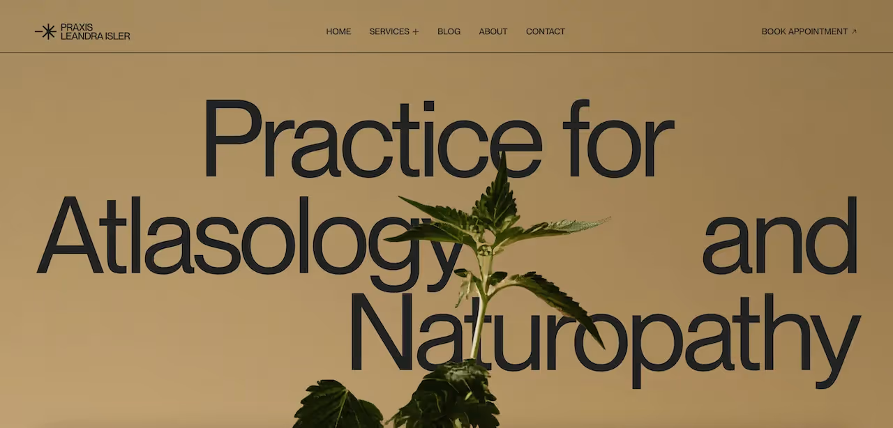
Why we love this landing page: Simple, calm, and approachable. The minimal layout creates trust while the clear “Book an Appointment” call to action makes it easy to take the next step.
- Purpose: Allow users to book other appointments with a naturopath and atlasology therapist
- Target Audience: Patients seeking holistic health support (e.g., naturopathy, massage, consultations)
- Power Features: Professional service menu, personal bio, direct online booking via Typeform
- Intuitiveness: Clear navigation with “Book appointment” button visible in site header
- Content Type: About page, services descriptions (massage, naturopathy, consultations), practitioner background
- CTA Type: “Book appointment” link using Typeform form
4. unseen.co/projects
.avif)
Why we love this landing page: Striking visuals and cinematic storytelling present each project like a work of art, while the pared-back navigation keeps the focus on imagery, making the portfolio feel curated and immersive.
- Purpose: Showcase an independent creative studio’s projects
- Target Audience: Brands, agencies, and collaborators in media/entertainment
- Power Features: Minimalist layout, cinematic project thumbnails, sleek transitions
- Intuitiveness: Grid-based portfolio keeps browsing easy
- Content Type: Project showcases with video and photography
- CTA Type: Contact
5. triplettapizza.com
.avif)
Why we love this landing page: This page instantly sets the mood with bold typography, playful graphics, and irresistible food photography. It’s a perfect example of design that whets your appetite while guiding you straight to the menu.
- Purpose: Drive foot traffic and online orders for a pizza chain
- Target Audience: Hungry locals and foodies looking for unique pizza
- Power Features: Retro 8-bit theme, gamified animations, playful copywriting
- Intuitiveness: Straightforward menu browsing with minimal clicks
- Content Type: Menu highlights, store details, quirky brand storytelling
- CTA Type: “Place and Order” and “Reserve a Table” buttons
6. niccolomiranda.com
.avif)
Why we love this landing page: A masterclass in creative portfolio design. The page blends playful animations with refined typography, proving how interaction design can showcase personality without overshadowing the work.
- Purpose: Portfolio of a creative developer/designer
- Target Audience: Agencies, tech companies, and collaborators in digital design
- Power Features: Playful scroll effects, bold use of grids, typography experimentation
- Intuitiveness: Non-linear but intuitive navigation
- Content Type: Case studies, interactive showcases
- CTA Type: “Let’s create something together: EMAIL ME”
7. regisgrumberg.com
.avif)
Why we love this landing page: Minimal but powerful. This page uses white space and bold statements to let the work speak for itself, balancing clarity with a sense of confidence.
- Purpose: Personal portfolio for a developer and designer
- Target Audience: Recruiters, startups, and agencies in tech/design
- Power Features: Animated case studies, kinetic text, precise layouts
- Intuitiveness: Simple vertical scroll with immersive detail views
- Content Type: Case studies, product design showcases
- CTA Type: Scroll-triggered “Contact” link
8. truestaging.co.uk
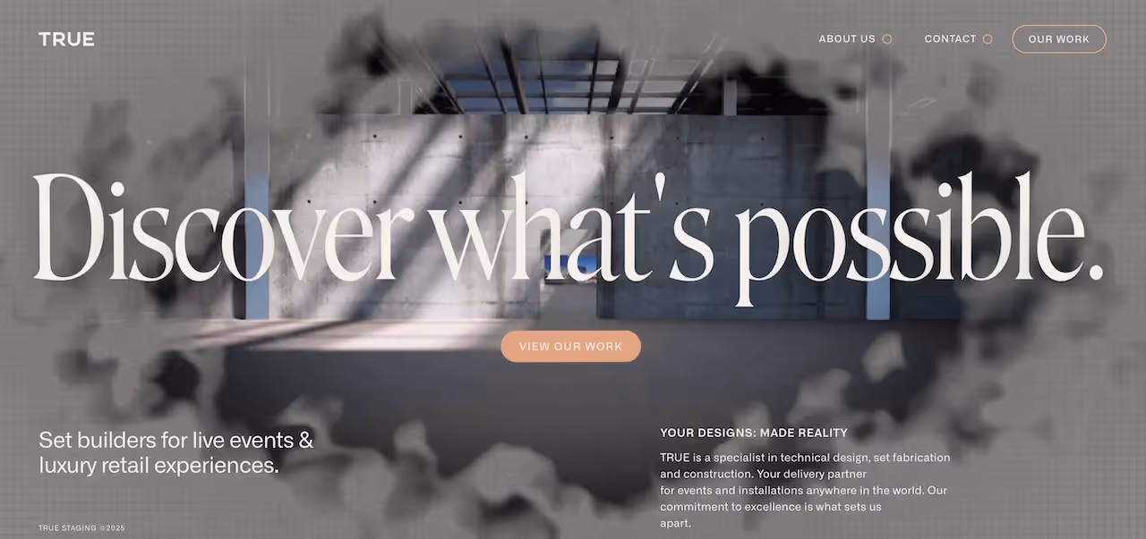
Why we love this landing page: Professional and polished, this page builds trust from the first scroll. The strategically placed “Book a Consultation” CTA ensures the user journey is smooth and purposeful.
- Purpose: Market an event staging and production company
- Target Audience: Event managers, corporate clients, production agencies
- Power Features: Cinematic video, large-format photography, bold typography
- Intuitiveness: Service categories are clearly outlined and easy to access
- Content Type: Project showcases, service descriptions
- CTA Type: Direct links to email and phone
9. bpco.kr
.avif)
Why we love this landing page: Playful, bold, and unexpected - BPCO’s design leans into oversized typography and vibrant visuals. It’s a page that feels alive, immediately communicating creativity and confidence.
- Purpose: Creative studio site highlighting innovative projects
- Target Audience: Brands, agencies, collaborators in media and design
- Power Features: High-impact visuals, auto-play videos, experimental layouts
- Intuitiveness: Sticky nav ensures smooth browsing through bold sections
- Content Type: Project showcases, studio overview
- CTA Type: Submit message inquiry form
10. bennettandclive.com
.avif)
Why we love this landing page: Elegant and modern, the design pairs sleek typography with confident messaging to showcase the agency’s expertise. Retro imagery and dynamic videography give it the energy and flair of a stylish commercial.
- Purpose: Production agency portfolio
- Target Audience: Luxury brands, wedding clients, corporate event planners
- Power Features: Full-screen visuals, elegant typography, seamless transitions
- Intuitiveness: Simple navigation, well-structured project breakdowns
- Content Type: Event showcases, service details
- CTA Type: “Work With Us” / Contact
Ready to Transform Your Landing Page?
The best landing pages aren’t just beautiful - they’re built to convert. As the examples above show, great design is about combining strategy, storytelling, and seamless interaction. From scroll depth to CTA placement, every detail shapes the user journey.
At Orizon, we craft landing pages that don’t just attract clicks - they generate customers and long-term impact. Whether you’re launching something new or refreshing an existing page, our team knows how to make every pixel count.
Let’s create a landing page that performs and inspires. Book a free call with Orizon today! 🚀

Keep Reading
More from Orizon

Let's talk
Design done right and fast by people you can trust.

%20(1).png)


.svg)


.svg)