10 Landing Pages That Nail It
Our 10 Favourite Landing Page Designs in Fall 2025 (and Why They Convert)
Your landing page has seconds to win a visitor’s trust. Research shows that users often leave a landing within 10–20 seconds if it fails to communicate value fast - making clarity and visual impact essential. Whether you're launching a product, testing demand, or promoting a campaign, a high-performing landing page can transform brief interest into measurable results.
What the numbers reveal:
- Pages with a single, focused CTA can increase conversions by up to 62%.
- Reducing page complexity can improve conversion rates by up to 27%.
- Websites that invest in structured A/B testing are 50% more likely to report strong ROI from landing pages.
In a noisy digital world, landing pages are one of the most powerful ways to turn attention into action. Great design blends clarity, structure, and intentional interaction. Here are ten standout examples and what makes them perform.
Whether you're a founder, marketer, or part of a product team, creating a landing page that truly performs means going beyond aesthetics - it requires clarity, resonance, and strategic CTAs. If you want to bring this level of craft to your own launch, Orizon can help.
📈 Great landing pages don't just look good - they convert. Let's design yours →
The Role of a Landing Page
A landing page is a dedicated web page created with a single goal in mind - driving one clear action. Unlike a multi-page site, a landing page is focused, distraction-free, and optimized for conversion. It’s a strategic piece of your marketing funnel, designed to bring people in, inform them, and drive them to act.
The Secret to Effective Landing Pages
A landing page is not just a pretty design - it's built to convert. Great landing pages combine clarity, purpose, and performance. They tell a story quickly, guide the visitor through a journey, and remove friction so that people feel confident taking the next step.
Key Ingredients of Landing Page Success
- Clarity of Value: Headline + sub‑headline that says what and why.
- Visual Hierarchy that guides the eye in milliseconds.
- On‑Brand Storytelling that resonates with the right audience.
- Fast Performance on every device.
- Friction‑Free CTA: Singular, visible, and compelling.
- Trust Factors: Social proof, security badges, testimonials.
Our Top 10 Landing Pages, Fall 2025
Here are ten landing pages that stand out this season - and exactly why we love them:
1. www.pasqua.it
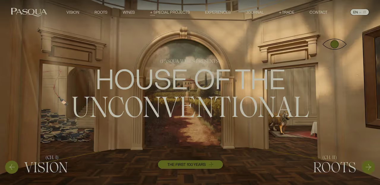
Why we love this landing page: Pasqua’s website strikes a beautiful balance between tradition and innovation. It weaves its century-long winemaking heritage with bold creativity - featuring immersive storytelling, modern design, and a refined aesthetic that reflects its “House of the Unconventional” philosophy.
- Purpose: Showcase Pasqua Wines’ legacy, innovation, and brand philosophy
- Target Audience: Wine lovers, design-conscious consumers, cultural tourists, distributors
- Power Features: Immersive storytelling, elegant typography, dedicated experience pages
- Intuitiveness: Clear navigation splits between “Wine,” “Experiences,” and “Journal,” making it easy to explore their history, tasting notes, and tours
- Content Type: Company history, wine collections, immersive experiences (on-site & virtual), journal articles
- CTA Type: “Start The Experience”
2. gehry.getty.edu
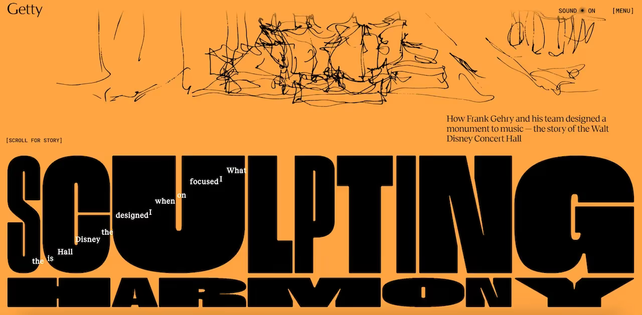
Why we love this landing page: The archive feels meticulously curated and beautifully presented, offering a deep dive into Gehry’s work with structure, clarity, and a scholarly tone - with a wonderful organ symphony playing as you scroll.
- Purpose: Archive and showcase Frank Gehry’s architectural legacy
- Target Audience: Architects, historians, students, researchers
- Power Features: High-resolution photos, architectural plans, timelines, project filters
- Intuitiveness: Well-organized filters and navigation make it easy to explore Gehry’s projects in depth
- Content Type: Photographs, essays, architectural plans, project timelines
- CTA Type: “Scroll For Story”
3. stryds.com
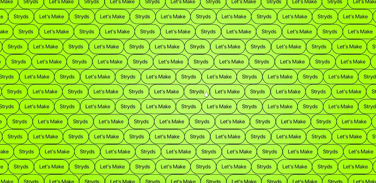
Why we love this landing page: It’s highly interactive, transforming a health-tracking app into a social and motivating experience - the site makes you feel like you’re not just using an app, but joining a community.
- Purpose: Promote a social health app with data‑driven motivation
- Target Audience: People interested in wellness, habit tracking, and social fitness
- Power Features: Interactive scroll, animated data, social / community-focused sections
- Intuitiveness: Flow from feature explanations to app value to join / sign-up feels very natural
- Content Type: App features, social challenges, trackable metrics, use cases
- CTA Type: “Join”
4. brand.dropbox.com
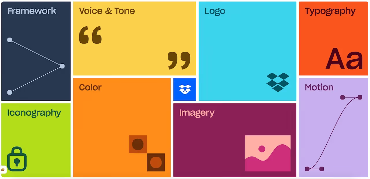
Why we love this landing page: This landing page is a clean, interactive showcase of Dropbox’s refreshed brand identity. The modular grid layout makes exploring the brandbook intuitive, while subtle animations guide users through each section without overwhelming them. It’s visually engaging yet entirely functional for understanding and referencing Dropbox’s design system.
- Purpose: Present Dropbox’s brand identity, visual system, and design standards
- Target Audience: Designers, developers, brand partners, internal teams
- Power Features: Animated grid modules, hover animations, interactive previews of logos, colors, typography
- Intuitiveness: Structured by category (Color, Logo, Iconography), making exploration logical and easy
- Content Type: Brand guidelines, style system, color palettes, icons
- CTA Type: Clickable modules revealing content
5. aim.obys.agency
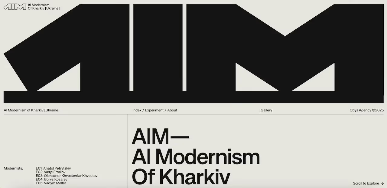
Why we love this landing page: Bold and experimental - the site feels like a piece of creative performance, not just a case study. The kinetic text and scroll-based storytelling reflect the agency’s innovative spirit.
- Purpose: Showcase Obys’s AI experiment for the AIM Awards
- Target Audience: Designers, digital creatives, award jurors, innovation‑minded brands
- Power Features: Variable typography, scroll animations, immersive layout
- Intuitiveness: Even though it’s highly creative, the navigation feels intentional - each scroll segment works like a “chapter”
- Content Type: Award case study, behind-the-scenes breakdown, design process
- CTA Type: “Scroll to Explore” and “Learn More”
6. silencio.es

Why we love this landing page: Silencio blends studio identity with digital product shop in a visually bold and interactive way - the site feels like a creative playground, not just a portfolio, coupled with sound effects with every scroll.
- Purpose: Present the design studio’s digital products and branding work
- Target Audience: Creative brands, directors, visual storytellers, design-forward clients
- Power Features: Interactive visuals, bold typography, motion, “digital product” concept
- Intuitiveness: Clear sections for digital branding, interactive websites, and comms - each invites you to scroll and explore
- Content Type: Studio portfolio, digital product catalog, interactive web experiences
- CTA Type: “Scroll to Discover” and “Let’s Talk”
7. cosmos.so
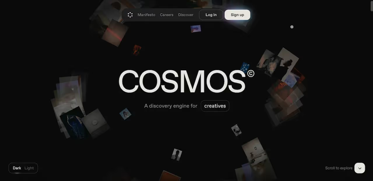
Why we love this landing page: Cosmos immediately communicates its value as a discovery engine for creatives with an engaging, scroll-to-explore interface. The landing page feels dynamic and immersive, using floating visual cards to hint at the diversity of content available, while the minimal design keeps focus on exploration. Every element encourages curiosity and interaction without overwhelming the user.
- Purpose: Present Cosmos as a discovery engine for creatives
- Target Audience: Artists, designers, and creative professionals looking for inspiration
- Power Features: Scroll-to-explore floating visual cards, interactive hover effects, immersive dark mode
- Intuitiveness: Clear scroll guidance, easy to explore content clusters
- Content Type: Images, artwork, and curated visual collections
- CTA Type: “Scroll to Explore” and “Sign Up”
8. new.pasteapp.io
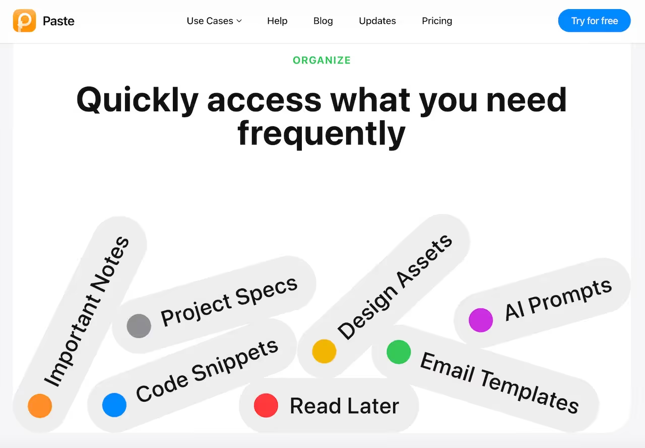
Why we love this landing page: Paste simplifies something complex - clipboard history - and makes it feel powerful yet lightweight. The layout is clean, the value proposition is crystal clear, and it supports both productivity and collaboration.
- Purpose: Promote a cross‑device clipboard manager
- Target Audience: Designers, developers, writers, power-users who copy/paste a lot
- Power Features: Infinite clipboard history, collaborative pinboards, search, custom rules
- Intuitiveness: Simple, clear UI - you get exactly what the app does without fluff
- Content Type: Feature descriptions, device integrations, use‑case examples
- CTA Type: “Try For Free”
9. superpower.com
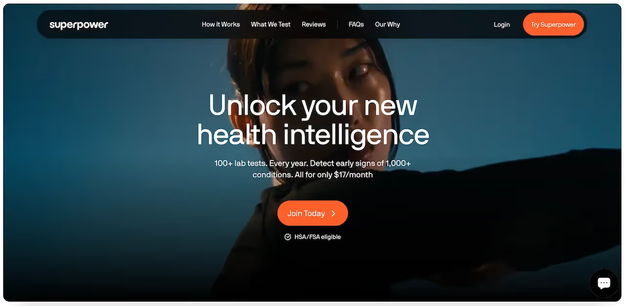
Why we love this landing page: The design feels futuristic and personal - the site communicates that you’re getting more than a product; you're gaining insight into your biology. The interactivity and health narrative feel thoughtful and modern.
- Purpose: Provide biomarker testing and personalized health insights
- Target Audience: Health‑oriented individuals, biohackers, people seeking data-driven wellness
- Power Features: Animated effects, data storytelling, health‑report UI
- Intuitiveness: Clear funnel that explains how the test works, what you get, and how to sign up
- Content Type: Health data, testing process, user stories
- CTA Type: “Join Today” and “Try Superpower”
10. unveil.fr
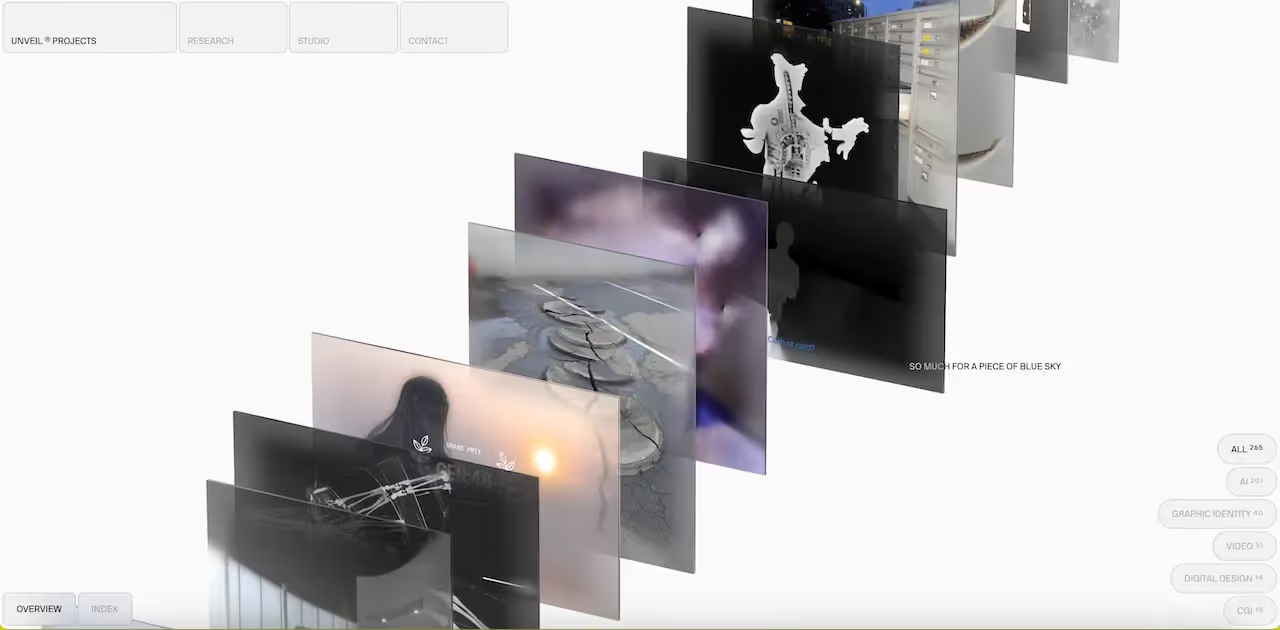
Why we love this landing page: Beautiful and intentional - the site flows like a story, with visual chapters that feel cinematic. It’s an experience as much as a portfolio.
- Purpose: Showcase the work of a creative storytelling / visual studio
- Target Audience: Brands, directors, creative clients interested in high-concept visual projects
- Power Features: Full-screen visuals, narrative scroll, strong use of brand aesthetics
- Intuitiveness: The design feels like chapters: each scroll reveals more of their story, making exploration feel natural
- Content Type: Portfolio reels, case studies, studio philosophy
- CTA Type: “Contact”
Ready to Turn Clicks Into Customers?
The top-performing landing pages share the same DNA: focused messaging, intuitive interactions, and design that leads users exactly where they need to go. As the examples above highlight, every choice - from motion to layout - influences how effectively your story lands.
If you’re inspired by these examples and ready to build a landing page that actually moves the needle, Orizon’s team is here to help. We don’t just design - we strategize, optimize, and iterate to deliver landing pages that perform.
Let’s build a landing page that doesn’t just look great - it delivers results.
The best landing pages aren’t just beautiful - they’re built to convert. As the examples above show, great design is about combining strategy, storytelling, and seamless interaction. From scroll depth to CTA placement, every detail shapes the user journey.
At Orizon, we craft landing pages that don’t just attract clicks - they generate customers and long-term impact. Whether you’re launching something new or refreshing an existing page, our team knows how to make every pixel count.
Let’s make your next page unforgettable. Book a free call with Orizon today 🚀

Keep Reading
More from Orizon
Let's talk
Design done right and fast by people you can trust.


%20(1).png)


.svg)
.svg)

.svg)