.avif)
10 ways to stop scaring off your users (and maybe your dates)
First Dates & First Screens: UX Onboarding Best Practices That Actually Work
Onboarding is basically a first date. You're nervous, they're skeptical, and one wrong move sends them running to your competitor. The good news? The same instincts that help you survive awkward small talk can help you design onboarding that actually converts.
At Orizon, we design onboarding flows that clarify value within seconds - because first impressions in UX aren't visual polish, they're trust-building moments.
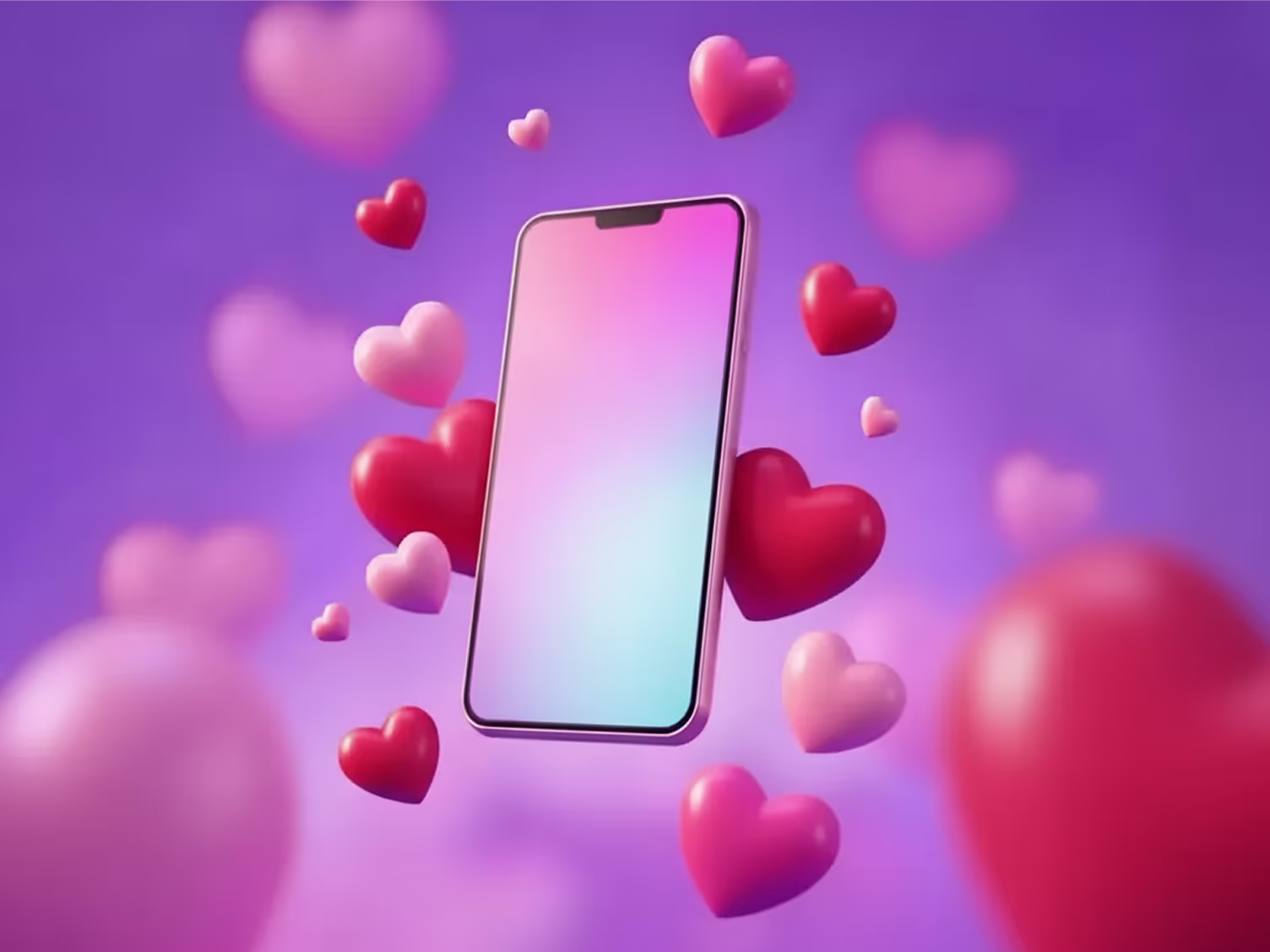
🩷 Great onboarding doesn't happen by accident. Let's design yours to convert from day one →
1. Make a Great First Impression
Remember that date who showed up 20 minutes late, blamed traffic, then immediately asked if you could split the bill for parking? Yeah. Your welcome screen shouldn't feel like that. Make it engaging, concise, and clear. Users should know exactly what they're getting into - without needing a tutorial for the tutorial.

2. Don't Overload with Information
We've all met the person who unpacks their childhood trauma before the appetizers arrive. Don't be that app. Focus on what users need to get started, not everything they could eventually do. Save the deep features for date three.
3. Guide, Don't Dictate
Nobody wants a date who orders for them, picks the movie, and schedules the next four weekends without asking. Onboarding should offer direction - tooltips, gentle nudges - while letting users explore at their own pace. Autonomy is attractive.
At Orizon, we design onboarding systems that adapt to user intent - offering guidance without friction, and freedom without confusion.

4. Minimize Registration Hurdles
Requesting three references and a credit score before you've even said hello? Red flag. Keep registration light. Let users experience value before you ask for commitment. Trust is earned, not demanded.
5. Show Progress (and Make Them Feel Wanted)
Nothing beats the thrill of being asked out for a second date. Your onboarding should give users that same feeling - like they're getting somewhere, and you actually want them to stick around. Progress bars, small wins, unlockable features: make every step feel like a "yes, let's do this again."

6. Personalization is Key
Remembering someone's coffee order? Cute. Remembering their dog's name and that they mentioned a tough week? They’re a keeper. Onboarding that remembers a user's name, preferences, and why they signed up? Same energy. Personalization makes people feel seen.
7. Mobile Responsiveness (Don't Ghost Your Users)
You know what kills chemistry? Someone who takes three days to reply, cancels last minute, or just... disappears. If your onboarding doesn't respond quickly across devices, you're essentially ghosting your mobile users. Be present. Be fast. Be reliable - especially on the platforms people actually use.
8. Test and Iterate
Every cringeworthy date teaches you something (even if it's just "never again"). Onboarding should work the same way. Collect feedback, watch for drop-off points, and improve. The best flows are built through trial, error, and honest reflection.

9. Provide Help and Support
Sometimes dates go sideways and you need an exit strategy. Users feel the same when they hit a wall. Give them easy access to help - chat support, FAQs, quick tutorials - so confusion doesn't turn into abandonment.
10. Celebrate Milestones
Good relationships mark the moments that matter. A simple "You did it!" or a small reward when users hit a milestone keeps them engaged and reminds them why they showed up in the first place.

At Orizon, we design onboarding as part of the product - not an afterthought. Because great UX doesn't just help users get started; it helps them stay.
Done right, onboarding isn't a chore. It's the beginning of something worth sticking around for. And who knows, maybe your onboarding experience will be so good, it'll be a love story for the ages!
Fancy dinner this week? We know just the agency. Let's talk! 💐

Keep Reading
More from Orizon

Let's talk
Design done right and fast by people you can trust.

%20(1).png)


.svg)
.svg)

.svg)