.avif)
Most forms are friction factories. Here’s how to make yours feel effortless.
Designing Forms That Don’t Make Users Hate You
Forms are where conversions go to die.
The checkout. The signup. The onboarding flow. All of them ask something of your users - and most ask far too much, in the worst possible way. Form abandonment rates sit between 67–81%. That's not a UX statistic. That's revenue walking out the door.
At Orizon, a form audit is usually the first thing we run when a product isn't converting. The problems are almost always the same. And they're almost always fixable.
Why Form UX Matters More Than Most Teams Realize
A form is the moment a user agrees to give you something - their email, their payment details, their time. How that moment feels determines whether they follow through.
Poor form design doesn't just hurt conversion rates. It signals that a product doesn't respect its users. Good form design is invisible —- users complete it without thinking twice.
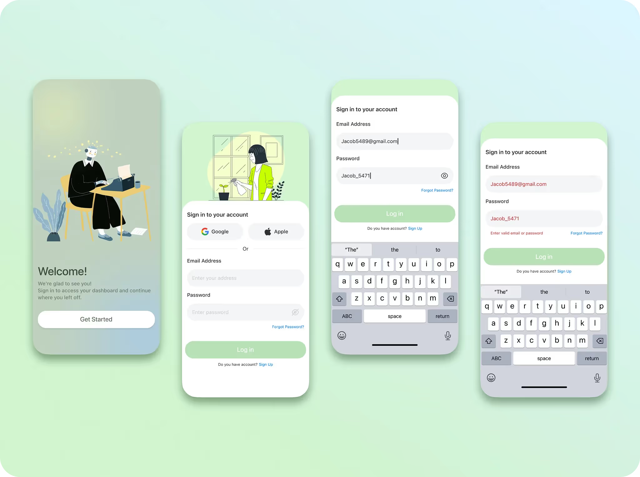
Never Use Placeholder Text as a Label
Placeholder text as a label is one of the most common mistakes in digital product design.
It disappears the moment a user starts typing. They forget what the field was asking. They second-guess themselves. They leave.
Top-aligned labels stay visible at every stage - through autofill, through edits, through accessibility zoom. Floating labels can work, but only with consistent, predictable behavior. The rule is simple: placeholders are for format hints only. "e.g. name@example.com." Never a substitute for a label.
✍️ Your forms are losing you users every day. Let's redesign the friction out of them →
Ask Less. Get More.
Every unnecessary field is a question your user didn't agree to answer.
Before any field makes it into a design, it should clear one test: what happens if we don't ask this? If the answer is "nothing critical" - cut it. At Orizon, we push teams to treat form audits like editorial passes: remove everything that doesn't earn its place.
Fewer fields don't just reduce friction. They signal respect. Research from Formstack shows that reducing form fields from 11 to 4 can increase conversions by up to 120%.

Validate in Real Time - But Gently
Submit-time errors are a trust-destroying experience.
Filling out an entire form, hitting submit, and getting a wall of red messages tells users one thing: we let you waste your time, then told you it was wrong.
Inline validation changes this. A subtle success state when a field clears. A gentle flag when something's off - after they've finished typing, not mid-keystroke. Fix as you go, not after the fact. This is the kind of detail that separates a product that feels polished from one that just looks it.
Write Error Messages That Actually Help
"Invalid input" is not an error message. It's a shrug.
A useful error message tells users exactly what went wrong and precisely what to do next. Not "Error in field 3" - but "Your password needs at least one number." Microcopy is where this lives, and it's where most teams go quiet.
At Orizon, our product writers work alongside the UX team from day one. Every error state, helper text, and confirmation message is treated as part of the design - not a dev task to fill in later.
Use a Single-Column Layout
Two-column forms feel efficient. They aren't.
Single-column layouts are completed faster because the eye has one clear path. Two columns create ambiguity - users skip fields, misread the flow, abandon more. Single-column also adapts to mobile without a redesign. In a world where most form interactions happen on a phone, that's not a detail. It's the whole thing.
Your CTA Button Is Part of the Form
"Submit" tells users nothing.
"Create my account." "Get my free trial." "Send my message." These tell users exactly what happens when they tap - and they reinforce value at the exact moment of commitment. At Orizon, the CTA on a form gets the same attention as the hero button on a landing page. It should reflect the user's goal, not the developer's function.

Form Design Checklist
Before shipping any form, run through this:
- Every field has a persistent top-aligned label - no placeholder-only fields
- Each field passes the "what if we cut this?" test
- Inline validation triggers after the user finishes typing, not mid-keystroke
- Error messages say what went wrong and what to do next
- Layout is single-column
- CTA copy reflects the user's goal, not a generic action ("Get started" not "Submit")
- Form is tested on mobile at thumb reach
- Autofill is enabled and tested
- Required vs. optional fields are clearly marked - default to required fields only
The Real Takeaway
The best forms are the ones users never have to think about. They flow. They feel obvious. They feel like the product respects their time.
That's never accidental. It's the result of deliberate design decisions at every level - label placement, field count, validation timing, button copy, microcopy. The kind of work we do every day at Orizon across SaaS products, e-commerce flows, and onboarding experiences.
Users don't hate forms. They hate poorly designed ones.
Ready to turn your forms into something users actually complete? Contact us today 🚀
FAQs
Why do users abandon forms?
The top reasons are too many fields, confusing labels, submit-time error messages, poor mobile experience, and security concerns. Research from Zuko across 93 million sessions shows that field count is the strongest driver of abandonment - not the number of steps. Every field you add is another reason to leave.
How many fields should a form have?
As few as possible. Each field you remove increases conversions by roughly 2–3%. Forms with 1–5 fields see an 89% completion rate. Once you hit 16+ fields on a single page, completion drops to around 8%. The test for every field: what happens if we don't ask this? If the answer is "nothing critical" - cut it.
Should I use placeholder text instead of labels?
No. Placeholder text disappears the moment a user starts typing - which means they can forget what the field was asking mid-entry. Always use persistent, top-aligned labels. Placeholders are for format hints only, like "e.g. name@example.com." Google's own UX research found top-aligned labels reduce the number of visual fixations required to complete a form.
What's the difference between inline validation and submit-time validation?
Inline validation flags errors field by field as the user completes each one - after they've finished typing, not mid-keystroke. Submit-time validation waits until the user hits submit, then surfaces all errors at once. Inline validation is consistently better for UX: it catches mistakes early, reduces frustration, and builds confidence. The key rule is to validate on blur (when the user leaves a field), not on every keystroke.
Are single-column forms better than two-column forms?
Yes, in almost every case. Eye-tracking studies show single-column layouts are completed faster because the eye has one clear path. Two-column forms create ambiguity - users skip fields, misread the flow, and abandon more. The only exception is short, related field pairs like City and State or Day, Month, Year.
When should I use a multi-step form instead of a single-page form?
When your form has more than 5 fields. Multi-step forms with progress indicators convert up to 300% higher than single-page equivalents for longer forms. Breaking the form into steps reduces cognitive load, lets you save sensitive questions for last (when users are already invested), and makes the process feel manageable. For forms under 5 fields, keep them single-page - the navigation overhead hurts more than it helps.
What should a good error message say?
It should say exactly what went wrong and exactly what to do next. "Invalid input" is not an error message - it's a shrug. "Your password needs at least one number" is. Error messages should appear inline, next to the field, not at the top of the form. And they should never make users feel blamed for getting something wrong.
How do I write better CTA copy for form buttons?
"Submit" tells users nothing. The button copy should reflect what actually happens when they tap - "Create my account," "Get my free trial," "Send my message." First-person phrasing ("Get my quote") consistently outperforms second-person ("Get your quote") in A/B tests. The submit button is the last moment of commitment - treat it with the same attention as a landing page hero CTA.
How do I reduce form abandonment on mobile?
Mobile users complete forms at roughly 8–9 percentage points lower than desktop. The biggest fixes: single-column layout, minimum tap targets of 44×44px, native input types (tel, email, numeric) so the right keyboard appears, autofill support, and removing any fields that aren't essential. Autofill alone can reduce abandonment by up to 70% for users who trigger it.
Does marking fields as optional reduce abandonment?
Yes - significantly. One study found that marking the phone number field as optional dropped abandonment on that field from 39% to 4%. The default assumption should be: if a field is optional, either remove it entirely or make the optional label explicit. Never let users guess whether a field is required.
Header image: Photo by SeGun / Dribbble – “Mobile App Login UI – Light & Minimal” (Shot #26252955).

Keep Reading
More from Orizon

Let's talk
Design done right and fast by people you can trust.

%20(1).png)


.svg)
.svg)

.svg)