.avif)
Every landing page now has a nature backdrop. Here's why - and what it means for your product.
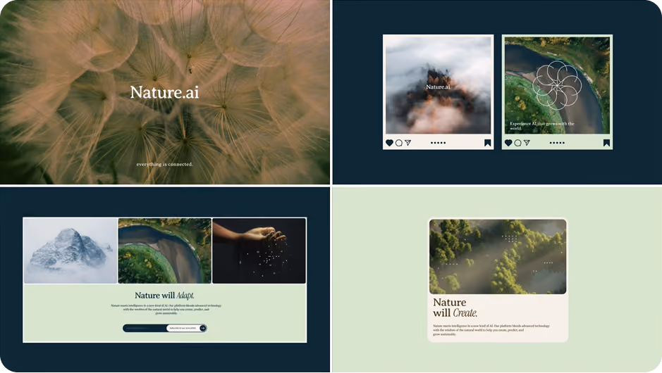
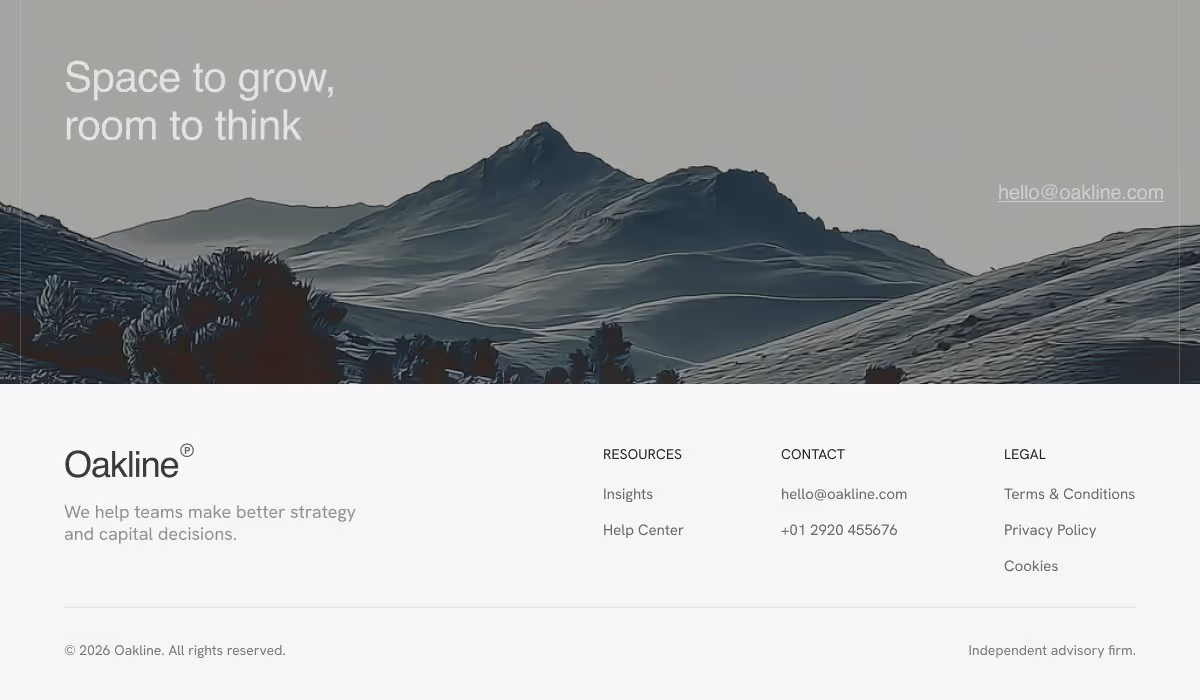
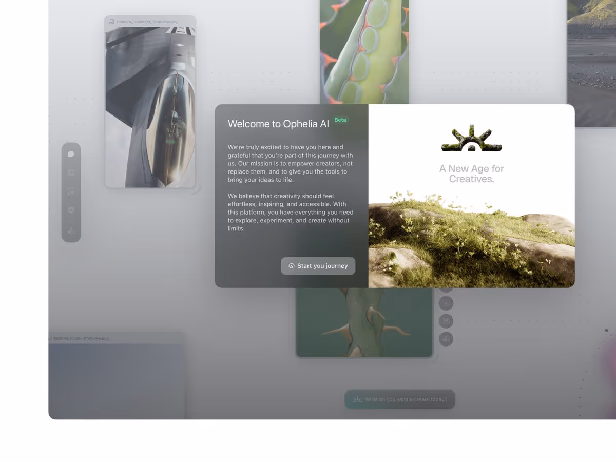
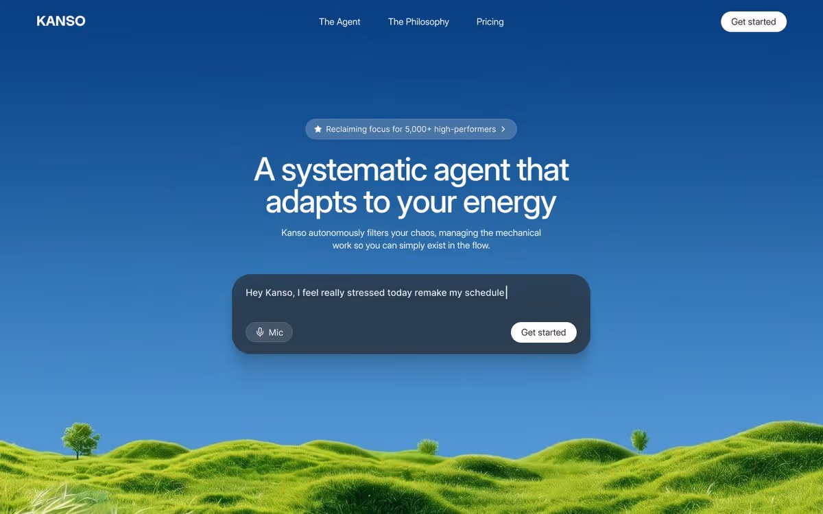
Digital Naturalism: The 2026 Design Trend Bringing Nature to Tech
Have you noticed? Every landing page now has a nature backdrop. Mountains. Forests. Landscapes. Muted earth tones. It's everywhere.
We've been tracking design trends for years at Orizon, and this one caught our attention. After analyzing hundreds of product launches in 2026, a clear pattern has emerged. We've been looking for a name for it - New Naturalism, Biomorphism. But the one that fits best is Digital Naturalism.
Here's what it is, why it's happening, and how to use it without overdoing it.
What Digital Naturalism Actually Looks Like
This isn't a few brands experimenting. It's across SaaS tools, AI products, wellness apps, productivity software, and fintech. The visual signatures:
- Product shots floating over mountain ranges
- App interfaces with forest or landscape backdrops
- Muted earth tone palettes - beige, terracotta, sage, sand, stone
- Organic textures layered behind clean, minimal UI
- Warm natural light replacing harsh studio gradients
Compare 2024 to now. Two years ago everything was blue-gray, neon gradients, glassmorphism, iridescent Web3 effects. Cold. Sterile. Electric. Today it's warm beige and soft greens. The shift is dramatic - and intentional.
🌿 Wondering if Digital Naturalism fits your brand? Let's find the aesthetic that actually converts →
Why This Trend Is Happening
Design doesn't change randomly. Trends reflect how people feel. And right now, people are overstimulated.
From 2020–2024, the dominant aesthetics were cyberpunk, glassmorphism, and Web3 iridescence - hyper-digital, intense, futuristic. It worked when it felt novel. But people got tired. Screens multiplied. Notifications became relentless. When your entire day is digital chaos, what do you crave? Warmth. Calm. Something that feels organic.
That's exactly what nature imagery delivers - and it's why AI products in particular are leaning into it hard. An earth-toned, landscape-backed interface signals:
- Trust - "We're grounded, not just algorithms"
- Calm - "We won't overwhelm you"
- Human-centeredness - "This tech is here to help, not dominate"
It's a visual handshake that says: this tool exists in the real world, not a cold digital void. Across hundreds of 2026 product launches, the pattern is consistent - organic design signals authenticity in a way that no gradient or glassmorphism effect can.
Digital Naturalism vs. Biomorphism vs. New Naturalism
These terms are floating around together, and it's worth being precise - because they're related but different.
Digital Naturalism (what we're calling this trend) uses literal nature imagery - mountains, forests, sunlight, landscape backdrops layered behind tech products. It's Adobe's "Nature Distilled" color direction taken into full visual environments.
Biomorphism uses organic shapes - rounded blobs, flowing curves, cell-like forms that evoke plants or the human body. Related, but no mountains required.
New Naturalism is the broader cultural shift toward earthy palettes and tactile materials across branding and product design. Digital Naturalism is its most visible expression in web and product design specifically.
Knowing the distinction matters when briefing a designer or interpreting a trend report. They're not interchangeable.
Why It Works (Beyond the Mood Board)
We've built 400+ products at Orizon, and we've seen firsthand how backdrop choices shift user perception. A few reasons Digital Naturalism actually performs:
Contrast creates focus. A clean UI against a soft nature scene creates instant visual hierarchy - the product stands out without needing heavy shadows or neon accents.
Warmth without clutter. Pure white minimalism can feel sterile. Organic textures add warmth without adding visual noise. It's the design equivalent of a well-lit room with plants.
It ages better than trends. Cyberpunk and Web3 aesthetics date fast. A mountain landscape won't feel embarrassing in 2028. For brands investing in brand identity, that longevity matters.
Nature signals trust at a subconscious level. Research shows people associate nature imagery with authenticity and environmental care - even when it's purely aesthetic. For AI and fintech products especially, that association is valuable.
How to Use It Without Overdoing It
Design trends are tools, not mandates. Here's how our team at Orizon thinks about applying this one:
Do:
- Use nature as backdrop - keep your UI clean and let the landscape recede
- Reach for muted palettes: warm beige, soft green, terracotta, stone
- Reserve it for high-impact moments - hero sections, landing pages, key marketing screens
Don't:
- Plaster a mountain photo on every screen - it becomes wallpaper fast
- Ignore accessibility - text must stay readable over organic textures (WCAG contrast ratios apply regardless of how beautiful the backdrop is)
- Apply it blindly - a hardcore gaming app or enterprise B2B dashboard probably shouldn't look like a wellness retreat
At Orizon, we prototype with nature-inspired backdrops and test with real users. Does it feel calming or distracting? Does it reinforce trust or muddy the message? The answer isn't always yes. Our UX design process always puts trend-testing against real user response before it ships.
Is This Just a Fad?
We don't think so - because the problem it solves isn't going away.
People will keep being overstimulated. Screens will keep multiplying. AI will keep advancing. The need for tech to feel warm, human, and approachable will only grow. Tech products used to position themselves as futuristic and otherworldly. That worked when tech was new and exciting. But now tech is just part of life - and people want products that fit into their real, human lives, not ones that pull them further away.
Digital Naturalism might evolve. But the core insight - that tech needs nature to feel grounded - is here to stay.
Ready to explore what Digital Naturalism could look like for your product? Contact us today 🚀
FAQs
What is Digital Naturalism?
Digital Naturalism is a 2026 design trend where tech products use nature imagery -. mountains, forests, landscapes, organic textures - as backdrops or visual elements. It creates warmth and calm in digital interfaces, contrasting with the cold, hyper-digital aesthetics that dominated from 2020 to 2024.
Why is this trend happening now?
People are overstimulated. Screens everywhere, notifications nonstop, information overload. After years of hyper-digital aesthetics - neon gradients, cyberpunk, glassmorphism - users are craving warmth, calm, and something that feels organic. Nature imagery delivers exactly that.
How is Digital Naturalism different from New Naturalism?
New Naturalism - Adobe's term - refers to color palettes: muted, earthy tones like beige, wood, and soil. Digital Naturalism is the visual extension: literal nature imagery (mountains, forests, sunlight) layered directly behind product UIs.
How is Digital Naturalism different from Biomorphism?
Biomorphism is about shape language - organic forms like rounded blobs and flowing curves that evoke living things. Digital Naturalism uses literal nature backdrops - mountains, landscapes, natural light. Related, but structurally different approaches.
Where are we seeing Digital Naturalism used?
Across SaaS tools, AI products, wellness apps, productivity software, and fintech. Landing pages, hero sections, and product marketing are the most common use cases - anywhere a brand needs to signal trust and approachability at a glance.
Why does nature imagery create trust?
People associate nature with care, sustainability, and wellbeing. Even when it's purely aesthetic, nature imagery signals "we're grounded, human-centered, and approachable" - which is especially valuable for AI products that might otherwise feel cold or intimidating.
Is Digital Naturalism just a passing fad?
Maybe - but the underlying problem it solves isn't going away. People will keep being overstimulated, and tech will keep needing to feel warm and human. The specific execution might evolve, but the core insight - that tech needs nature to feel grounded - is here to stay.
How can I use Digital Naturalism without overdoing it?
Use it subtly. Nature as backdrop, not overwhelming the UI. Keep your product interface clean and let the landscape recede. Use muted palettes - warm beige, soft greens, terracotta. Test with real users to confirm it feels calming, not distracting. And only apply it if it genuinely fits your brand.
What color palettes work best for Digital Naturalism?
Warm beige, soft greens, terracotta, sand, stone, and sage. Think natural light, sunrise and sunset tones, organic warmth. Avoid harsh blue-gray or neon gradients - they work against the effect entirely.
How does Orizon use Digital Naturalism in client work?
We prototype with nature-inspired backdrops and test with real users - asking whether it reinforces trust, feels calming, and genuinely fits the brand. Nature textures are always used subtly, as backdrops that keep the product UI clean and minimal. Learn more about our design approach →
Header image: Photo by @Peterpangfx / X https://x.com/Peterpangfx/status/2049438699469873597?s=20

Keep Reading
More from Orizon

Let's talk
Design done right and fast by people you can trust.

%20(1).png)


.svg)
.svg)

.svg)