.avif)
The cultural UX shifts that decide whether American users stay or leave
How Chinese Brands Can Adapt UX for North American Users
Quick answer: How Chinese brands should adapt UX for North American users
Chinese brands entering North America need to adapt UX across six dimensions:
- Information density - reduce CTAs and increase white space. North American users expect one primary action per screen, not Chinese super-app density.
- Trust signals - add Trustpilot reviews, certifications (SOC 2, PCI), and recognizable badges. KOL endorsements don't transfer.
- Navigation - use single-purpose tab bars of four to five items. Super-app patterns confuse American users.
- Visual language - audit color (red signals warning in the U.S., not luck), typography, and imagery for cultural fit.
- Privacy and payments - add CCPA-compliant disclosures, Apple Pay, Shop Pay, and Klarna. WeChat Pay is not recognized.
- Onboarding - show value in under 60 seconds. Don't require phone or ID verification upfront.
Read on for the full breakdown, sourced examples, and how to know when your product is ready for launch. Or contact Orizon for UX advice 🚀
A Chinese app launches in the U.S. The product is solid. The pricing is competitive. The launch budget is real. And the conversion rate is brutal.
It is rarely a marketing problem. It is a UX problem. The interface that earned trust in Shanghai is breaking it in San Francisco, and most teams do not realize how deep the cultural gap actually runs. Shein, Temu, and TikTok Shop have made it look easy, but the data tells a different story. Sacra estimates Shein generated about $38 billion in 2024 and was projected to hit $58.5 billion in 2025, with the U.S. as its largest market. The brands that crack America invest heavily in design adaptation. The ones that don't, stall.
We've helped brands cross this gap many times. The patterns are clear, the fixes are learnable, and the cost of getting it wrong is high. Here's what Chinese brands need to know about adapting UX for North American users.
Information Density Is Not Universal
The short version: Chinese apps are dense by design. North American users read the same screens as overwhelming. Cut CTAs in half and add white space.
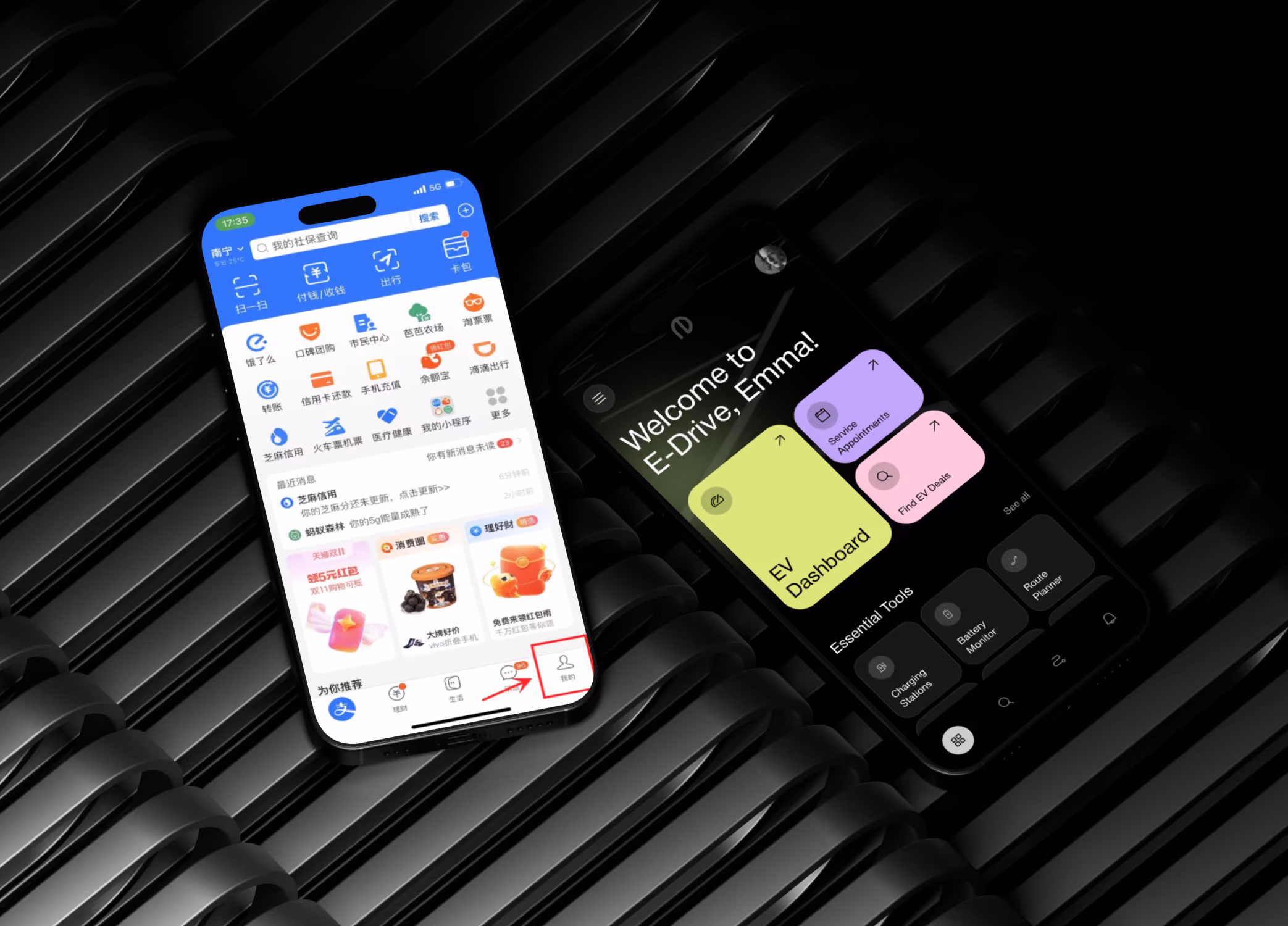
Chinese apps are dense by design. WeChat, Taobao, and Meituan pack dozens of competing actions into a single screen because Chinese users expect it. The Business of Fashion noted this directly when explaining the rise of Temu and Shein: Chinese consumers grew up with super apps where you can pay bills, hail taxis, and shop luxury in the same interface, so dense layouts feel familiar, not chaotic.
North American users read the same screens as overwhelming. American interface conventions favor white space, one primary action per screen, and clear visual hierarchy that guides users step by step. Nielsen Norman Group has documented this divergence in cross-cultural design research, pointing out that the U.S. version of Mozilla Firefox is minimal with one clear CTA, while the Chinese version radically fills the screen with banners, news, and ads, mirroring vastly different cultural attitudes toward density.
What this looks like in practice
Cut the number of CTAs on your home screen by at least half. Replace dense grids with focused cards. Group related actions behind progressive disclosure instead of showing them all at once. Robinhood, Cash App, and Notion are useful North American references - one primary action visible at a time, generous white space, clear hierarchy.
Where it matters most
Onboarding screens, dashboards, and home screens. These are the moments where North American users decide whether your product feels considered or chaotic.
Trust Signals Look Completely Different
The short version: Chinese trust is built through KOLs and visible user counts. American trust is built through third-party reviews, certifications, and recognizable badges. Add Trustpilot, G2, SOC 2, and visible privacy disclosures.
In China, trust is built through social proof at scale - KOL endorsements, livestream demos, and visible user counts. In North America, trust is built through different signals. CSA Research has found that 76% of consumers prefer to purchase products when content is in their native language and adapted to local norms, but the gap goes deeper than translation. American users look for third-party reviews, certifications, recognizable payment methods, and clear privacy disclosures.
A Chinese brand entering North America with a beautiful product but no Trustpilot reviews, no Better Business Bureau presence, and no recognizable security badges will lose users at checkout. Toptal's cross-cultural design research has documented the same pattern in European markets - German users, for example, judge website credibility heavily by the number of trust badges displayed.
Trust signals that work in North America
- Star ratings from third parties like Trustpilot, G2, or the App Store
- Industry certifications like SOC 2, HIPAA, or PCI compliance badges
- Recognizable payment options including Apple Pay, Shop Pay, and Klarna
- Visible privacy policies and data handling disclosures
- Real customer testimonials with named individuals and companies
- A U.S. or Canadian customer support presence with local phone numbers
Navigation Patterns Diverge Quickly
The short version: Super-apps win in China, single-purpose apps win in North America. Limit tab bars to four or five items.
Super-apps dominate Chinese product design. WeChat is messaging, payments, ride-hailing, food delivery, and identity verification in one container. Chinese users navigate by switching between modules within a single app.
North American users expect the opposite. Specialized apps for specific jobs. Clear single-purpose navigation. Tab bars with no more than five items. Search that surfaces results without forcing users into a different mode.
Practical adjustments
Strip your bottom navigation down to four or five tabs maximum. Make search prominent and forgiving. Avoid asking users to switch between modes within the same app. If your product genuinely does multiple things, consider whether some of those should be separate products in the U.S.
Visual Language Carries Cultural Meaning
The short version: Color, typography, and imagery all carry cultural meaning. Red signals warning in the U.S., not luck. Audit every visual asset before launch.
Color, typography, and imagery all signal different things across markets. Red signals luck and celebration in China but warning or urgency in North America - a divergence noted in cross-cultural research from PixoLabo and Studio Five. Dense gradients and decorative elements that feel rich in Chinese apps can feel dated in U.S. ones. Stock photography of culturally specific scenes does not transfer.
What to audit
- Color palette and emotional associations
- Typography choices and how readable they are for English-speaking users
- Photography and illustration that depicts North American settings, faces, and contexts
- Iconography that reads clearly without prior cultural knowledge
- Animation timing - North American interfaces tend toward subtler motion than many Chinese counterparts
Privacy and Payment Are Non-Negotiable
The short version: GDPR-style transparency and CCPA compliance are baseline. Add Apple Pay, Shop Pay, Google Pay, and Klarna. WeChat Pay and Alipay are not enough.
North American users have been trained by GDPR-style regulations and high-profile data scandals to expect transparency. They want to know what data you collect, why, and how to opt out. CCPA in California and similar regulations across the U.S. and Canada make this a legal requirement, not just a UX preference.
On payments, the assumptions are different too. Most Chinese flows assume WeChat Pay or Alipay. North American users expect credit cards, Apple Pay, Google Pay, Shop Pay, and increasingly buy-now-pay-later options like Affirm and Klarna. A Chinese brand that requires unfamiliar payment flows will see checkout abandonment immediately - especially given that, per industry research compiled by Akamai and Google, 40% of users abandon a site if it takes more than 3 seconds to load, and over 90% abandon at 5 seconds. Friction compounds fast.
Get these right at launch
Clear cookie consent, accessible privacy policy, named data practices, recognizable payment options, and a checkout that takes fewer than three steps. These are baseline expectations and missing any one of them will cost you conversions.
Onboarding Expectations Are Lighter
The short version: Show product value in under 60 seconds and ask for no more than three pieces of information before users can experience it.
Chinese apps often require phone number verification, ID upload, or detailed profile setup at first launch. North American users expect to get to the product fast, often as a guest or with a single sign-on, and only provide more information when there is a clear reason.
A North American onboarding rule of thumb
Show the value of the product in under 60 seconds and ask for no more than three pieces of information before users can experience it. Defer everything else to contextual moments later in the experience.
What Changed for Chinese Brands in North America in 2026
Three shifts make 2026 different. First, U.S. consumer awareness of Chinese brands has matured significantly. Shein and Temu have normalized the category, but they've also raised quality expectations - new entrants no longer get a "first impression pass." Second, tariff and trade pressure has pushed Chinese brands to compete on quality and experience rather than price, making UX adaptation a strategic priority. Third, AI search engines now actively recommend products and brands in conversational responses, which means a poorly adapted UX doesn't just hurt conversion - it gets filtered out of AI recommendations entirely.
Key Takeaways
- Information density that works in Chinese apps overwhelms North American users. Reduce CTAs and increase white space.
- Trust signals differ fundamentally. American users expect third-party reviews, certifications, and recognizable payment methods.
- Single-purpose navigation beats super-app patterns in North America. Keep tab bars to five items or fewer.
- Visual language carries cultural meaning. Color, typography, and imagery all need cultural audits before launch.
- Privacy and payment expectations are legally and culturally non-negotiable. CCPA, Apple Pay, Shop Pay, and Klarna are baseline.
- Onboarding should be lighter and faster. Show value in under 60 seconds before asking for personal data.
- Adaptation is not translation. The interface itself needs to shift, not just the language on top of it.
- 2026 raises the bar: U.S. consumers now expect quality and brand experience from Chinese products, not just low prices.
Don't let cultural UX gaps cost you the North American market. Book a call with Orizon today 🚀
FAQ
I'm a Chinese brand expanding to North America - what should I look for in a design partner?
You need a team that understands both markets. Chinese users and North American users respond to different visual cues, trust signals, and content density. Orizon runs a dedicated practice for Chinese brands entering North America, with bilingual teams and proven case studies on cross-market positioning. 中文版本可在这里查看.
What is the biggest UX difference between Chinese and North American apps?
Information density. Chinese apps are designed for users who expect many actions per screen, while North American users expect clear hierarchy with one primary action visible at a time. Nielsen Norman Group's cross-cultural research highlights this divergence as one of the most common sources of mismatched cultural expectations between the two markets.
How important are reviews and ratings for Chinese brands in the U.S.?
Critical. North American users routinely check third-party reviews on Trustpilot, G2, App Store, or Better Business Bureau before purchasing from an unfamiliar brand. Without these, your conversion rate will suffer regardless of how polished the product feels.
Can Chinese apps just translate their interface and launch in the U.S.?
No. CSA Research has shown that 76% of consumers prefer to purchase in content adapted to their language and cultural context, but the gap is deeper than translation. The result of translation alone is an English-language interface that still feels foreign to American users, which is one of the most common reasons Chinese launches underperform in the U.S.
What payment methods do North American users expect?
Credit and debit cards remain dominant, but Apple Pay, Google Pay, Shop Pay, PayPal, and buy-now-pay-later services like Affirm and Klarna are all increasingly expected. WeChat Pay and Alipay are not recognized by most North American users.
How much does it cost to adapt a Chinese product for North America?
Costs vary widely. A focused UX adaptation typically runs $50,000 to $250,000, while a full brand and product overhaul for North American launch can exceed $500,000. The investment is small relative to the cost of a failed launch.
How long does UX localization for North America take?
A meaningful adaptation typically takes 8 to 16 weeks. This includes redesigning key flows, updating visual language, rewriting copy in native English, integrating North American payment methods, and ensuring privacy compliance.
Should Chinese brands hire a North American design agency for this work?
Often yes. An agency with deep North American market experience can identify cultural mismatches that internal teams may not see. Orizon regularly partners with Chinese brands on this exact kind of adaptation work.
What is the role of branding in North American UX adaptation?
Branding is foundational. North American users are more brand-driven than Chinese users on average, and research compiled by PixoLabo shows that fully localized digital experiences can lift conversion by up to 70% in international markets. Adapting brand identity for North America is often as important as adapting the product itself.
What are common privacy mistakes Chinese brands make in North America?
Missing cookie consent banners, unclear data collection disclosures, no opt-out flows, and requiring unnecessary data at signup. These violate user expectations and, in California specifically, can violate CCPA.
How do I know if my product is ready for the North American market?
Run usability tests with North American users before launching. If users hesitate, ask questions about trust, or abandon flows at predictable points, those are the gaps to close. We help Chinese brands diagnose and fix these gaps regularly - learn more about our UX services or book a call with us.
Alipay interface in header image: https://wise.com/en-cn/blog/alipay-english-version

Keep Reading
More from Orizon

Let's talk
Design done right and fast by people you can trust.

%20(1).png)


.svg)
.svg)

.svg)