.avif)
Most dashboards show everything. Great dashboards show the right thing.
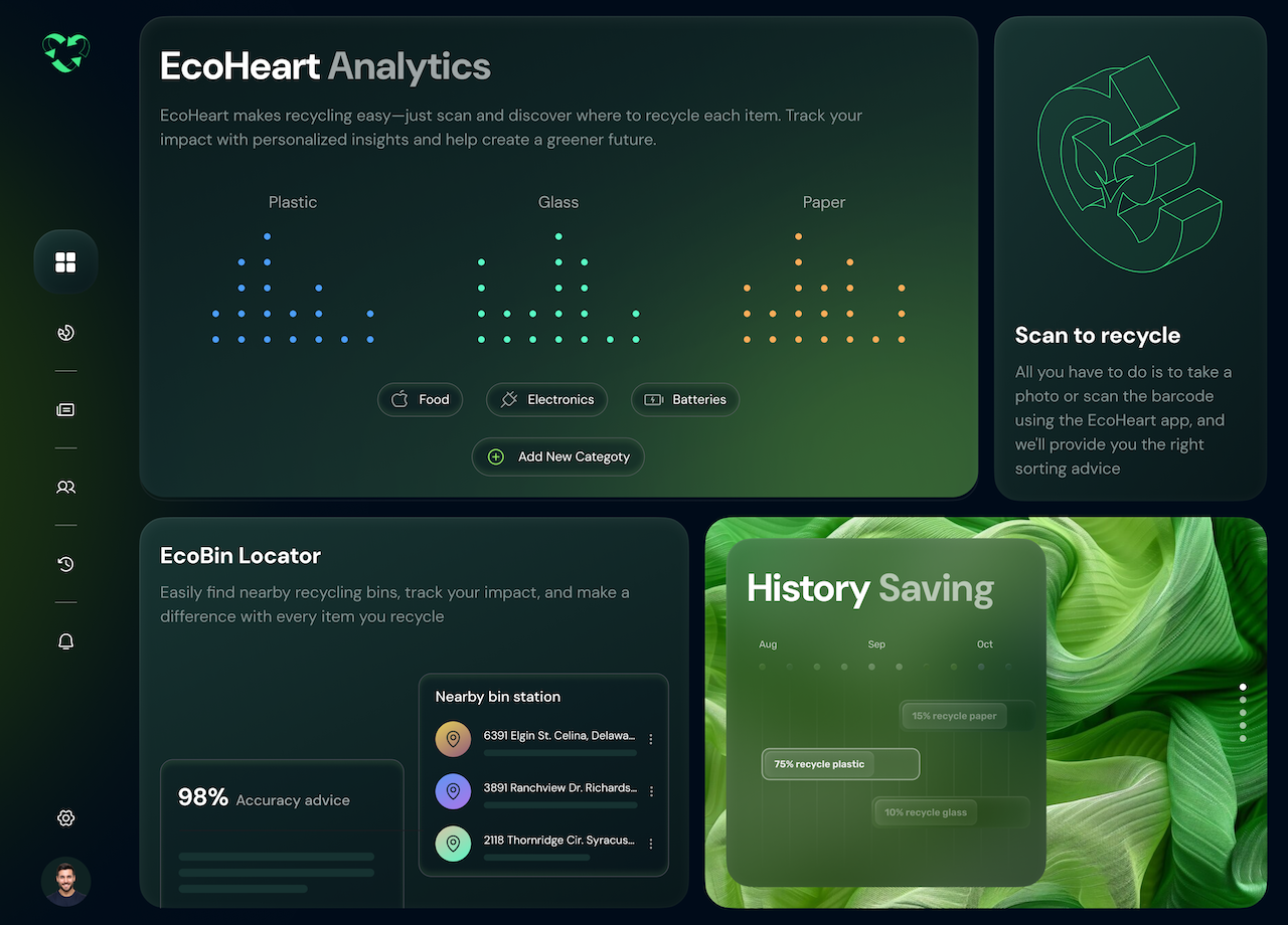
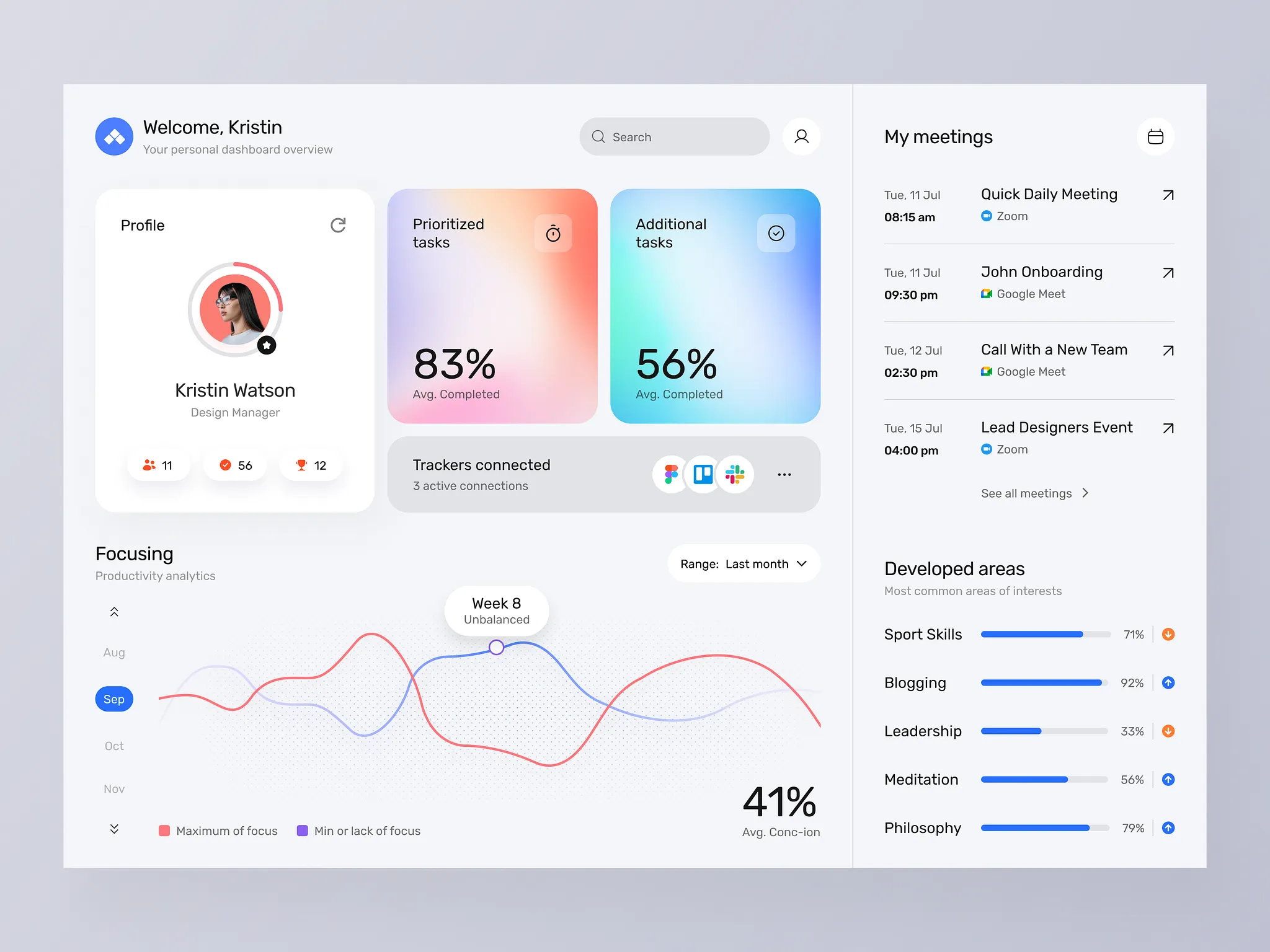
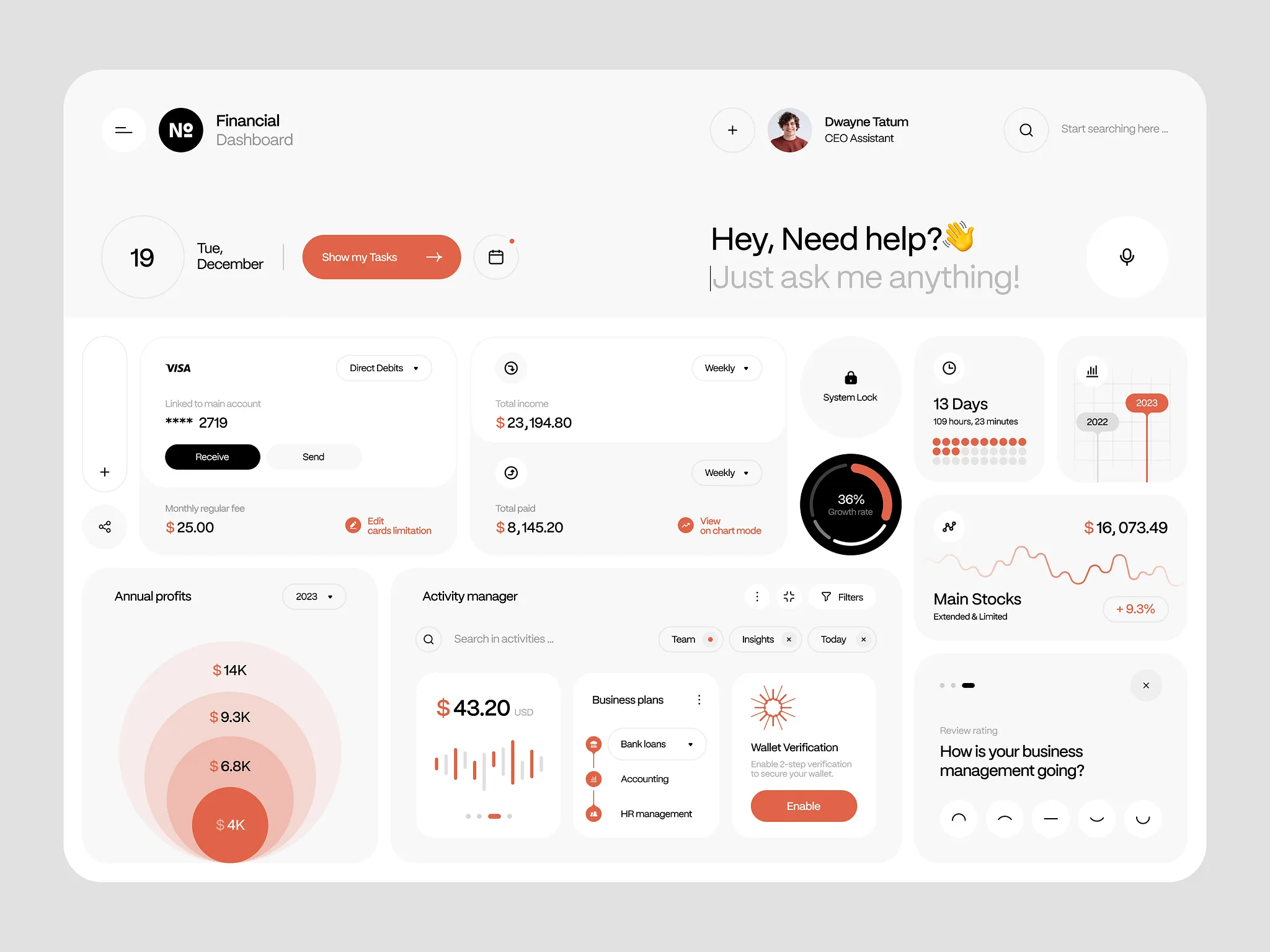
The Anatomy of a Perfect Dashboard
Most dashboards are built to impress a stakeholder in a demo. Then they go live, and nobody uses them.
The data's all there. The charts look great. But something's off. Users can't find what they need. They don't know what to act on. They stop opening it.
At Orizon, we've designed dashboards for SaaS products, enterprise platforms, and AI-first products. And in 2026, the bar has moved. Users don't just expect dashboards to show data, they expect them to surface what matters. Here's what separates the ones that get used every single day from the ones that collect dust.
📊 Building a dashboard your team will actually use? Let's design it right →
1. A clear information hierarchy
The most common dashboard mistake: treating every metric like it matters equally. It doesn't.
A perfect dashboard has three tiers. The number users need to see immediately (top, big, impossible to miss), the context that explains it (secondary, supporting), and the detail they can drill into when they want to (tertiary, on demand). If everything is the same size, nothing matters. Visual hierarchy isn't decoration. It's decision-making.
2. Metrics tied to actions, not just data
A number with no "so what?" is noise.
Every metric on a dashboard should answer one of two questions: is this good or bad, and what should I do about it? If users stare at a chart and feel nothing, no urgency, no direction, it's not doing its job. The best dashboards in 2026 go further: they surface anomalies, flag thresholds, and increasingly use AI to predict what's about to break before it breaks. Data is only useful when it moves someone to do something.
3. Designed for the actual user, not the data team
The person who built the data model and the person who reads the dashboard are almost never the same person.
At Orizon, the first question we ask in every dashboard project is: who opens this, and what decision are they making? A sales manager needs to know if they're hitting target. A product lead needs to know where users are dropping off. An ops director needs to know where the bottleneck is. Design for that person's question, not the full breadth of the data available.
4. Data visualizations that don't require a legend
If someone needs to read the legend to understand your chart, the chart is wrong.
Use bar charts for comparison. Line charts for trends over time. Single big numbers for KPIs. Donuts sparingly, and only for part-to-whole relationships with two or three segments maximum. The chart type should be so obvious that the insight lands in under two seconds. Anything longer is friction.
5. Empty states that don't feel broken
A dashboard with no data looks like a failure, even when it isn't.
Empty states are one of the most overlooked parts of dashboard design, and one of the things our team at Orizon spends real time on. A first-time user seeing empty charts feels like they've done something wrong. Good empty states explain what the data will show, how to get it there, and make the product feel alive even before the numbers populate.
6. Speed and trust
A slow dashboard is an unused dashboard.
Users check dashboards habitually. First thing in the morning, before a meeting, mid-task. If it takes five seconds to load, that habit breaks. Beyond speed, trust matters just as much: users need to know when the data was last updated. A timestamp, a sync indicator, a subtle "last refreshed" line. These tiny details are the difference between a dashboard that gets trusted and one that gets questioned.
The test: the 5-second rule
Show someone your dashboard for five seconds, then cover the screen. Ask: what's the most important thing on that page?
If they can't answer, or they answer with something that isn't actually the most important thing, the design isn't working. Every dashboard we ship at Orizon passes this test. It sounds simple. It's surprisingly hard to get right.
Key Takeaways
- Visual hierarchy is decision-making, not decoration. Three tiers: hero metric, context, drill-down detail.
- Every metric should answer "is this good or bad?" and "what should I do about it?"
- Design for the person opening the dashboard, not the team that built the data pipeline.
- If a chart needs a legend to be understood, pick a different chart.
- Empty states are part of the product. Treat them with the same care as the populated view.
- Speed and freshness signals (timestamps, sync indicators) build the trust that gets users to come back.
- AI is shifting dashboards from passive displays to proactive partners. Surface anomalies and recommended actions, not just numbers.
Ready to turn your data into a dashboard people actually open? Contact us today 🚀
FAQs
What makes a dashboard well-designed?
A well-designed dashboard has a clear visual hierarchy, charts that don't need explanation, fast load times, and metrics tied to specific actions. The user should know what matters most within five seconds of opening it.
What are the most common dashboard design mistakes?
The biggest mistakes are treating every metric as equally important, using chart types that require a legend, ignoring empty states, slow load times, and designing for the data team instead of the actual end user.
How many metrics should a dashboard show?
There's no fixed number, but the rule is: every metric should support a specific decision. If a metric doesn't drive an action or provide context for one that does, it shouldn't be on the main view. Move it to a drill-down.
What is the 5-second rule in dashboard design?
The 5-second rule is a usability test: show a user the dashboard for five seconds, cover the screen, and ask what the most important thing on the page was. If they can't answer correctly, the hierarchy needs work.
How is AI changing dashboard design in 2026?
AI has moved dashboards from passive data displays to proactive decision partners. The best 2026 dashboards forecast outcomes, recommend next actions, and let users query data in natural language instead of clicking through filters.
What's the best chart type for a dashboard?
Use bar charts for comparison, line charts for trends over time, and single large numbers for primary KPIs. Avoid pie charts with more than three segments and avoid 3D charts entirely. The right chart makes the insight obvious in under two seconds.
Why do empty states matter in dashboard UX?
Empty states are the first thing a new user sees. A blank dashboard with no data feels broken, even when it's working correctly. A good empty state explains what the data will show, how to populate it, and keeps the product feeling alive from day one.
How do you design a dashboard for non-technical users?
Start with the decision they're trying to make, not the data available. Use plain language labels, lead with one hero metric, hide complexity behind progressive disclosure, and add context (good/bad, trending up/down) directly into the interface so nothing needs interpretation.

Keep Reading
More from Orizon

Let's talk
Design done right and fast by people you can trust.

%20(1).png)


.svg)
.svg)

.svg)