.avif)
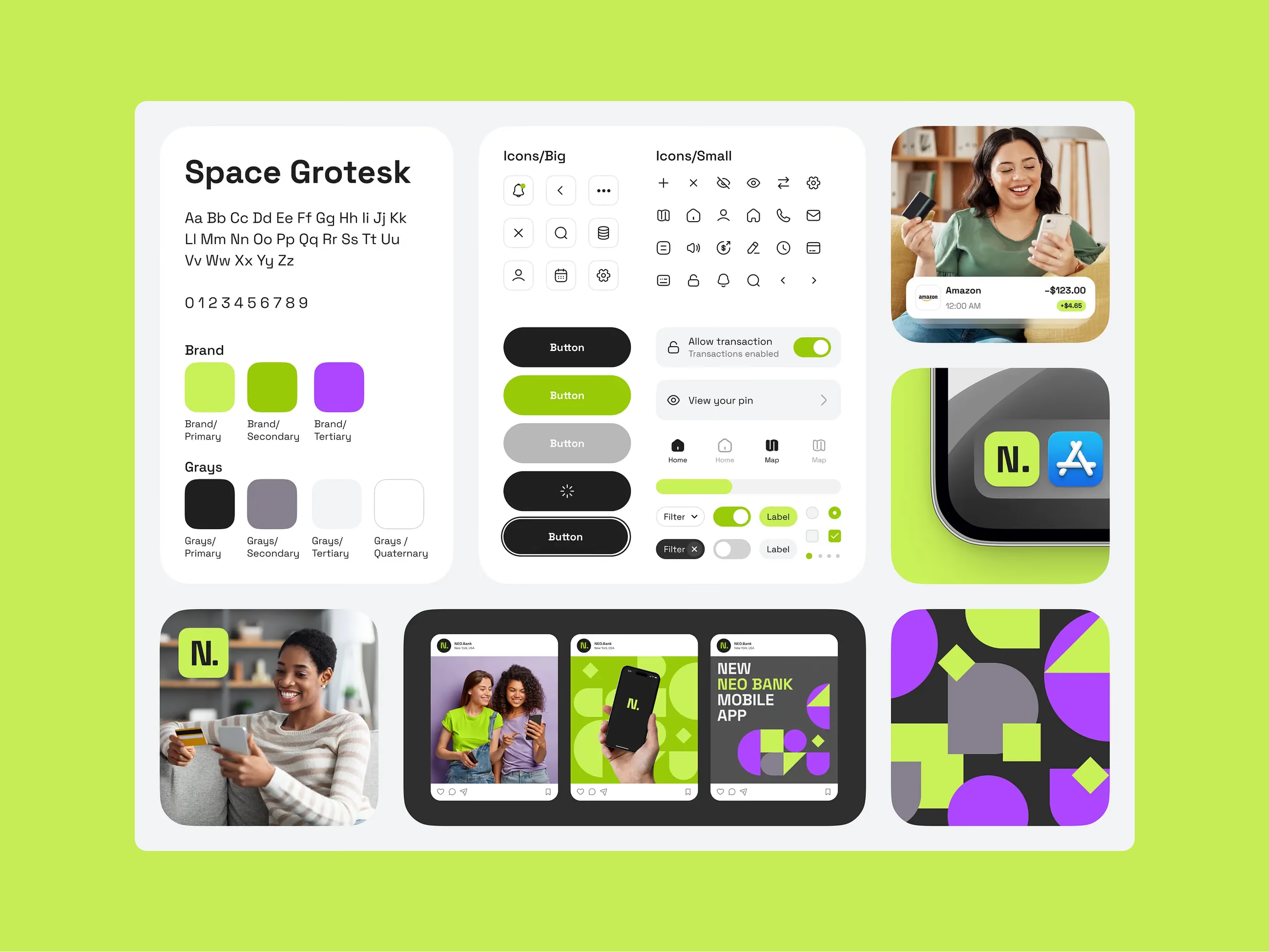
The tools got better. The process didn't.
Fixing the Design-Developer Handoff in 2026
If you've shipped software, you know the pattern. A designer hands off a polished Figma file. The developer builds it. The designer sees the result and sighs. The developer sighs back. Three rounds of "does this match the spec?" follow, and somehow a week disappears.
This is the design handoff problem. Better tools have not solved it. Poor communication and unclear requirements sit behind up to 30% of development delays. Design errors and review processes contribute to 68% of rework costs. Fixing a problem during design costs about $1. Fixing the same problem during development costs $5. Fixing it after ship costs $30.
We've worked on this across 400+ products, from SaaS platforms and fintech tools to enterprise dashboards and consumer apps. The teams that ship faster and with higher fidelity aren't using magic tools. They've changed how they think about handoff itself. Here's what actually works.
🤝 Losing weeks per quarter to design-development churn? Let's fix that →
Why Handoff Still Breaks
The first instinct is to blame tools. "We need better annotations." "Our tokens aren't synced." Sometimes that's true. Usually the root problem is deeper.
There are two structural gaps. The first is the spec gap: Figma files typically show the happy path but skip edge cases, error states, loading states, empty states, and responsive behavior. When engineers hit a case the design doesn't cover, they guess. The second is the feasibility gap: designers create interactions that engineers can't build as designed, either because of performance, framework limits, or accessibility constraints.
Both gaps come from the same source. Designers and developers use the same brief but optimize for different outcomes. Design thinks in hierarchy, motion, and micro-interaction. Engineering thinks in components, state, and maintainability. Both are right. The gap is that these mental models are rarely made explicit until something breaks.
The teams that solve this start with process, not tooling. Every fix below is a different mechanism for the same goal: making sure there's only one reasonable interpretation of what gets built.
Design in Components From Day One
The single highest-leverage change: make your design files use the same mental model as your codebase from the start.
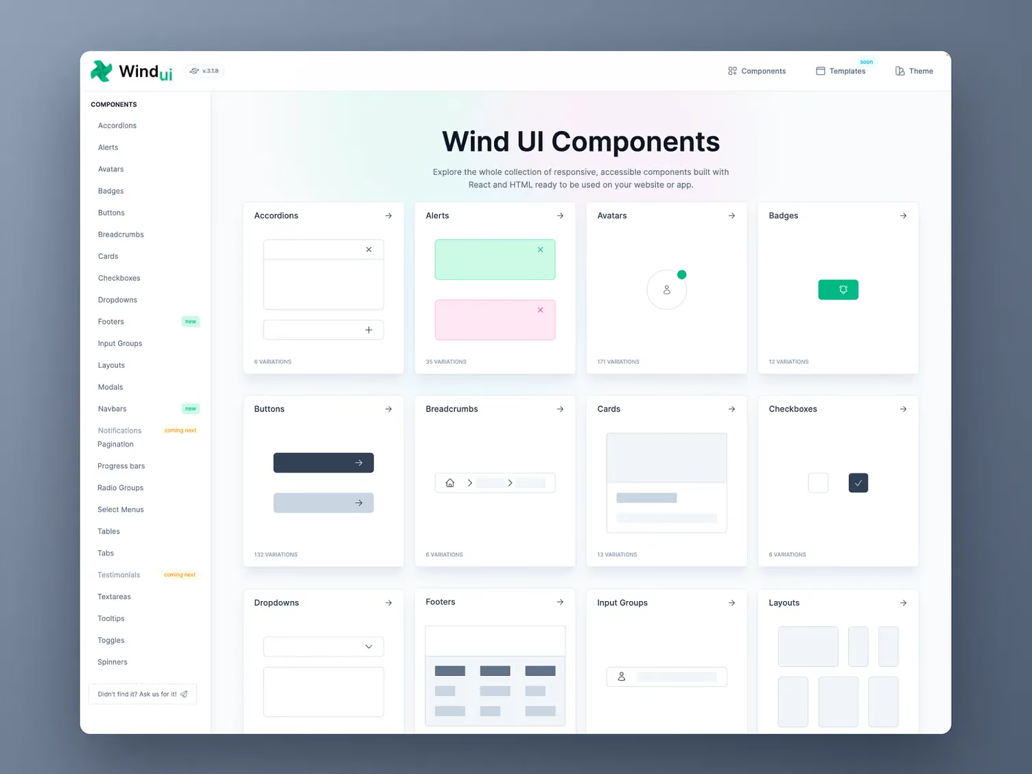
If engineering uses a component library, your design system should map to those components. Not "button style" and "button variant." Same names, same states, same hierarchy. Companies that adopted shared component libraries cut their handoff time by roughly 35%. Teams using component-based design systems have reported up to 70% faster development cycles compared to older methods.
Most teams say they do this. Very few actually do.
In practice it looks like this: before any new feature kicks off, a designer and developer spend 30 minutes together identifying which existing components will be used, which need modification, and which need to be built from scratch. That conversation happens in the design file and the code. If a component exists in code, it exists in Figma. If it doesn't exist in Figma, it shouldn't be in the code.
Linear, Vercel, and Notion are the reference examples people point to. What they share isn't a specific tool. It's that design and engineering share a component vocabulary from the beginning.
Define "Done" Before Development Starts
The most common handoff failure mode: a design that's 80% complete gets shipped to engineering because there's deadline pressure. The developer guesses on the missing 20%. The guesses are wrong.
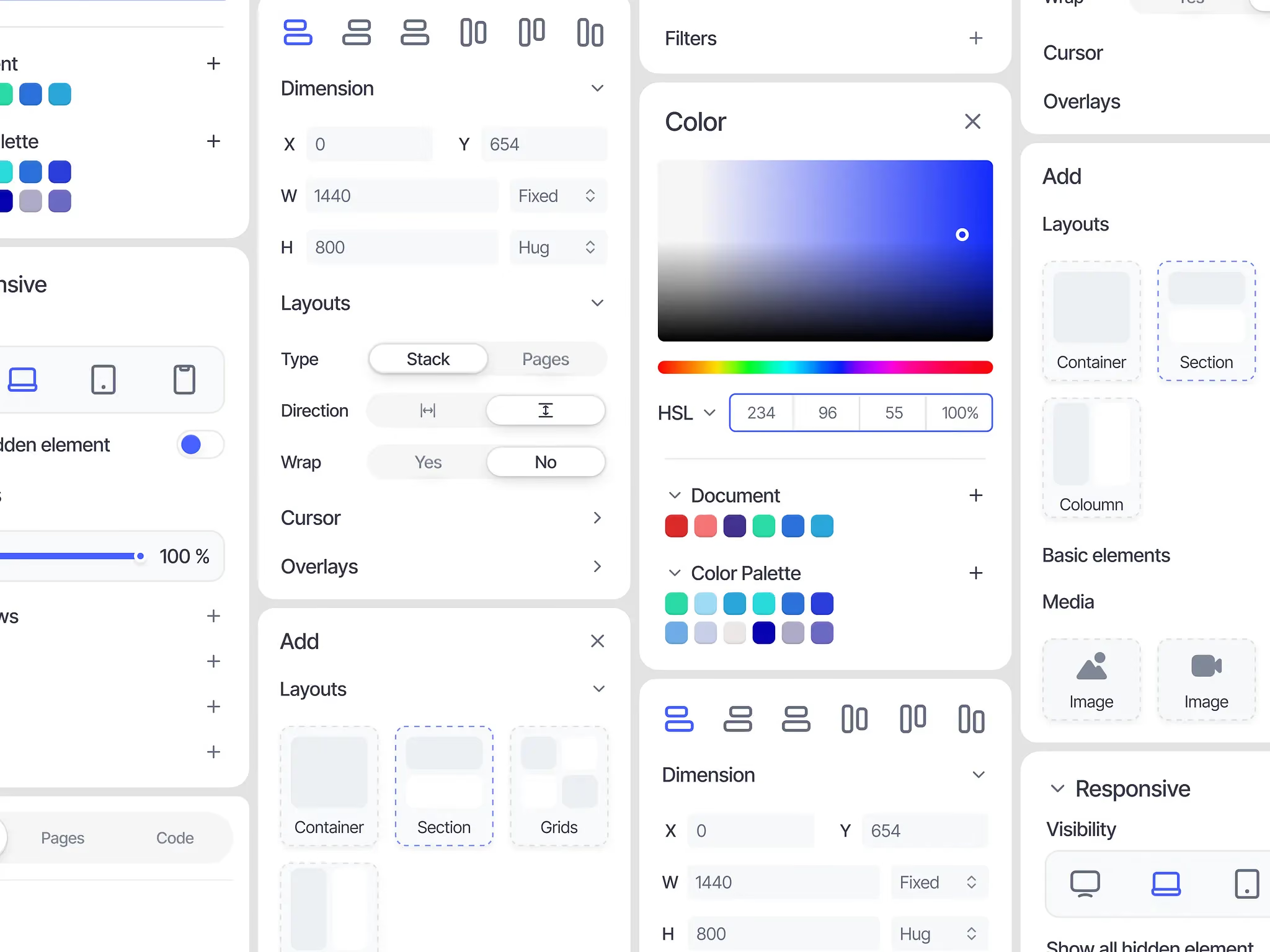
The fix is a checklist a design lead signs off on before any file crosses the wall. What ours covers:
- All interactive states defined (hover, active, disabled, loading, error, empty)
- Responsive breakpoints annotated at mobile, tablet, and desktop minimum
- Motion specs documented (what animates, how long, what easing)
- Edge cases covered (1 item, 1,000 items, no items)
- Real content, not lorem ipsum
- Accessibility notes: contrast ratios, focus states, screen reader intent
This isn't bureaucracy. Companies with formal assumption-testing practices reduce rework cycles by an average of 47% compared to peers without them. The checklist just surfaces the conversations that always happen anyway, earlier and cheaper.
Annotate for Behavior, Not Just Appearance
Beautiful Figma files don't tell a developer what they need to know. Spacing tokens, conditional logic, motion timing, these live in a different mental layer than visual design.
Three annotation habits that work.
Annotate what triggers a state, not just what it looks like. "On click, expand the row and load sub-items via API" is more useful than "expanded state, see component."
Use your actual token names. If your design system has a token called surface-primary, use that name in Figma, not "light gray background." Teams that use a shared design system with agreed token names spend around 30% less time in clarification.
Mark the unexpected. The things that look standard but aren't (a button that behaves differently on mobile, a scroll container with specific inertia) deserve explicit annotation. Developers build what they see. Annotate anything that should behave differently from expectations.
Annotated design files with states, edge cases, and interaction notes reduce clarification rounds by up to 40%. The quality of the annotation still depends on how well the designer understands what's being built, not on the tool.
Include Developers in Design Reviews
This is the highest-leverage change on this list, and the one most teams resist because "we don't have time."
Bring at least one developer into the weekly design review as an active participant, not a rubber-stamp at the end. Developers catch things that would cause implementation problems. Designers learn what's expensive to build and what's cheap. Both sides build the shared mental model that makes handoff smoother. When engineering and design work together from the start rather than serially, implementation errors drop by up to 60%.
A weekly 30-minute review where the designer presents work in progress and the developer asks questions is enough. The investment is small. The return is weeks of recovered development time per quarter.
The word "handoff" itself is part of the problem. It implies a relay race: design does their leg, passes the baton, engineering does theirs. That framing creates a seam, and seams are where information gets lost. The healthiest teams describe the relationship as a dance rather than a relay. Design leads when the problem is a design problem. Engineering leads when the problem is an implementation problem. There is no single handoff point because the collaboration is continuous.
Build the Smallest Design System That Works
The handoff problem gets dramatically worse as teams grow. With two designers and two developers, everyone knows the unwritten rules. With eight and twelve, the unwritten rules become the source of every bug and revision.
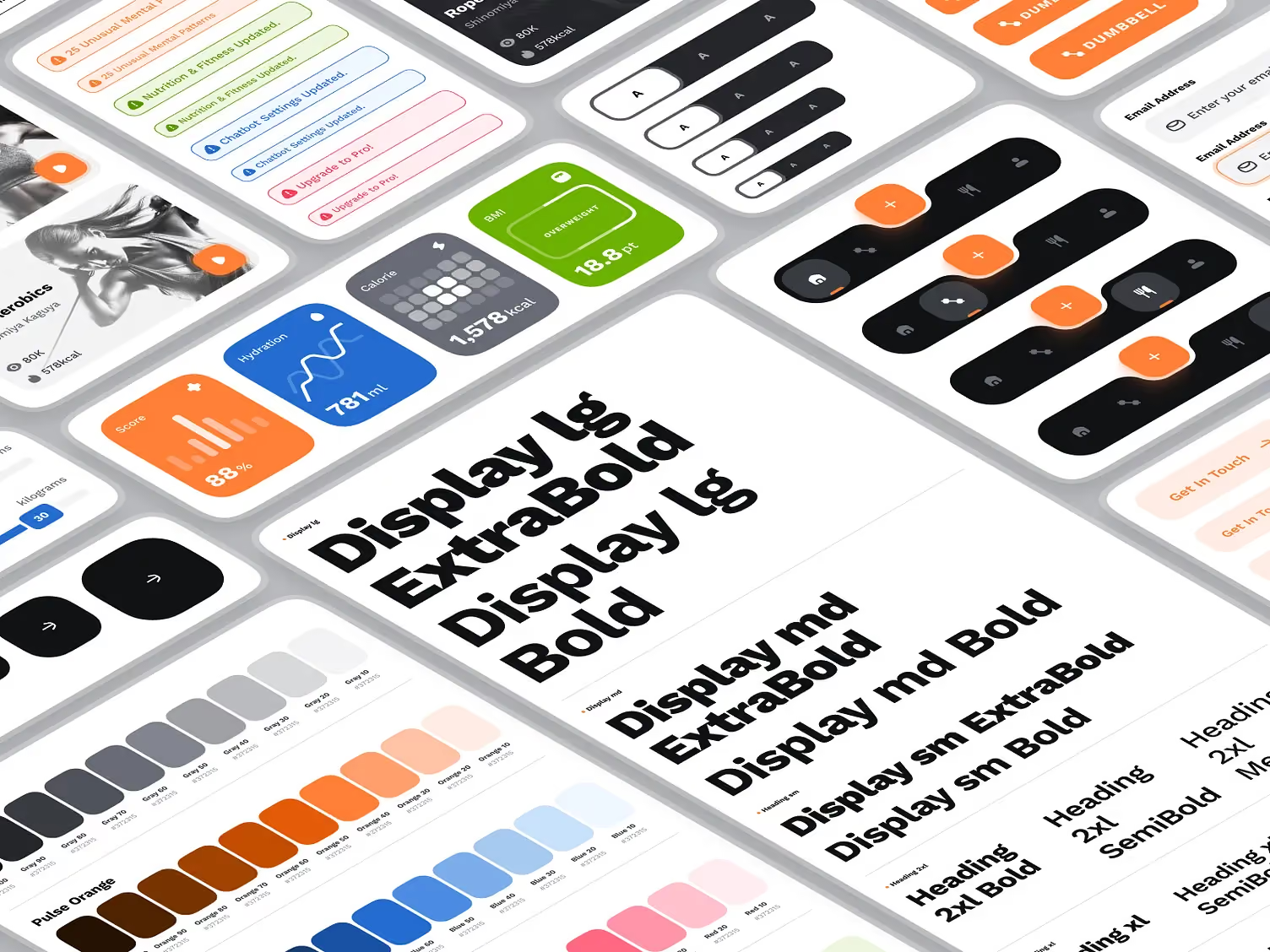
A design system, even a modest one, makes the unwritten rules explicit. The minimum viable version for a product team of 4-8 people covers:
- Color tokens with semantic names tied to brand and functional colors
- A typography scale, from display to caption
- A spacing system (8pt or 4pt grid) reflected in both design and code
- Core components (buttons, inputs, cards, navigation) with all states defined, built once in Figma and once in code
- Motion guidelines with durations and easing curves used across the product
This takes a few weeks to build and typically pays back within a month or two. If your team hasn't done this yet, it's the highest-leverage investment in your product development process.
New tools are also starting to help. The tooling shift we wrote about after Figma Config 2026 (Motion on the canvas, Code Layers rolling out, Dev Mode as a first-class inspection surface) removes some friction that used to be structural. But every one of those tools works better on top of a strong design system and a healthy process. Weak systems just produce inconsistent output faster.
Key Takeaways
- Handoff failures are mostly a process problem, not a tooling problem. Poor communication drives up to 30% of development delays. Design errors contribute to 68% of rework costs.
- Design files should use the same component names and hierarchy as the codebase from day one. Shared component systems cut handoff time by around 35% and drive up to 70% faster development cycles.
- A handoff checklist covering states, breakpoints, motion, and edge cases is a forcing function. Formal assumption-testing practices reduce rework cycles by 47%.
- Annotate for behavior and use real token names. This reduces clarification rounds by up to 40%. Shared token vocabulary alone cuts clarification time by around 30%.
- Developers in weekly design reviews is the highest-leverage change most teams skip. Early collaboration cuts implementation errors by up to 60%.
- A minimal design system (tokens, type scale, spacing, core components, motion) takes a few weeks and pays back within a month or two.
- New canvas tools help teams that have the process right. They expose teams that don't.
Want a design system and handoff process built to hold up under real shipping pressure?
Book a call with Orizon 🚀
FAQs
What is design handoff?
Design handoff is the process of transferring a completed design from the design team to the development team for implementation. It involves sharing Figma files, design specs, annotations, and assets so developers can build the product as designed. In healthy teams, handoff is a continuous conversation. In broken ones, it's a wall.
Why does design handoff fail so often?
Two structural reasons. The spec gap: design files often show the happy path but skip edge cases, error states, loading states, empty states, and responsive behavior. The feasibility gap: designers create interactions engineers can't build as designed. Both usually trace back to designers and developers not sharing a component vocabulary or joint review cadence.
What should a design handoff checklist include?
At minimum: all interactive states (hover, active, disabled, loading, error, empty), responsive breakpoints at mobile, tablet, and desktop, motion specs with duration and easing, edge cases (empty, overflow, error), real content instead of placeholder text, and accessibility notes including contrast ratios and focus states.
How does a design system reduce handoff friction?
A design system creates shared vocabulary: tokens, components, and patterns that both designers and developers reference. When both sides use the same names and the same building blocks, translation cost drops, guesswork drops, and revision cycles drop. Teams using shared design systems with agreed token names spend roughly 30% less time in clarification.
Should developers be involved in the design process?
Yes, from early iteration, not just at handoff. Developers identify implementation challenges, clarify technical constraints, and help designers make better-informed decisions. When engineering and design work together from the start, implementation errors drop by up to 60%.
How do you annotate a design for developers effectively?
Focus on behavior, not just appearance. Explain what triggers a state, not just what the state looks like. Use the actual token names from your design system, not descriptive labels. Explicitly mark anything that behaves differently from what a developer would reasonably assume from the visual alone.
How long does it take to build a minimum viable design system?
For a team of 4-8 people, a few weeks of focused work covers color tokens, a typography scale, a spacing system, core components with all states, and basic motion guidelines. It typically pays back within a month or two through reduced revision cycles.
How do you handle responsive design in handoff?
Annotate every major breakpoint. Mark which elements change behavior at each breakpoint, not just which elements reflow. Clarify whether components collapse, reorder, or hide at smaller sizes. Auto-layout with responsive constraints helps communicate intent, but it doesn't replace explicit notes for anything non-obvious.
What's the difference between design specs and design annotations?
Specs are the technical measurements: spacing, colors, typography, dimensions. Annotations explain the intent behind decisions: why a component behaves a certain way, what triggers an interaction, what happens in edge cases. Both are needed for a complete handoff.
Can Orizon help build or audit our design system?
Yes. We've built design systems and improved handoff processes for companies ranging from early-stage startups to publicly traded software companies. Reach us here.
Header image: Photo by Ronas IT | UI/UX Team – “Banking App UI Kit” (Dribbble Shot #25395077).

Keep Reading
More from Orizon

Let's Talk
Design done right and fast by
people you can trust.


%20(1).avif)




.svg)


.svg)