.avif)
Seven UX checks before you stretch your layouts or commit to a full redesign.
Your App Might Work on iPhone Duo. That Doesn't Mean It's Ready.
Your app opens. The buttons respond. Nothing obviously breaks.
That is a good start. It is not the same as a good iPhone Duo experience.
Apple says existing apps can run on iPhone Duo without recompiling, while newer SDKs improve screen usage and the behavior of standard controls. Your implementation still needs testing, but a new device does not automatically mean a complete rebuild.
The more useful question is this: when the available space changes, does your app become more useful, or just look different?
For product teams planning an iPhone Duo update, that is where a UX review should begin.
🚀 Planning your iPhone Duo update? Let's scope the redesign together →
Does your app need a full redesign?
Not necessarily. Start with the journeys people rely on, identify what no longer works well, and separate essential changes from improvements that make better use of the expanded layout.
An app may need a targeted navigation update. A complex workflow may benefit from a new list-and-detail experience. Some screens may need almost no design changes.
The goal is not to redesign everything. It is to understand what deserves attention before committing the roadmap.
1. Look beyond a closed/open pair
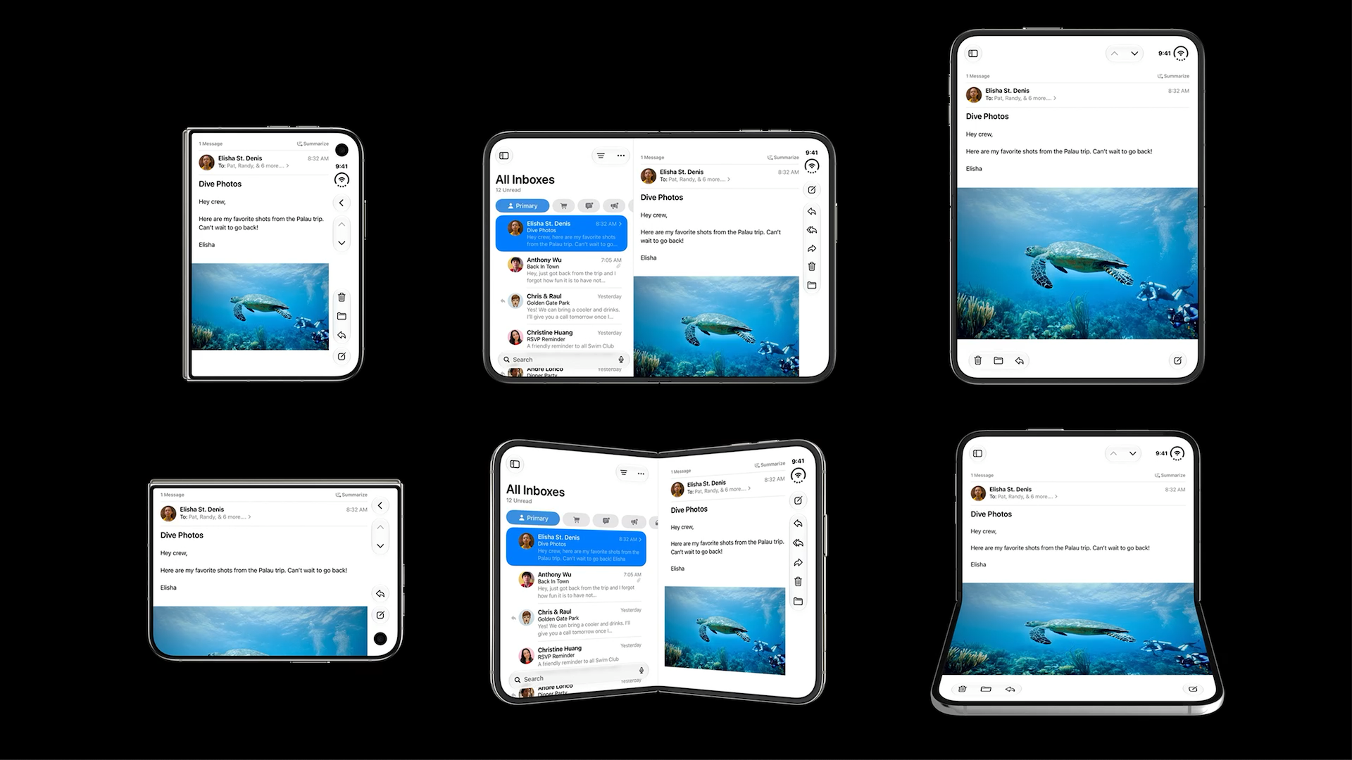
A compact mockup and a beautiful expanded mockup do not describe the whole experience. iPhone Duo supports side-by-side multitasking, so your app must also respond when it occupies only part of the display.
Look at the six configurations in the illustration. The email remains recognizable, but its relationship with the message list, controls, and image changes.
Treat those as examples of adaptation, not six separate products to design. Apple recommends using available space and size classes rather than creating a custom layout for every pose.
The review question: when space becomes tighter, what collapses first, and can the person still finish the task?
For a messaging app, the conversation should remain usable when the conversation list disappears. For a booking app, the selected option should not vanish just because a map needs less room.
2. Move the controls, not the meaning
Apple's Duo guidance describes side-positioned bars in landscape and a return to horizontal bars on the inner display in portrait. Navigation and actions can share a constrained region, making their grouping and priority important.
That is not permission to invent a different app structure for each configuration.
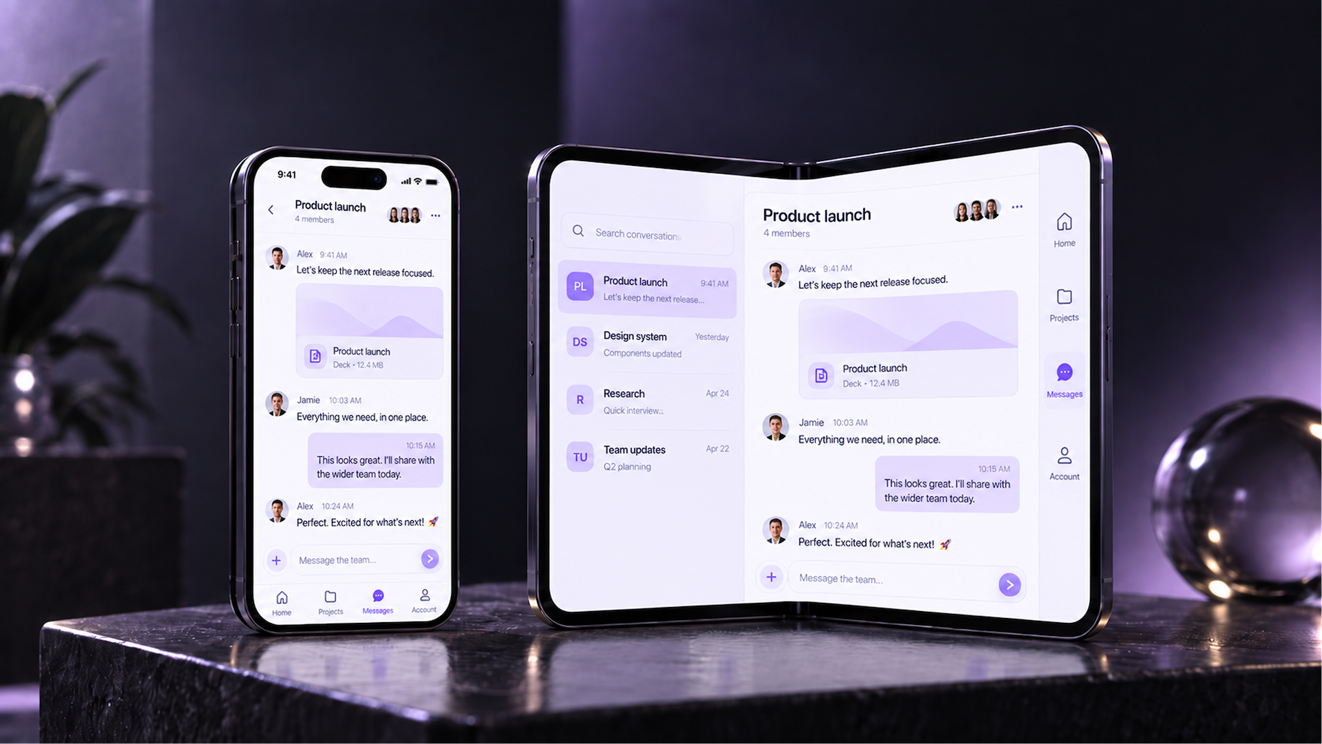
Suppose your app has Home, Projects, Messages, and Account. Keep those destinations recognizable as their placement changes.
A left-hand conversation list answers "Which conversation am I reading?" Main app navigation answers "Which part of the product am I in?" Reply, archive, and compose are actions within that experience.
Those are different jobs. Do not turn them into a single collection of unrelated icons.
The review question: can someone explain what each navigation area does without first learning a new interface?
3. Make the extra space earn its place
Imagine a travel app where people repeatedly alternate between a map and a shortlist. An expanded view could bring them together.
Or an AI workspace where the conversation and the document it produces live on different screens. More space could let someone discuss a change while seeing the result.
These are useful design hypotheses to prototype. A wider card with the same information is not the only option.
Start by asking which two pieces of information a person needs at the same time. Then check whether showing them together actually helps, rather than simply increasing density.
The review question: what can someone understand or accomplish more easily in the expanded view?
There should be a better answer than "see a larger version of the phone screen."

4. Treat the fold as a layout condition, not a permanent blank stripe
Apple's fold guidance distinguishes controls and grouped content from continuously scrolling articles and feeds. Some elements should move away from a partially folded region; that does not mean every screen needs an empty column through its center.
Safe areas also need attention. Opposite edges can have different insets, so equal padding everywhere is not a reliable assumption.
Review meaningful combinations. A confirmation button and its explanation should still feel connected. A dialog should not straddle an awkward region. An image should not lose its important subject through an unconsidered crop.
The review question: when elements move, do their relationships still make sense?
The best adaptation should look intentional, not like the interface is escaping the hardware.
🧭 Not sure which journeys to prioritize first? Book a scoping call with Orizon →
5. Protect the work already in progress
Take one realistic scenario: someone opens a conversation, writes half a reply, expands the available view, then returns to a narrower layout.
Our acceptance criteria would be simple: the conversation remains selected, the draft survives, and the person can continue without reconstructing the last few steps.
Apply the same exercise to a checkout, an unsaved document, a selected map location, or a media timeline.
This is a specification to design and test, not something a screenshot can prove.
The review question: what must remain unchanged even when the interface rearranges itself?
Document that alongside the layouts. Design should establish the expected behavior; engineering should verify it in the running app.
6. Review the less photogenic states
A presentation screen usually shows short labels, balanced content, and no keyboard. Your review should deliberately include the opposite.
Open the keyboard. Increase text size. Use a long conversation title. Show an empty list, a loading state, and an error that requires an action. Check screen-reader order and whether focus still reaches the right controls.
For a messaging app, inspect the composer, latest message, and conversation context together. For a form, inspect the active field, its error, and the next action.
The review question: does the hierarchy still work when the content is inconvenient?
These checks belong in the design brief, not in an informal request to engineering to "make it responsive."
7. Turn the review into a prioritized scope
A useful audit should leave the team with decisions, not just a longer list of screens:
- A task or control becomes unusable: resolve it as part of the readiness work.
- Extra space could improve an important journey: prototype the opportunity and prioritize it against product goals.
- A screen already works well: keep it unless there is a specific reason to change it.
This is how you avoid two unhelpful extremes: dismissing the update as simple resizing, or turning a device adaptation into an unnecessary product overhaul.
Estimate against the agreed journeys, shared components, transitions, and validation work. A screen count alone does not explain the scope.
What a useful iPhone Duo design handoff includes
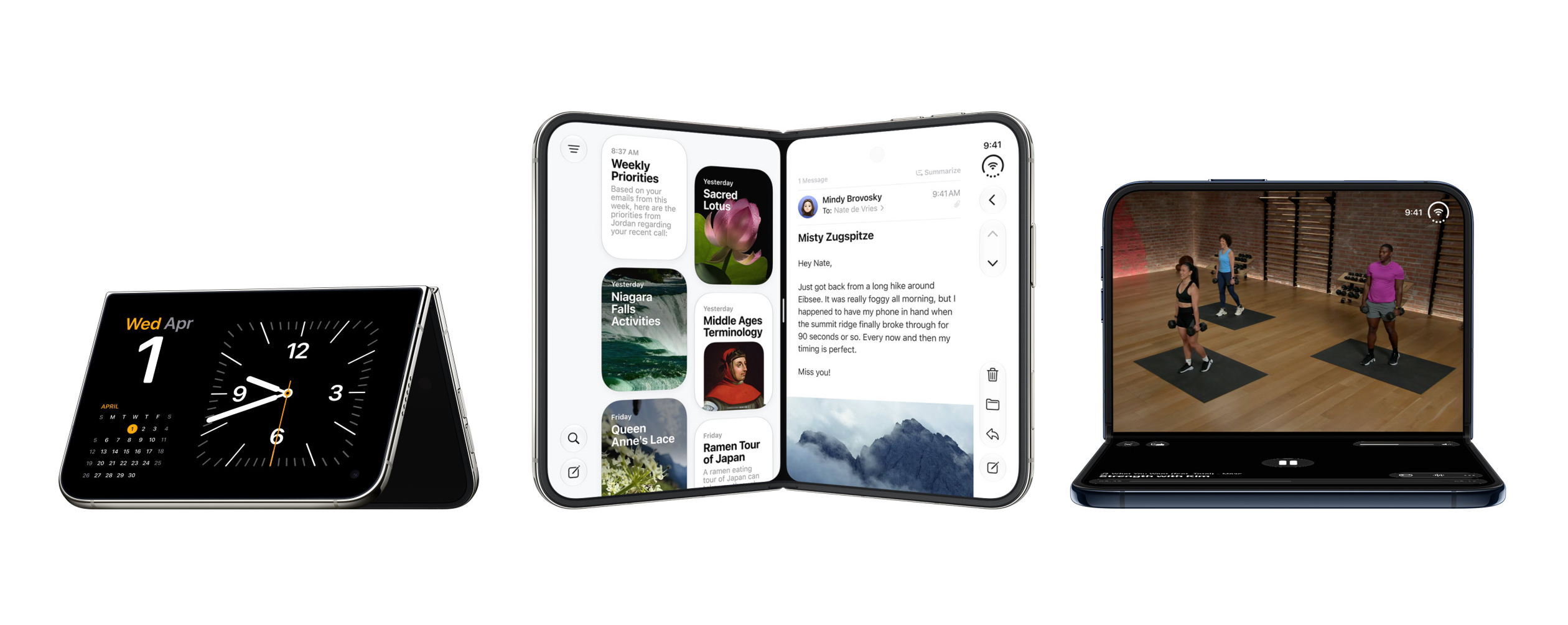
We would expect a prioritized review, representative compact and expanded flows, updated components, and clear rules for navigation, content visibility, and in-progress work.
The developer should understand when a column appears, where its content goes when it collapses, and which state must survive. The team should also know which behaviors rely on standard platform components and which require custom implementation.
A Figma prototype establishes the intended experience. It does not replace implementation testing.
At Orizon, our mobile app design work combines product flows with reusable UI systems and developer-facing documentation. An iPhone Duo adaptation applies that approach to the journeys that matter most in your existing product.
The goal is not more screens. It is a better experience across them.
Key Takeaways
- Existing iOS apps run on iPhone Duo without recompiling, but running is not the same as being ready.
- Adapt by size class, not by orientation. The inner display does not honor supported interface orientations for resizable apps.
- Navigation should stay recognizable across poses. Do not invent a different app structure for each configuration.
- The expanded view should earn its space by improving a real task, not by enlarging the phone screen.
- Treat the fold as a layout condition. Protect the relationships between elements, not every empty column.
- Preserve in-progress work (selections, drafts, timelines) across every transition. Design should specify this behavior, engineering should verify it.
- A useful review produces a prioritized scope, not a longer list of screens to redesign.
Ready to make the next screen size a product improvement?
Book a call with Orizon 🚀
FAQs
Should every screen be redesigned for iPhone Duo?
No. Review shared navigation and components first, then the journeys that depend on them. Change screens where there is a concrete usability issue or a worthwhile product improvement, rather than treating every existing screen as new design work.
Does having an iPad app help with iPhone Duo readiness?
Yes. Existing support for resizing and multitasking is a useful starting point. It is not a substitute for reviewing the Duo experience itself, especially the fold, the outer display, and side-by-side multitasking.
What should we send a design partner to get started?
Share your app link, the important journeys, your existing Figma files or design system, the framework your developers use, and your target release goals. That creates a more useful starting point than a request to "make every screen bigger."
What breaks first when an app runs on iPhone Duo without changes?
Usually navigation, dialogs, and layouts that assume a specific orientation. Anything that relies on device idiom checks, UIScreen.main, or supported interface orientations is worth auditing before anything else.
How long does an iPhone Duo redesign typically take?
It depends entirely on scope. A focused readiness pass on a few core journeys can take a few weeks. A broader redesign that reworks navigation, adds an expanded experience, and refreshes the design system takes longer. The audit is what tells you which one you are actually signing up for.
Should we start the design work from the compact or expanded view?
Neither in isolation. Start from the journey. Sketch how the same task works in the outer display, the inner display, and a multitasking pane, then use size classes to describe the transitions between them. Designing one pose in a vacuum is what creates the awkward jumps between configurations.
How much of our existing design system carries over?
Most of it, if the system already handles size classes and safe areas cleanly. Tokens, typography, and components usually survive. The parts that need work are navigation containers, list-and-detail patterns, and any component that assumes a fixed width.
Can Orizon help with iPhone Duo app design?
Yes. Orizon can run the prioritized review, redesign the priority journeys, and hand engineering a clear implementation direction across iPhone Duo, iPad, and iPad mini. Book a call to scope your project.

Keep Reading
More from Orizon

Let's talk
Design done right and fast by people you can trust.


%20(1).avif)




.svg)


.svg)