.avif)

Add faster than you cut, and you build a junk drawer.
The Best Feature in Your Product Is the One You Cut
Every team we work with has the same conversation eventually. They want to add something. A new dashboard widget. A new filter. A new mode. We ask what they'd remove to make room. Silence.
That silence is where product design dies.
Most teams treat their UI like a shelf you keep adding to. Every quarter, another button. Every release, another modal. Nobody argues against a feature that "might help someone." Six months later, users are asking where things are, onboarding takes 45 minutes, and the support team is running a scavenger hunt for basic actions.
At Orizon, we've redesigned products for Instantly, Fairmarkit, and Cambium, and the biggest wins almost always come from cutting, not adding. Not because we're minimalists. Because bloat is expensive in ways most teams don't measure.
👉 Feature creep eating your product? Let's talk about what to cut →
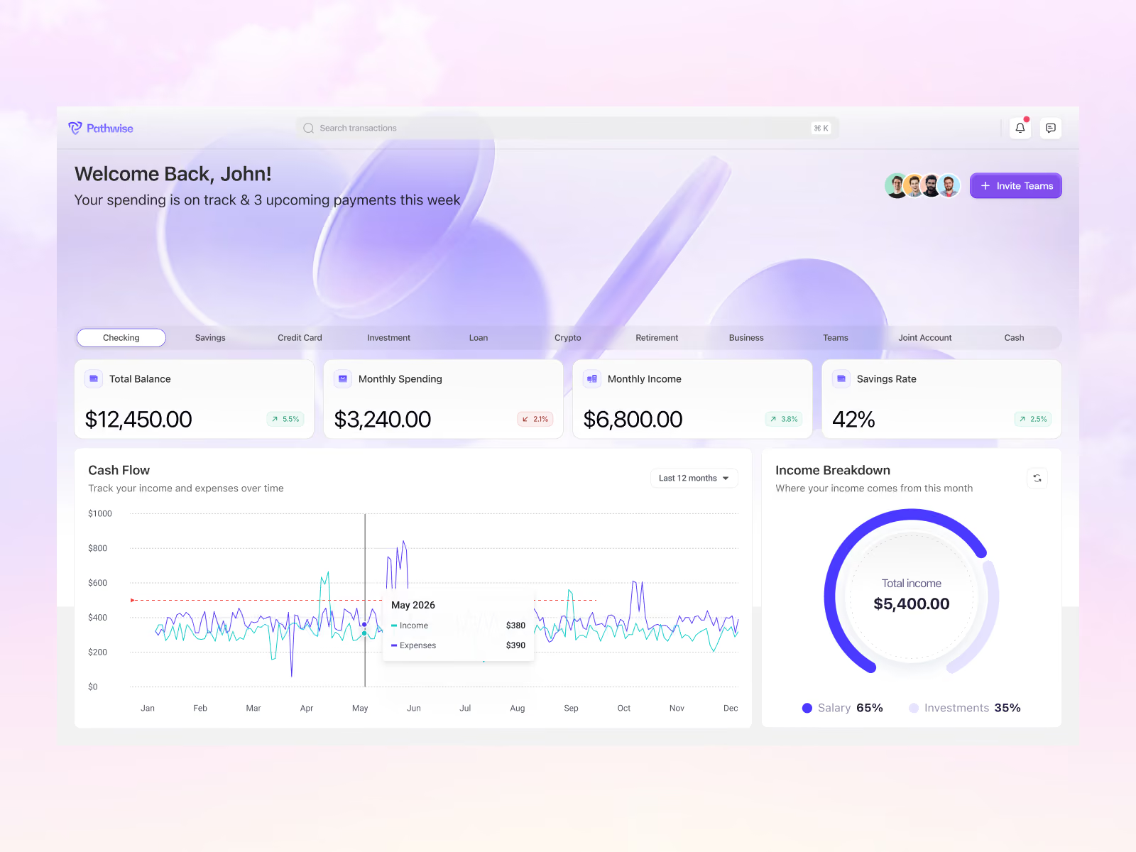
What UI Bloat Actually Costs You
There's a specific failure mode we see in almost every audit. It looks like this:
Users constantly ask where things are. Key actions are buried three clicks deep. Every screen feels crowded. New users take 30-plus minutes to figure out onboarding. Power users have built spreadsheets to track workarounds. Support tickets skew toward "how do I…" instead of "why doesn't this work."
That's a bloated product. And the cost shows up in four places.
Speed.
Hick's Law is real. Every extra option a user has to consider stretches the time it takes to make a decision. This effect compounds across a session. A dashboard with six sections and a dashboard with twenty don't take three times as long to navigate. They take much longer, because the user's mental model of "where things are" collapses somewhere around option eight.
Performance.
More components mean more code. More code means slower loads. Google's own research is still one of the cleanest data points here: 53% of mobile users leave a site if it takes longer than 3 seconds to load. Every widget you don't need is a chunk of JavaScript you're shipping for nothing. The math gets brutal fast, especially on mobile.
Trust.
This one gets underrated. In fintech, healthcare, defense, and enterprise SaaS, a cluttered UI reads as "this team doesn't know what matters." A prospect on a demo call sees twenty tabs and thinks: complexity. Complexity means risk. Risk means slower deals. Instantly bootstrapped to around $20M in revenue with an interface that is aggressively focused on the one job the product does. That's not a coincidence.
Team velocity.
Every element on the page is something your team has to test, update, ship a11y for, and maintain. Every dropdown is a translation cost. Every modal is a mobile edge case. The bloat isn't just a UX tax on users. It's an engineering tax on you.
What Minimal Actually Means
Minimal doesn't mean fewer features. This is where most teams get scared and back off.
Figma is not a minimal product. It has thousands of features. But the interface is minimal, because those features are organized so that 90% of them are hidden until you need them. The canvas is empty. The right panel adapts to what you selected. Everything else lives behind commands and shortcuts.
Slack is the same. Type "/" and hundreds of commands appear. The default interface is a message list, a sidebar, and a text input. That's it. The power is there. It just doesn't shout.
Notion, Linear, and Superhuman all work this way. Progressive disclosure is not a compromise. It's the highest form of interface design. You are hiding nothing. You are respecting the user's attention.
The teams that get this right ship interfaces that look empty and feel unstoppable. The teams that don't ship dashboards that look expensive and feel exhausting.
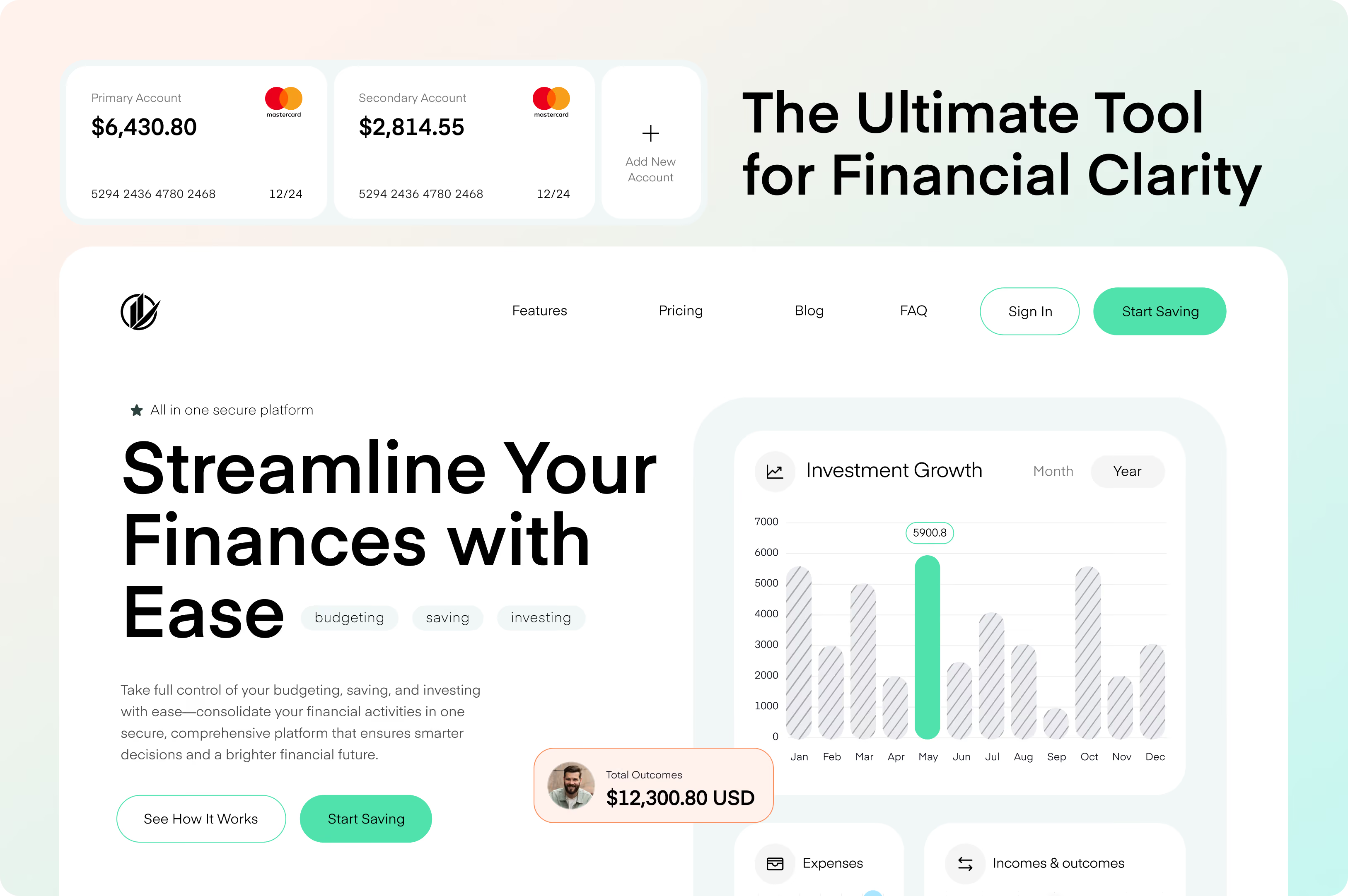
How to Actually Cut
Five moves that separate clean redesigns from cosmetic ones:
- Start with intents, not features. What are users hiring your product to do? For most analytics tools we've worked on, this collapses to three or four core jobs. Anything that doesn't serve one is a candidate for progressive disclosure or removal.
- Pull the usage data before the redesign meeting. Most "we can't remove this, someone uses it" arguments die the moment analytics show 2% of users touched the feature in the last 90 days, and none of them are paying. Data is a shortcut through internal politics.
- Design in layers. First layer handles the 80% case in plain view. Second layer holds power features behind a command palette, right-click, or shortcut. Third layer lives in docs. The mistake is stuffing everything into layer one for "power users." They're the first to appreciate a cleaner interface.
- Enforce hierarchy visually. Primary action gets weight, contrast, and placement. Secondary gets less. Tertiary lives in an overflow menu. Three equally weighted buttons is a screen with no primary action, which forces the user to make a decision your design should have made.
- Trade every added feature for a removed one. Basecamp's discipline, and the only long-term defense against bloat. The surface always grows. Feature discipline is the only fix.
The Move That Separates Good Products From Bloated Ones
Most teams treat "keep it" as the default and require justification to cut. Reverse that. Make "cut it" the default and require justification to keep.
That single reframing is what separates products that stay usable at scale from products that become unusable at year three. It's cultural, not tactical. But once a team internalizes it, the interface fixes itself over time instead of getting worse.
The best interface is the one your users don't notice, because they're too busy getting the thing done. If they're commenting on your UI, it's in the way.
Key Takeaways
- Bloat is the default state of any product without active editing discipline. The surface grows every quarter unless someone is paid to say no.
- UI bloat costs you in four measurable places: speed of decisions (Hick's Law), performance (53% of mobile users leave after 3 seconds, per Google), trust, and team velocity.
- Minimal doesn't mean fewer features. It means fewer things visible at once. Figma, Slack, Linear, and Notion all have massive feature sets and minimal interfaces.
- Progressive disclosure is the highest form of interface design. Hide power. Reveal it on demand.
- Start with user intents, not feature lists. What is the user hiring your product to do? Design around those jobs.
- Pull usage data before the redesign meeting. Data ends 90% of the "someone uses this" arguments.
- Reverse the default: require justification to keep, not to cut.
Ready to fix a product that has more surface than value?
Book a call with Orizon 🚀
FAQs
What is UI bloat?
UI bloat is when your interface has more elements than users need to do the job they came for. Signs include buried key actions, crowded screens, long onboarding, and users asking "where is X" as a routine question. It's usually the result of adding features without removing any.
Isn't minimalism just hiding features?
No. Minimalism in interface design means organizing features by likelihood of use, then progressively revealing them. Figma has thousands of features. Its interface is minimal because 90% of them are one command palette or right panel away. The power is there, it just isn't in your face.
How do I know if my product has UI bloat?
Watch three signals. Support tickets skewing toward "how do I" instead of "why doesn't this work." Onboarding times climbing past 30 minutes. Users asking where basic actions live. If any of those are happening, you have bloat.
Won't cutting features make users angry?
Usually not. The Orizon redesigns that cut features aggressively find that users almost never notice removed features. They notice how fast they got the task done. The exception is power users on removed workflows, which is why analytics and interviews matter before you cut.
How do I get stakeholder buy-in for removing features?
Two things work: usage data showing how little a feature is used, and a redesign that clearly makes the remaining features easier to find and use. Stakeholders don't fight for a feature. They fight for the users they think need it. Show that removing something benefits those users and the debate ends.
What's the difference between minimal and limited?
Limited means the product can't do the thing. Minimal means the product can do the thing but the interface doesn't shout about it. Slack can do hundreds of things. It looks like a chat app. That's minimal, not limited.
How does progressive disclosure work in practice?
Design in layers. The first layer handles the 80% case in plain view. The second layer holds power features behind a command palette, right-click menu, or settings screen. The third layer handles edge cases and lives in docs. Users graduate to deeper layers as they need to.
Which products get this right in 2026?
Linear, Figma, Notion, Superhuman, Arc, and Slack are all reference points. Each has a massive feature surface hidden behind a minimal, focused interface. Studying how they surface secondary actions is one of the best free design educations available.
Does Orizon do UI simplification audits?
Yes. Product audits and redesigns are a core part of our work with clients like Instantly, Fairmarkit, Cambium, and others. If your product has grown beyond the interface it was designed for, get in touch.
Where should I start if my product is already bloated?
Pull usage data on every feature. Rank them by monthly active use. Map the top 5 to core user intents. Anything not serving those intents becomes a candidate for progressive disclosure or removal. Then design the redesign around what stayed.

Keep Reading
More from Orizon

Let's Talk
Design done right and fast by
people you can trust.


%20(1).avif)




.svg)


.svg)