.avif)
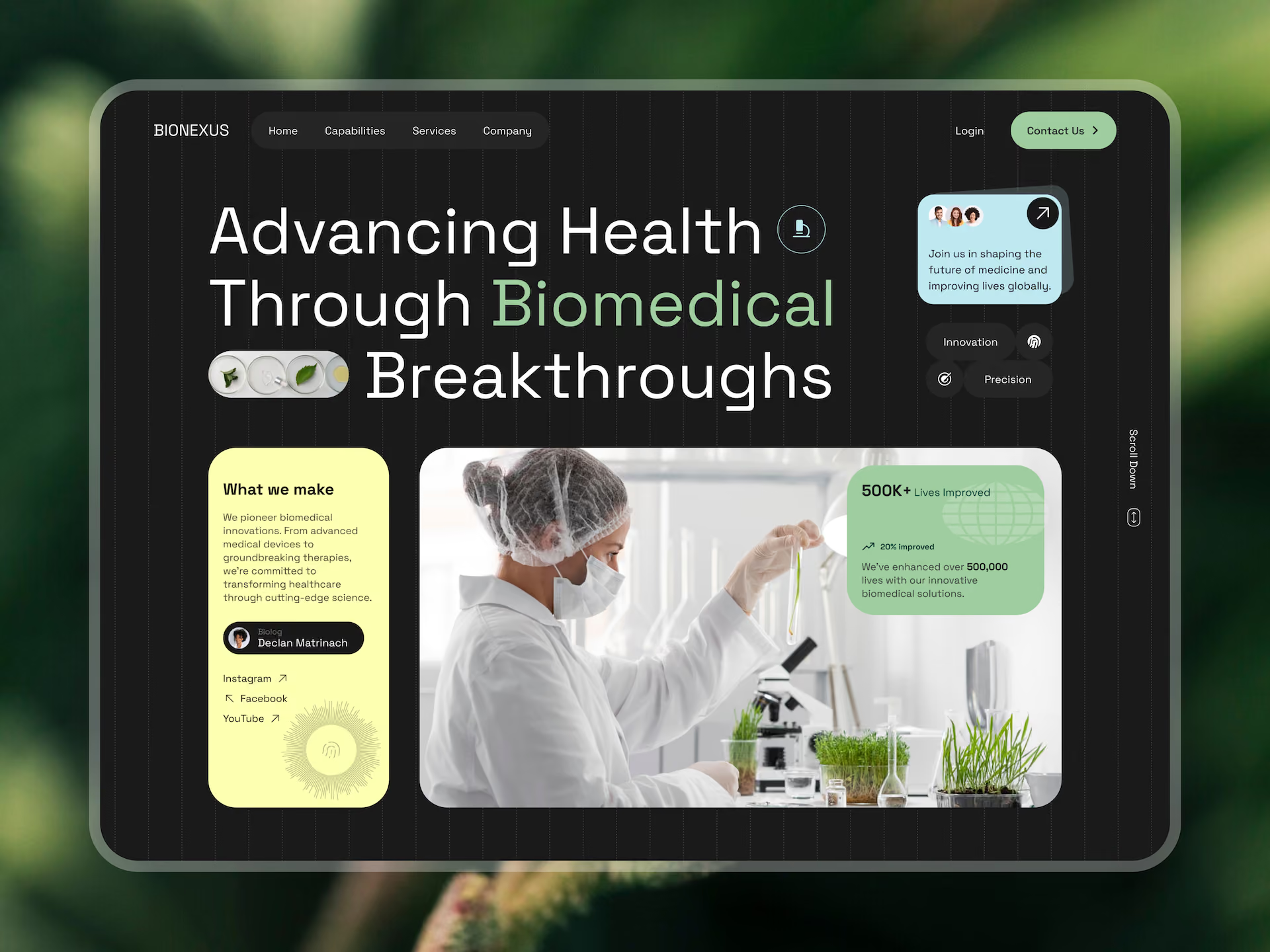
Trust in healthcare isn't a banner in the footer. It's a hundred small design decisions.
Healthcare UX Design: Building Interfaces Clinicians and Patients Actually Trust
Most healthcare software is designed like nobody has to use it. That's the only explanation for how many EMRs still bury critical actions three menus deep, or how many patient portals surface a red-flagged lab result with zero context.
Healthcare UX is one of the few product categories where bad design has direct consequences. Missed medications. Delayed diagnoses. Clinicians burning out because charting takes longer than actual care. It's also one of the categories where "good enough" isn't. We've worked on healthcare products with Vivodyne, Kernel, Canopy Digital, Twelve AI, and Happy, and the pattern is consistent. The teams that treat UX as a compliance checkbox lose users. The teams that treat it as core infrastructure win them.
Here's what actually separates the interfaces people trust from the ones they tolerate.
🩺 Building a healthcare product? Work with the team behind Vivodyne, Kernel, and Canopy Digital →
Healthcare UX Isn't Consumer UX with More Rules
Most product design optimizes for engagement. Healthcare has to optimize for accuracy, speed, and safety, often in the same screen. That changes everything about how you make design decisions.
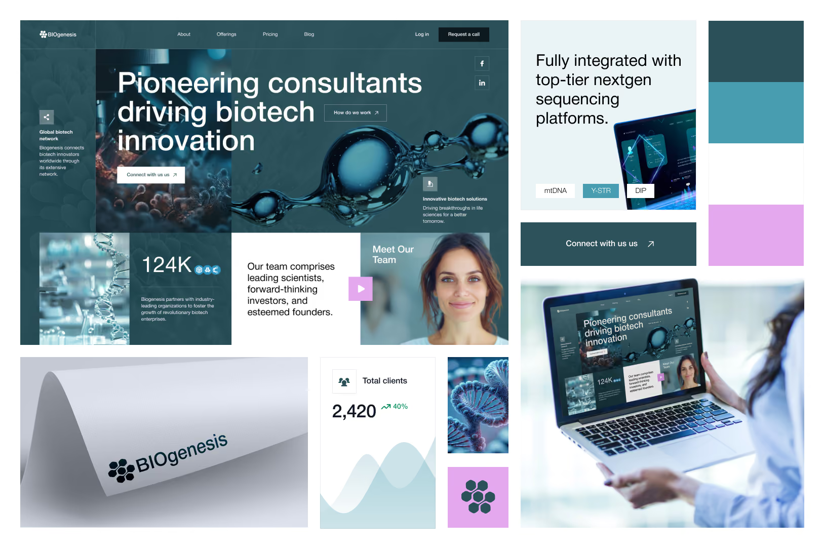
The users span extremes
A hospital EMR is used by a 28-year-old NP who grew up on smartphones and a 62-year-old attending who trained on paper. A patient portal serves a health-literate professional managing their own care and a first-time user navigating from the ER waiting room. That range forces harder tradeoffs than most consumer apps ever face.
Compliance shapes the design, not the other way around
HIPAA, FDA guidance on software as a medical device, WCAG 2.1 AA, regional data rules. These aren't post-design layers. They shape what information can be shown, how consent flows work, what audit trails need to surface. A team that treats compliance as a review-stage problem creates friction for engineering and risks rework at the worst possible moment.
The cost of an error is not a churn number
Error prevention beats error recovery every time. Confirmation for irreversible actions. Clear hierarchy separating primary and secondary paths. Never rely on color alone to communicate status. These aren't design guidelines. In clinical products, they're the difference between a safe interaction and a dangerous one.
Designing for Clinicians: Speed, Clarity, Cognitive Load
Clinicians are power users working under load. They're interrupted constantly, operating with gloves on, sometimes in poor lighting. Design that treats them like consumer users fails immediately.
.avif)
Reduce clicks, not features
The most common mistake in clinical UX is confusing simplicity with hiding functionality. Clinicians need access to a lot of information. The job isn't to strip it out. It's to make the critical information immediately visible and put everything else one logical step away. Progressive disclosure is the right pattern. Flattening everything onto one screen in the name of "clean design" usually makes it worse.
Design for interruption
Clinical workflows are rarely linear. A nurse mid-administration gets pulled away, comes back five minutes later, needs to know exactly where she left off. Persist in-progress work. Show clear state indicators. If someone returns to a half-filled form, they should never have to guess what they've already entered.
Match the language they actually use
Don't force clinicians to translate between your interface and their practice. If they say "PRN," your UI should too. If they call it a "problem list," don't call it a "diagnosis history." This requires real observation, not assumptions. Ten hours of contextual inquiry saves months of avoidable rework.
Designing for Patients: Plain Language and Reduced Uncertainty
Patient-facing interfaces carry different weight. Someone reading lab results, scheduling a follow-up, or reviewing a care plan is often anxious. That's not the audience for a complex UI.
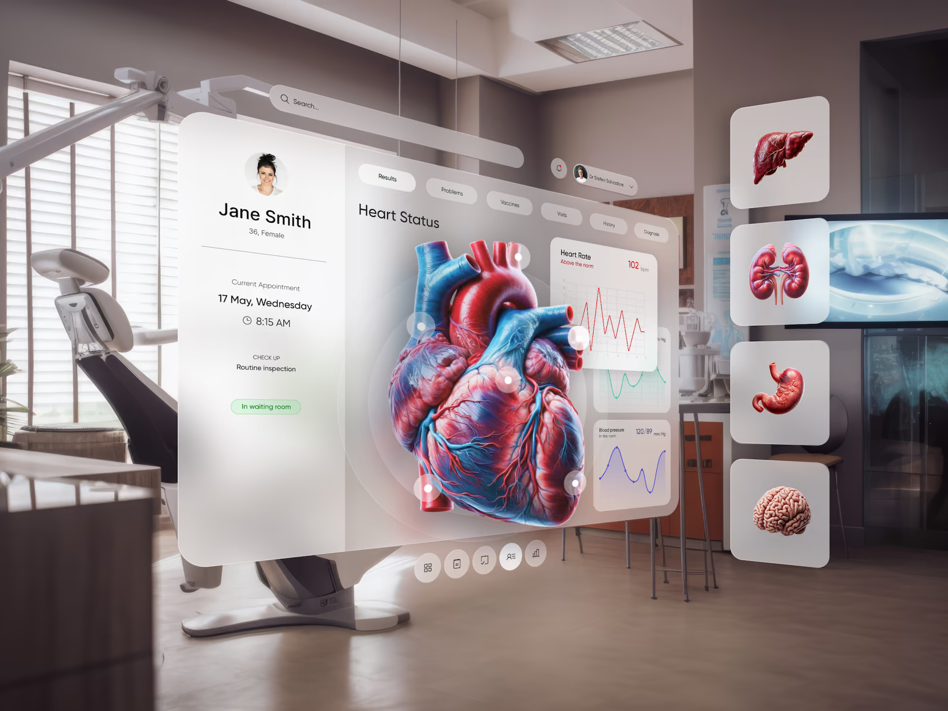
Plain language isn't dumbing down
"Serum creatinine elevated" means something to a nephrologist. To a patient, it either means nothing or triggers unnecessary panic. "Your kidney function test came back slightly high. Your doctor will review this with you at your next visit" is more useful, more accurate to the moment, and less scary. Health literacy guidance points to a 6th to 8th grade reading level for patient-facing content. That's a reasonable target.
Answer the next question before they ask it
Patients on a portal are almost always uncertain. About what a result means. What happens next. Whether their message was received. Good healthcare UX answers those questions proactively. "Your appointment is confirmed for Tuesday, September 8 at 2:00 PM with Dr. Patel at the downtown clinic" is a different product than "Appointment booked."
Accessibility is a baseline
A meaningful portion of healthcare users have visual, motor, or cognitive impairments. WCAG 2.1 AA isn't a stretch goal in healthcare. It's the floor. Sufficient contrast, keyboard navigability, screen reader support, large enough touch targets, and never conveying meaning through color alone.
Trust Is a Design Decision, Not a Marketing One
Trust in healthcare interfaces gets built through hundreds of small design choices, not through a "your privacy matters" banner in the footer.
Put privacy information where the sensitive interaction actually happens, not buried in a settings page. Keep visual language consistent across every screen and state, because inconsistency reads as unreliability. When something goes wrong, write error messages that are specific and honest. "We couldn't save your changes. Please check your connection and try again. Your progress is saved" is a trust signal. "An error occurred" is not.
A well-maintained design system does most of this work in the background. It's the infrastructure that makes every screen consistent, every compliance review cleaner, and every developer handoff faster. For healthcare products, that's not a nice-to-have. Learn more about how we approach UX design for regulated products.
Key Takeaways
- Healthcare UX has to optimize for accuracy, speed, and safety, often on the same screen. Consumer UX principles don't transfer cleanly.
- Compliance shapes the design from day one. Treating HIPAA, FDA, and WCAG as post-design layers creates rework and risk.
- Clinicians need progressive disclosure, not hidden features. Reduce clicks, don't cut functionality.
- Design for interruption. Clinical workflows are rarely linear, and state persistence is a safety feature.
- Patient interfaces should use plain language at a 6th to 8th grade reading level and reduce uncertainty at every step.
- Accessibility is a baseline in healthcare, not a feature. WCAG 2.1 AA is the floor.
- Trust is built through consistency, honest error states, and privacy transparency at the point of interaction, not through marketing copy.
Ready to ship healthcare UX clinicians and patients actually trust?
Book a call with Orizon 🚀
FAQs
What makes healthcare UX different from standard product UX?
Healthcare UX operates under stricter regulatory constraints (HIPAA, FDA, WCAG), higher-stakes decision environments, and a user base that spans clinical experts and patients with varying health literacy. The cost of a design error is higher, so research, error prevention, and accessibility get more rigorous attention than in most consumer products.
How do you design for clinicians and patients in the same product?
Most healthcare products serve distinct groups with different needs, so the answer is usually separate interfaces or clearly separated user flows. Clinicians need speed, density, and clinical terminology. Patients need plain language and clarity about what happens next. A shared design system keeps things consistent while the UX layer adapts to each audience.
What's the biggest mistake teams make with clinical UX?
Confusing simplicity with hiding functionality. Clinicians need a lot of information available. The right move is progressive disclosure, not stripping features out. Flattening everything onto one screen makes clinical workflows slower, not faster.
How important is accessibility in healthcare UX?
It's foundational. A meaningful portion of healthcare users have visual, motor, or cognitive impairments. WCAG 2.1 AA is a legal baseline in many jurisdictions and a practical necessity for serving a broad patient population. Design it in from the start, not as a retrofit.
What's the right reading level for patient-facing content?
Health literacy guidance generally points to a 6th to 8th grade reading level. That means plain language, short sentences, and context around any medical terminology that has to appear on screen.
How does a design system help a healthcare product specifically?
Design systems enforce consistency, which reads as reliability. They also make compliance reviews cleaner, speed up developer handoff, and reduce the risk of small inconsistencies introducing confusion or error in clinical workflows.
When should a healthcare team bring in an external design partner?
Common moments: an interface needs a full overhaul before a funding round, a patient portal has to ship on a tight window, a clinical tool is failing usability review, or internal design can't keep pace with the roadmap. An embedded design pod moves faster and with more depth than ramping a new hire.
Does Orizon work with regulated healthcare products?
Yes. We've designed for Vivodyne, Kernel, Canopy Digital, Twelve AI, Happy, and other companies working in biotech and clinical software. If you're building a healthcare product and want to talk about how we could help, get in touch.

Keep Reading
More from Orizon

Let's Talk
Design done right and fast by
people you can trust.


%20(1).avif)




.svg)


.svg)