.avif)
.avif)
Clear beats clever. Every time.
The 5-Second Rule: Landing Pages That Convert in 2026
Users form an aesthetic judgment about a page in 50 milliseconds. The average visitor stays 10 to 20 seconds before leaving. Somewhere in that window, they decide whether your product is worth their time.
Most landing pages lose the decision. Cross-industry data puts the median conversion rate at 2.35%. The top 25% hit 5.31%. The top 10% hit 11.45% and up. The difference isn't budget, it isn't A/B testing volume, and it definitely isn't clever copy. It's clarity, hierarchy, speed, and trust, delivered in the first few seconds.
We've designed landing pages for companies including TELUS, Red Bull, Netflix, and 400+ others, and the ones that convert follow the same principles. Here's what actually works in 2026.
🎯 Ready to turn your traffic into revenue? Let's talk →
The 5-Second Test Is Not a Metaphor
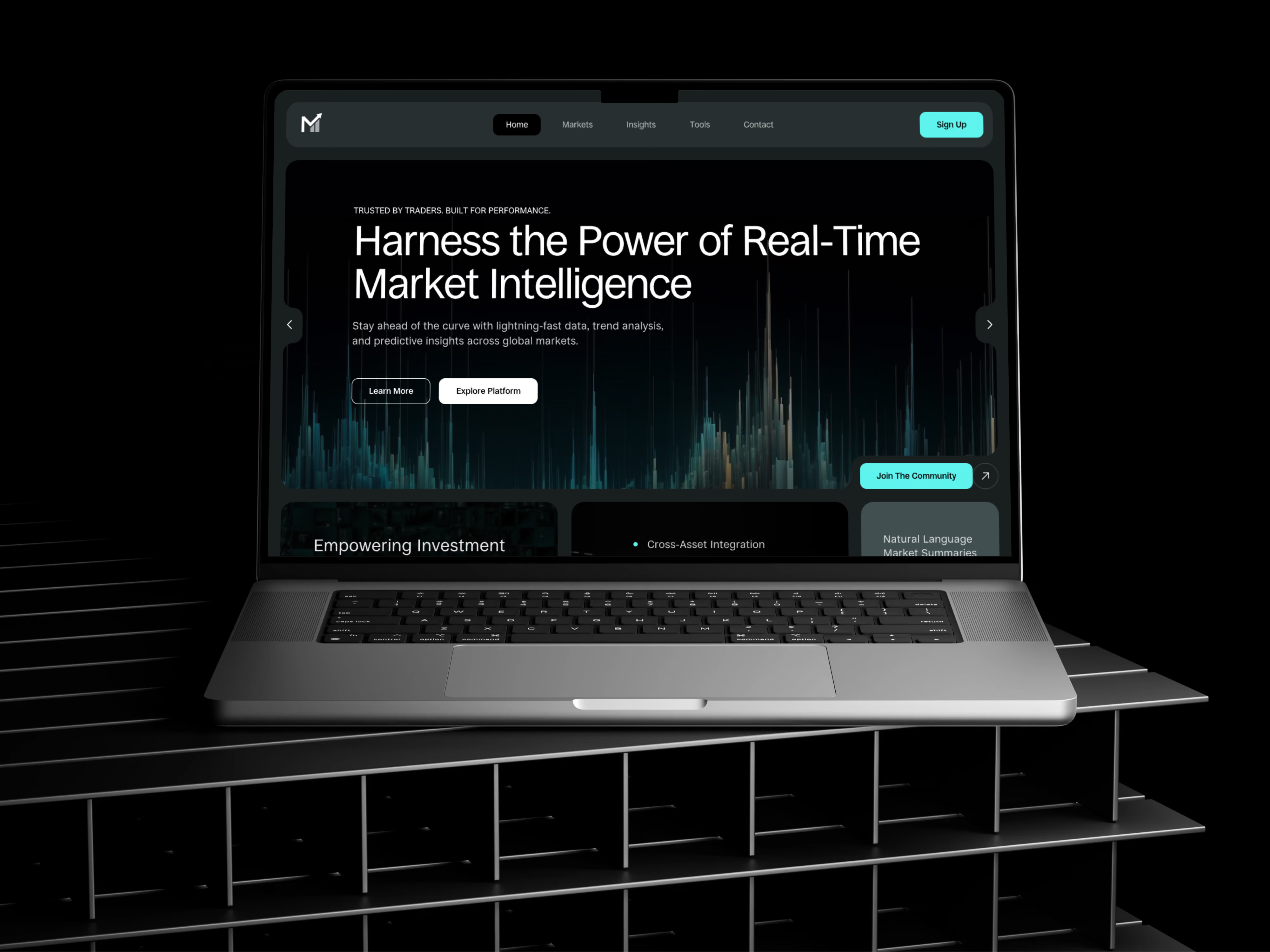
The 5-second test is a real UX research method, validated in academic usability studies. Show someone your landing page for exactly five seconds. Hide it. Ask what the product does, who it's for, and why it matters. If they can't answer, you've lost.
Three things must be visible above the fold within that window.
What the product does. Not "we empower teams to collaborate dynamically." Try "Project management for remote teams." A clear headline beats a clever one every time.
Who it's for. "For developers" or "For early-stage founders" is stronger than "For everyone." If a visitor can't tell whether the product is for them, they leave.
Why it matters. State the benefit, not the feature. "Ship code 2x faster" beats "Integrated CI/CD pipeline."
Users are running your page against ten other tabs. Cognitive load is the enemy.
Hierarchy Is the Whole Job
The most common mistake we see on landing pages is treating every element as equally important. When everything is emphasized, nothing is.
A landing page that converts has a visual hierarchy that mirrors how visitors actually evaluate a product: What is it, is it for me, can I trust it, how does it work. Every design decision should serve that order.
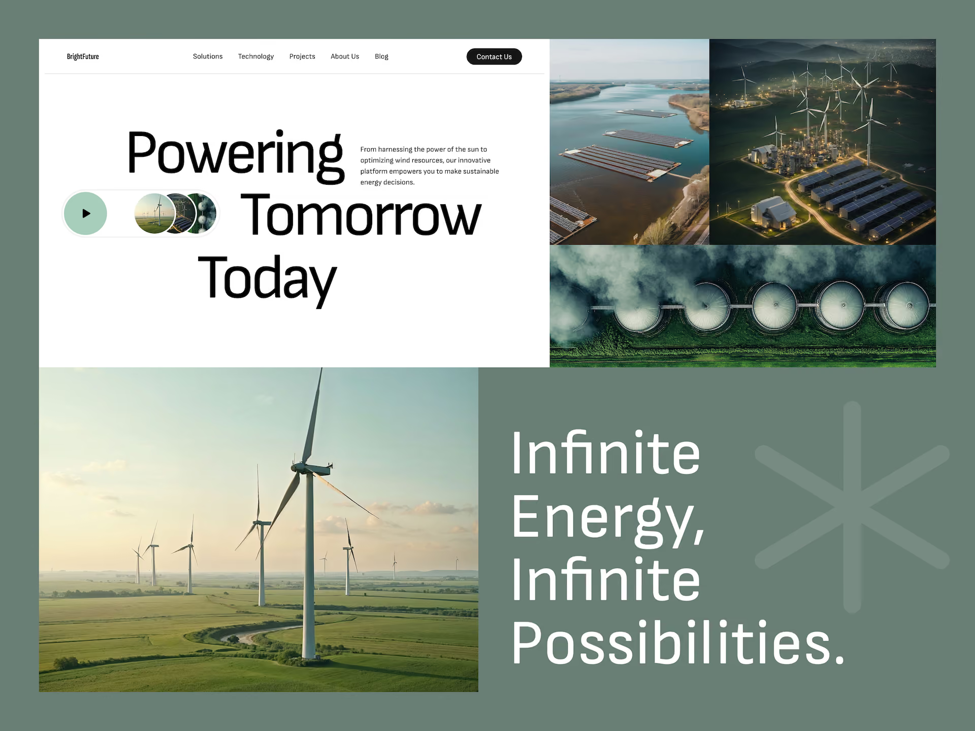
That means the headline is the largest, highest-contrast thing on the page. The subheadline clarifies. The primary CTA is visually distinct and unmissable. Social proof appears near the top when it's strong, further down when you're still building it. Feature details come last, scannable, below the fold.
The fold is not dead. Users only scroll when the above-the-fold content gives them a reason to. Waste that real estate on a stock photo of someone laughing at a salad, and you're done before they've read a word.
Speed Is a Feature, Not an Optimization
The performance data is unambiguous. A 1-second delay in load time drops conversions by 7%. Sites that load in 1 second have conversion rates 3x higher than sites that load in 5 seconds for lead-gen products, and 2.5x higher for e-commerce. Bounce probability rises 32% as load time goes from 1 to 3 seconds, and 90% from 1 to 5 seconds. 53% of mobile users abandon a site that takes more than 3 seconds to load.
None of this is new. It's just consistently ignored.
What actually helps: lazy-load images below the fold, compress aggressively (WebP, under 200KB per image), minimize JavaScript, and serve assets from a CDN. Every third-party script is a delay tax. Every unnecessary animation is a bounce.
Mobile is 60% of most landing page traffic. Design mobile-first, then scale up. Every tap target should be at least 44x44 pixels. Never horizontal-scroll. If your hero video doesn't autoplay, it doesn't exist.
Clear Copy, Real Visuals, One CTA
Clever copy loses to clear copy. Every A/B test we've ever run has confirmed this.
"Transform how your team collaborates" is a headline that reviewed well in the boardroom. "All-in-one workspace for product teams" is a headline that converts. Clear copy signals confidence. Vague copy signals either overconfidence or a lack of focus. Search engines also reward it, because it matches user intent.
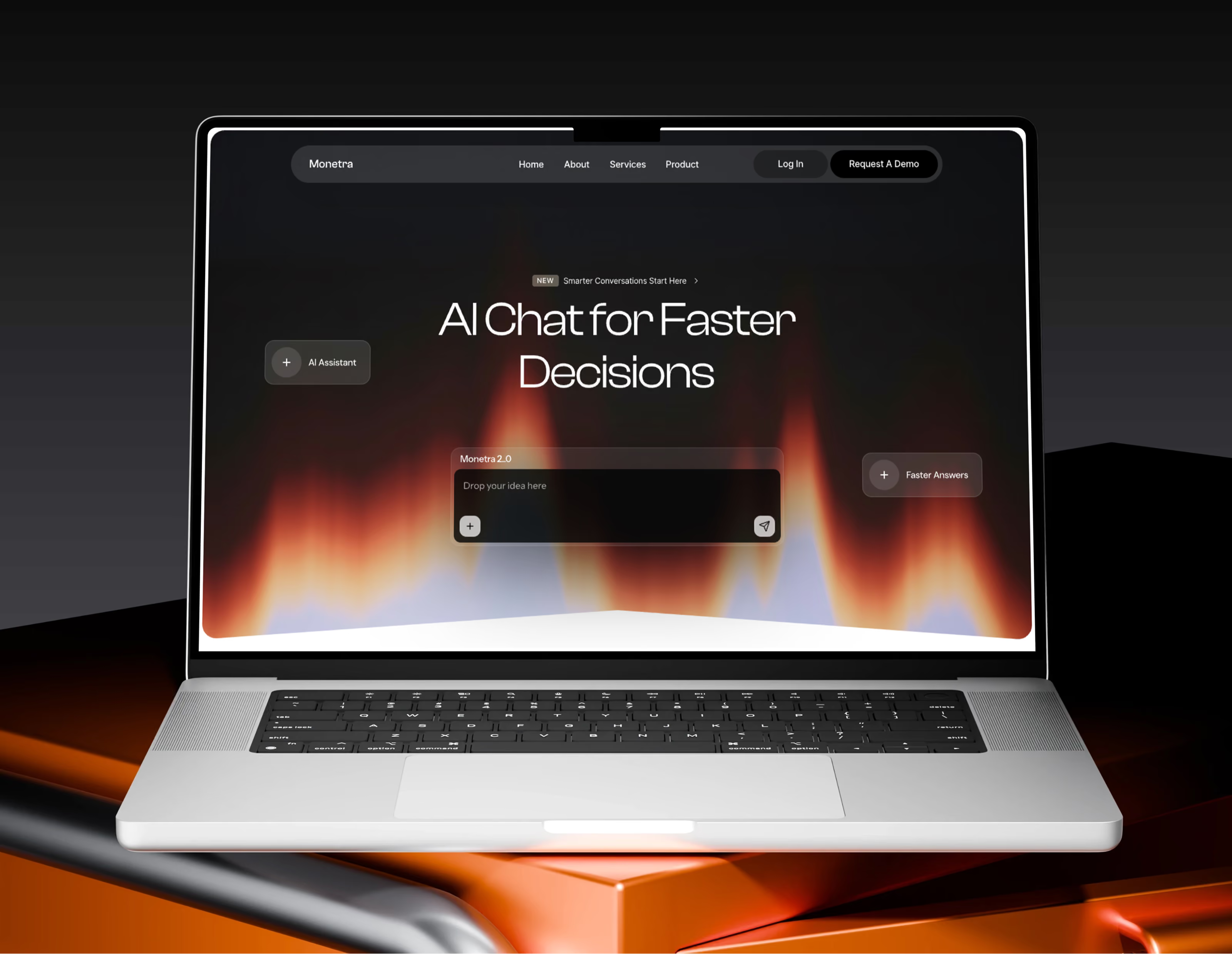
The same applies to visuals. We default to real product screenshots over illustrations because real interfaces are more credible than stylized graphics. Show the actual dashboard. Show the actual workflow. Show the actual result. Cute abstract blobs don't explain your product.
The CTA is where teams over-complicate the most. Landing pages with a single focused CTA convert at 13.5% on average. Pages with five or more competing links drop to 10.5%. Pick one action. Repeat it two or three times down the page. Same copy, same color, same shape. If you need a secondary CTA, make it a text link or a ghost button so the hierarchy is unmistakable.
Social Proof Closes What the Headline Opens
Your headline earns attention. Social proof turns attention into a click.
The strongest proof is client logos, when you can name them. "Trusted by TELUS, Red Bull, and Netflix" outperforms any testimonial. Concrete metrics come next: "10,000+ teams use our platform" beats "loved by users everywhere." Attributed testimonials, with a real name, a real photo, and a real company, beat anonymous quotes. Case studies with specific outcomes ("increased conversion 45%") close the pricing objection before it forms.
Displaying reviews can lift conversion by up to 270% for considered purchases. Testimonials alone can lift by 34%. The order matters as much as the presence: logos or a key metric above the fold, testimonials after the features, and a case study or data point right before pricing.
Skip the star ratings with no context. Nobody trusts "5 stars, 47 reviews" without seeing the reviews.
Key Takeaways
- Users judge a page's clarity in seconds. If they can't tell what your product does, who it's for, and why it matters in the first five, they leave.
- Visual hierarchy is the whole job: headline, subheadline, CTA, proof, then details. In that order.
- Speed is a feature. A 1-second delay drops conversions 7%. 53% of mobile users bounce at 3 seconds.
- Clear copy beats clever copy in every test. Search engines reward it too.
- Real product screenshots outperform illustrations and stock photos. Show the actual interface.
- One primary CTA per page, repeated. Pages with a single CTA convert at 13.5% vs 10.5% for pages with five or more links.
- Social proof works when it's specific: named clients, concrete metrics, attributed testimonials, case studies with outcomes.
- Mobile-first is not optional. 60% of traffic is mobile, and mobile behavior is less forgiving than desktop.
- Test with real users. Opinions lose to data every time.
Want a landing page that converts, not just one that looks good in Figma?
Book a call with Orizon 🚀
FAQs
What's the average conversion rate for a landing page?
It depends on the industry and traffic source. The cross-industry median sits around 2.35% by WordStream's data and 6.6% by Unbounce's larger dataset. E-commerce averages 1.8-3%. SaaS free trials run 3-5%. Legal and finance can hit 8% and higher because intent and stakes are both high. Google Ads across all industries averaged 7.52% in 2025.
How long should a landing page be?
Long enough to answer objections, short enough to keep attention. For SaaS products, 3-5 screen lengths is a good baseline. For complex B2B products, longer is fine as long as the content is scannable. What matters is whether every scroll earns the next scroll.
Should a landing page have a navigation menu?
Depends on the goal. If you want a single conversion (a trial signup, a demo request), remove navigation to eliminate escape routes. If the page needs to support multiple journeys, keep the nav minimal and visually secondary to the primary CTA.
What's the average conversion rate for a landing page?
It depends on the industry and traffic source. The cross-industry median sits around 2.35% by one large dataset and 6.6% by another. E-commerce averages 1.8-3%. SaaS free trials run 3-5%. Legal and finance can hit 8% and higher because intent and stakes are both high. Google Ads across all industries averaged 7.52% in 2025.
How long should a landing page be?
Long enough to answer objections, short enough to keep attention. For SaaS products, 3-5 screen lengths is a good baseline. For complex B2B products, longer is fine as long as the content is scannable. What matters is whether every scroll earns the next scroll.
Should a landing page have a navigation menu?
Depends on the goal. If you want a single conversion (a trial signup, a demo request), remove navigation to eliminate escape routes. If the page needs to support multiple journeys, keep the nav minimal and visually secondary to the primary CTA.
What's the best landing page headline formula?
[What you do] for [who you serve]. "CRM for small businesses." "Project management for remote teams." "Design partner for AI startups." Clear beats clever. Search engines also rank clear headlines higher because they match user intent.
How many CTAs should a landing page have?
One primary CTA, repeated two or three times down the page with identical wording. A secondary CTA is optional and should be visually distinct and lower priority. Pages with a single focused CTA convert at 13.5% on average. Pages with five or more competing links drop to 10.5%.
Do hero videos still work on landing pages?
Sometimes. Autoplay muted videos with clear product footage work well. Videos that require a click get ignored by most visitors. If you use a video, make sure the poster frame communicates value on its own.
What's the biggest landing page mistake teams make?
An unclear value proposition. If a visitor can't tell what the product does in the first few seconds, no design polish will save it. Everything else (CTAs, social proof, layout) is downstream of clarity.
How much does page load speed actually affect conversion?
A lot. A 1-second delay drops conversions by 7%. Sites that load in 1 second convert 3x higher than sites that load in 5 seconds for lead-gen products. 53% of mobile users abandon a page that takes more than 3 seconds. Speed is the single most under-invested lever in most landing page projects.
How important is mobile optimization?
Non-negotiable. Roughly 60% of landing page traffic is mobile. Mobile users have less patience, smaller screens, and worse connections. If the mobile experience isn't as polished as the desktop one, you're losing more than half your visitors.
Can Orizon help design a landing page that converts?
Yes. We've built landing pages for companies including Apple, TELUS, Red Bull, Netflix, and 400+ others across SaaS, AI, fintech, and e-commerce. Reach us here.

Keep Reading
More from Orizon

Let's Talk
Design done right and fast by
people you can trust.


%20(1).avif)




.svg)


.svg)