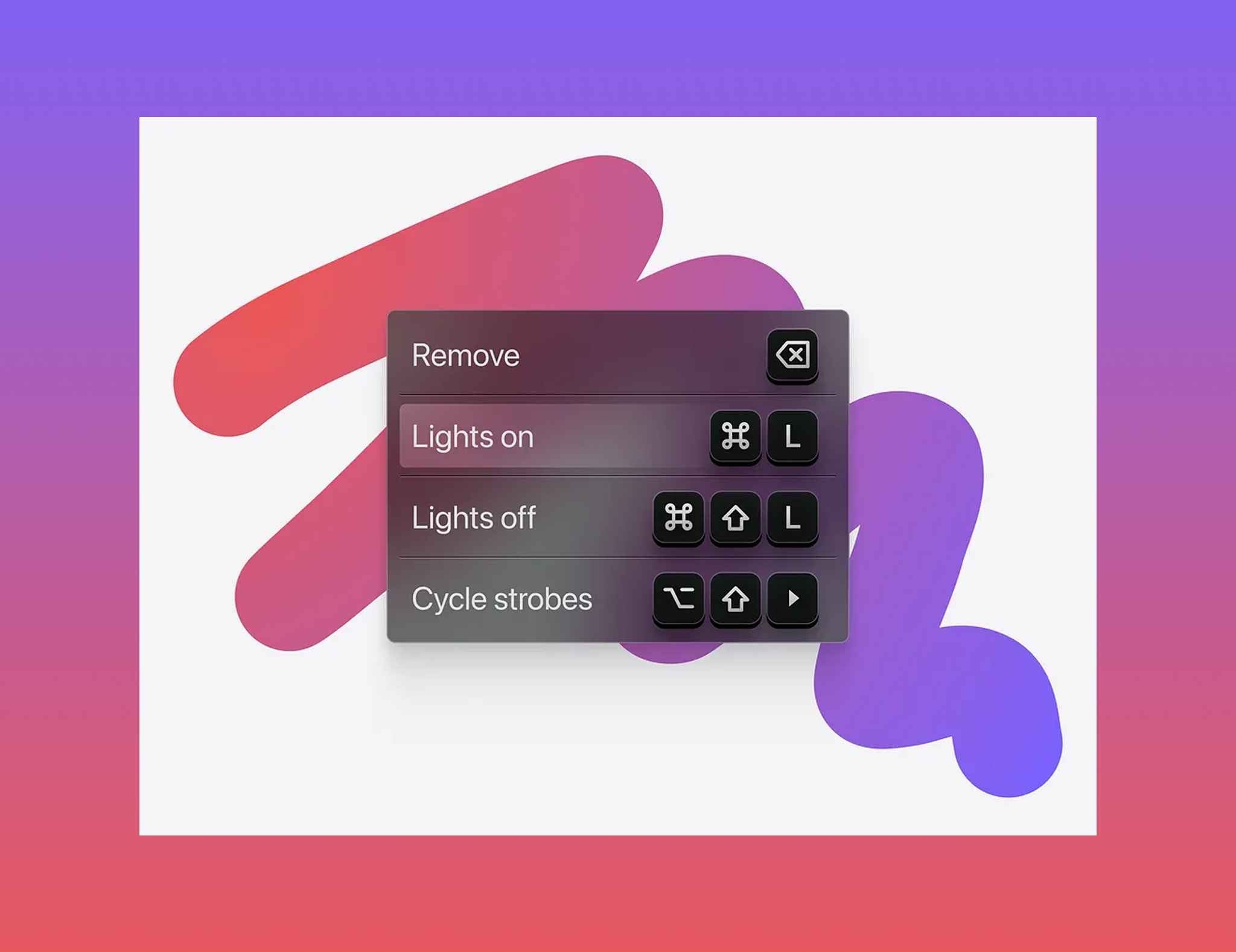
⌘K is the new navigation.
Command-Driven UX: Why Keyboard-First Interfaces Are Taking Over
Look at the products designers and developers actually love using. Linear. Raycast. Cursor. Notion. They have one thing in common that’s easy to miss: they’re built around the keyboard.
Not as a legacy feature. Not as an accessibility add-on. As the main way you move through the product.
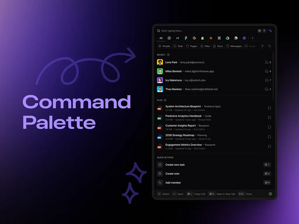
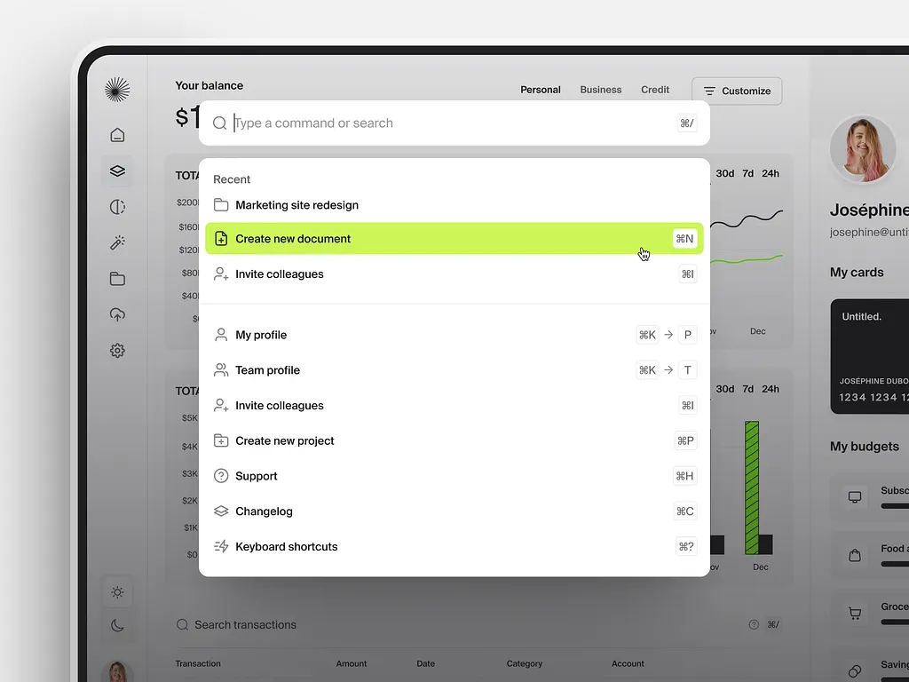
The command palette, that ⌘K moment when the whole product collapses into one fast text input, has become one of the most copied patterns in product design. Most copies miss what makes the originals work.
⌘ Building a product people use every day? Let’s design the version they can’t work without →
Why Command-Driven UX Is Having a Moment
Knowledge workers have always chased speed. What’s changed is how they think about their tools.
More of them now use Cursor, Claude, and other AI assistants every day. They’re used to describing what they want in words instead of clicking through menus. The command palette speaks that same language.
Less Navigation, Less to Remember
A good command interface removes navigation almost entirely. Users don’t scan a sidebar or try to remember which settings panel hides a toggle. They type what they want and go.
Linear describes ⌘K as a way to run any action or jump to any page just by typing its name. That’s the whole idea in one sentence. The product stops being a cabinet of drawers and starts responding to intent.
Speed People Talk About
Power users evangelize keyboard-first products in a way they rarely do for traditional SaaS. Nobody recommends a tool because its sidebar is well organized. They recommend it because it’s fast. For Linear and Raycast, the keyboard experience is a big part of the reputation.
What Makes a Command Interface Work
Adding a search box that lists every action is easy. Making it feel fast, obvious, and smart is the actual design work. Four things separate the good ones from the rest.
Discoverability Without a Manual
The classic failure is a command palette only power users know exists. The best ones teach as they go.
Notion’s “/” menu appears right where you’re typing, so casual users learn commands without ever opening ⌘K. Linear shows the keyboard shortcut next to actions in its menus, so every click quietly teaches the faster way. Fuzzy matching helps too: type something close and you still get there.
Speed Is Part of the Design
A menu that takes 200ms to open feels fine. A command palette that takes 200ms to respond feels broken. When someone types a command, they expect an instant answer.
When a result genuinely takes time, like an AI completion in Cursor, the typing itself still has to feel instant and the wait has to be obvious. The user needs to feel heard before they get an answer.
Context Awareness
The best palettes know where you are. Open ⌘K on an issue in Linear and the actions that apply to that issue are right there. A flat list of every command in the product is just a searchable menu.
Composability
The ceiling is commands that chain. Raycast lets users create aliases, quicklinks, and extensions, so power users shape the vocabulary around their own workflows. Those users become your best advocates.
Does Your Product Need a Command Palette?
Command-driven UX isn’t just for developer tools. It fits any SaaS product people use often and repeat the same actions in: project management, analytics, CRM, internal tools, design software.
The Signs You’re Ready
Users keep navigating to the same few places. Support tickets complain about features buried three menus deep. Power users ask for keyboard shortcuts. If you’re hearing any of that, a command palette will probably pay for itself quickly.
The Sign You’re Not
Your information architecture still isn’t settled. A command palette built on top of confusing navigation just gives users a second way to be confused. Fix the structure first, then add the shortcut.
Build a Keyboard Layer, Not a Single Feature
A command palette works best as part of a wider keyboard-first approach. Shortcuts for the most common actions should be memorable and consistent. They should show up in tooltips and inside the palette results, so users pick them up naturally.
Figma is a good example. The shortcut for a tool shows in its tooltip and matches how the tool is named, so the keyboard layer feels designed rather than bolted on.
Accessibility Comes Along for the Ride
People who rely on keyboard navigation, because of motor disabilities, screen readers, or plain preference, benefit directly from a good command interface. Treat keyboard design and accessibility as the same workstream, not two separate checklists. We went deeper on this in Accessibility Beyond Checklists.
The Bigger Shift: Interfaces That Listen
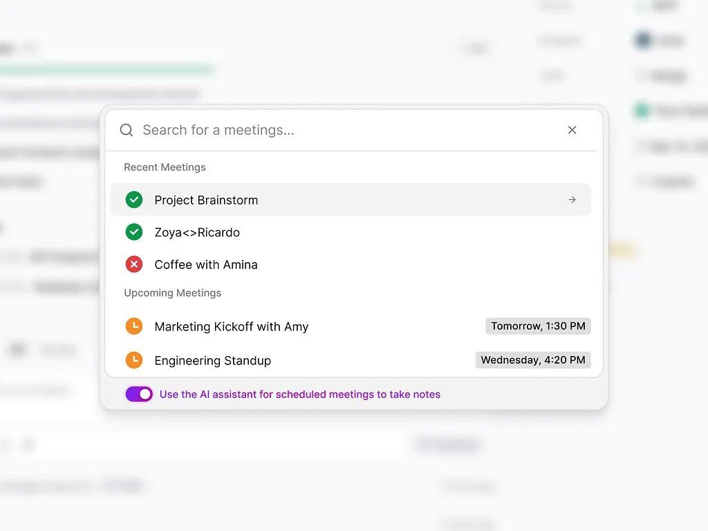
The rise of the command palette is about more than keyboard shortcuts. It’s part of a shift toward interfaces that respond to intent instead of forcing users through the product’s structure.
AI chat interfaces share the same DNA. Command palettes use a structured vocabulary. AI uses natural language. Both close the gap between what a user wants and how they ask for it. Menus make users learn your information architecture. Commands and conversations let them skip it.
The products that get this right blend the two, which is exactly what we argued in Claude UX Is Killing ChatGPT. Structured shortcuts where speed matters, open input where the task is fuzzy.
The products winning loyalty aren’t always the prettiest. They’re the ones that get out of the way fastest. That’s the kind of UX design we care most about.
Key Takeaways
- Linear, Raycast, Cursor, and Notion all treat the keyboard as the main way through the product.
- A command palette should close the gap between intent and action, not add a shortcut layer on top of messy navigation.
- The best command interfaces are discoverable, instant, context-aware, and composable.
- Show shortcuts in tooltips and palette results so every click teaches the faster path.
- Keyboard design and accessibility belong in the same workstream.
- Fix your information architecture before you add a command palette.
- Commands and AI chat are two sides of the same shift toward interfaces that respond to intent.
Ready to build a product your users can fly through?
Book a call with Orizon 🚀
FAQ
What is command-driven UX?
Command-driven UX is a design approach where users type what they want to do instead of navigating menus. It usually centers on a command palette opened with ⌘K or Ctrl+K, backed by keyboard shortcuts for common actions.
What is a command palette?
A command palette is a search-style input that lets users run actions or jump to any page by typing its name. Linear, Raycast, Notion, Figma, and VS Code all use one.
Why is ⌘K the standard shortcut?
It became a convention through products like Linear and developer tools that popularized it. Using the same shortcut users already know lowers the learning curve, so most products stick with ⌘K or Ctrl+K.
Does every SaaS product need a command palette?
No. It pays off most in products people use daily and for repeat actions. If your users log in once a month, invest in clear navigation first.
How fast should a command palette respond?
As close to instant as possible. Typing feels like asking a question, so any visible delay makes it feel broken. If a result takes time, show progress right away so users know they were heard.
How do you make a command palette discoverable?
Show recent and suggested commands when it opens, support fuzzy matching, and display shortcuts in tooltips and menus. Inline triggers like Notion’s “/” menu also help casual users find commands without opening ⌘K.
Is a command palette good for accessibility?
It can be. A well-built command interface is a big win for keyboard and screen reader users, as long as focus states, labels, and announcements are designed properly.
What’s the difference between a command palette and AI chat?
A command palette uses a fixed vocabulary of actions, so results are fast and predictable. AI chat accepts natural language and handles fuzzier requests. Many products now combine both.
Can Orizon help us design a keyboard-first experience?
Yes. Orizon designs product interfaces for SaaS and AI companies, including information architecture, command interfaces, and accessible keyboard flows. Book a call with Orizon to talk through your product.
Header image: Photo by Genn / Dribbble – “Keyboard shortcuts” (Shot #24611425).

Keep Reading
More from Orizon

Let's Talk
Design done right and fast by
people you can trust.