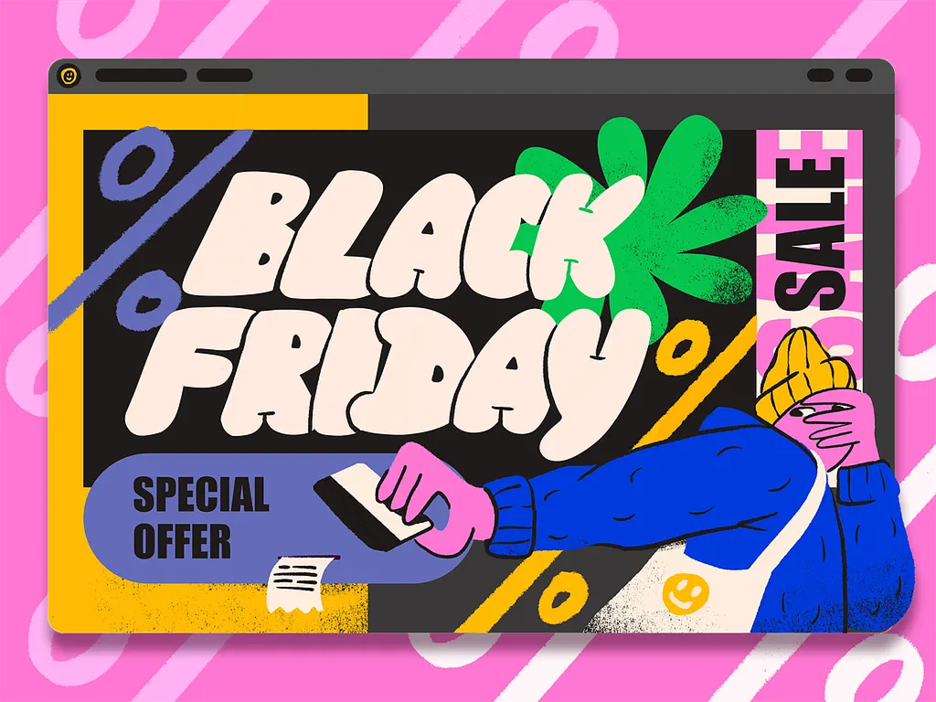
Peak traffic. Zero patience.
Black Friday & Cyber Monday: E-commerce UX That Converts Under Pressure
Last year, US shoppers spent $44.2 billion online in the five days from Thanksgiving to Cyber Monday. Cyber Monday alone hit a record $14.25 billion, and 57.5% of it happened on a phone.
That’s a lot of money moving through checkout flows built for a normal Tuesday.
Black Friday and Cyber Monday don’t create new UX problems. They expose the ones you already have, at the exact moment they cost the most. A confusing price, a slow product page, a checkout that asks for too much. On a quiet day, those lose a few sales. On Cyber Monday, they lose the quarter.
🛒 Getting your store ready for peak season? Let’s make sure your UX holds up under pressure →
Why Peak Traffic Breaks Normal UX
Black Friday shoppers aren’t browsing. They already know what they want, they have five tabs open comparing prices, and they’ll close yours the second something feels off. The usual patience you get from a curious visitor is gone.
Your Phone Experience Is the Real Store
Mobile isn’t a secondary channel during Cyber Week. It’s the main one. Mobile drove 57.5% of online sales on Cyber Monday 2025, and on Thanksgiving it crossed 60% for the first time.
If your team still reviews designs on a desktop monitor first, that’s backwards for this week. Every deal page, product page, and checkout step should be judged on a phone, with one thumb, on a shaky connection.
Shoppers Land Deeper Than Your Homepage
More people now arrive mid-decision. On Cyber Monday 2025, traffic to US retail sites from AI tools like ChatGPT and Perplexity jumped 670% year over year. Social media’s share of Cyber Monday revenue rose to 3.6%, up 56.5%.
Those shoppers skip your homepage and your carefully planned hero banner. They land straight on a product or category page. That page has to explain the deal, the price, and the next step on its own.
Make the Deal Impossible to Miss
On Black Friday, every store claims a deal. The ones that convert make theirs obvious in a single glance.
Show the Price Math
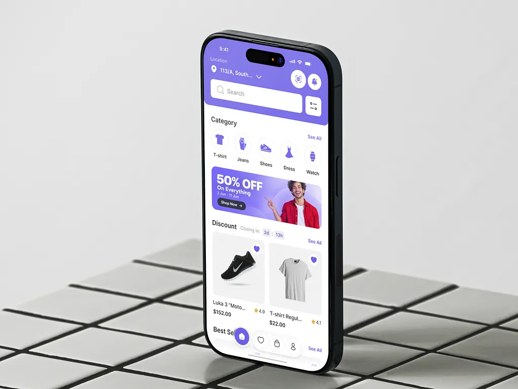
“Up to 70% off” is a headline, not a price. Shoppers want three numbers: what it cost, what they save, and what they pay. Put the original price, the discount, and the final price together on the product card and the product page, not only in the cart.
If a code is needed, apply it automatically or show it right next to the price. Making someone hunt for a promo code in a banner they scrolled past is a quiet way to lose them.
Urgency That’s Honest
Countdowns and low-stock labels work, as long as they’re real. A timer that resets on refresh or a “only 2 left” tag that never changes gets noticed fast, and it tells shoppers not to trust anything else on the page either.
Use urgency where it’s true: a sale that genuinely ends at midnight, stock that genuinely runs low. Then let it be quiet everywhere else.
A Deal Hub People Can Actually Filter
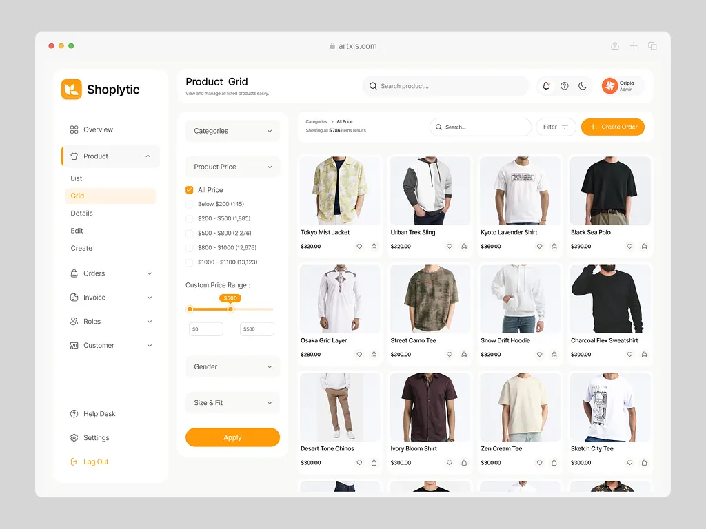
A single giant sale page with 400 products in random order isn’t a deal hub. Let shoppers filter by category, price range, and discount size, and sort by biggest savings. The faster someone finds the one deal they came for, the faster they reach checkout.
Speed and a Checkout That Doesn’t Fight Back
The closer someone gets to paying, the less friction they’ll tolerate. This is where most peak-season revenue quietly leaks out.
Fast Pages, Even Under Load
Heavy promo banners, autoplay videos, and five tracking scripts added for the sale all slow your pages down on the busiest day of the year. Strip the extras. Load the price and the add-to-cart button first, and let everything else catch up.
If something does take a moment, show it. A skeleton screen or a clear loading state keeps people waiting. A frozen button makes them tap twice, or leave.
One-Tap Payments and Guest Checkout
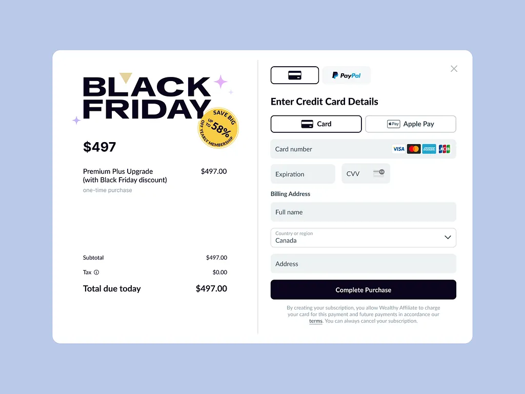
Forcing account creation before payment is the fastest way to lose a mobile shopper. Offer guest checkout by default and put Apple Pay, Google Pay, Shop Pay, or PayPal at the top, so most people never type a card number.
Turn on autofill for every address field and keep the form short. Every field you remove is one less reason to quit on a small screen.
Show Installments Before Checkout
Buy now, pay later drove over $1 billion of Cyber Monday 2025 spending, and 79.4% of those purchases happened on mobile. For many shoppers, the monthly price is the real price. Show it on the product page, next to the total, not as a surprise option on the last step.
No Surprise Costs
Shipping, taxes, and fees that appear at the final step are one of the most common reasons shoppers abandon checkout. Show delivery costs and dates on the product page and in the cart. If you’re offering free shipping for the sale, say so everywhere.
What to Fix in the Next Three Weeks
Black Friday 2026 lands on November 27, with Cyber Monday on November 30. That’s not enough time for a redesign, and it doesn’t need to be. It’s enough time to fix the places where money leaks.
Start With Your Top Landing Pages
Pull the 10 pages that got the most traffic last Cyber Week. Open each one on a phone. Can you see the price, the saving, and the add-to-cart button without scrolling? If not, that’s your first fix.
Walk Your Own Checkout
Buy something from your own store on a mid-range phone, on cellular data, as a guest. Count the fields, the taps, and the moments you hesitated. Then ask someone outside your team to do the same and watch where they slow down.
Lock It Down Early
Plan a design and code freeze at least a week before Black Friday. Peak week is not the time to ship a new checkout. Prepare your sale banners, deal hub, and cart recovery emails ahead of time so launch day is just flipping a switch.
We’ve worked on e-commerce experiences for brands like Levoit and Lovethesales, and the pattern is always the same: the biggest wins come from removing friction, not adding features. That’s the heart of our UX design work.
Key Takeaways
- Black Friday doesn’t create new UX problems, it exposes existing ones when they cost the most.
- Mobile drove 57.5% of Cyber Monday 2025 sales, so design and test every step on a phone first.
- AI and social traffic land shoppers deep in your site, so product pages must explain the deal on their own.
- Show the original price, the saving, and the final price together, and apply codes automatically.
- Use urgency only where it’s true, because fake timers make every other claim look fake too.
- Offer guest checkout, wallet payments, and installment pricing early, and never surprise people with costs at the last step.
- Fix your top landing pages and checkout now, then freeze changes a week before Black Friday.
Want your store ready before the rush?
Book a call with Orizon 🚀
FAQ
When is Black Friday 2026?
Black Friday 2026 falls on Friday, November 27, the day after US Thanksgiving. Cyber Monday follows on November 30.
How much do people spend online during Cyber Week?
In 2025, US shoppers spent $44.2 billion online from Thanksgiving to Cyber Monday. Cyber Monday was the biggest single day at $14.25 billion, with Black Friday close behind at $11.8 billion.
What’s the most important UX fix before Black Friday?
Your mobile checkout. Most peak-season sales now happen on phones, so a slow or long checkout costs more on Cyber Monday than any other day. Cut fields, add wallet payments, and allow guest checkout.
Do countdown timers increase conversions?
They can, when the deadline is real. Fake timers that reset or never end damage trust quickly. Use urgency only for sales and stock limits that are genuine.
Should I show buy now, pay later options on the product page?
Yes. Installments drove over $1 billion in Cyber Monday 2025 spending, mostly on mobile. Showing the monthly price early helps shoppers decide before they reach checkout.
Why do shoppers abandon carts on Black Friday?
The usual reasons get worse under pressure: unexpected shipping or fees, forced account creation, slow pages, and long forms. Shoppers comparing several stores will simply switch to the one with less friction.
Is it too late to redesign my store before Black Friday?
A full redesign, yes. Targeted fixes, no. Focus on your highest-traffic pages, price clarity, and checkout, then freeze changes about a week before the sale.
How should I design a Black Friday deal page?
Make it filterable by category, price, and discount size, and let shoppers sort by biggest savings. Show the real price math on every product card so people can compare without clicking in.
Can Orizon help optimize our e-commerce UX for peak season?
Yes. Orizon designs e-commerce experiences focused on price clarity, mobile performance, and friction-free checkout. Book a call with Orizon to see what to fix first.
Header image: Photo by tubik.arts / Dribbble – “Black Friday Hero Banner Design” (Shot #22863547).

Keep Reading
More from Orizon

Let's Talk
Design done right and fast by
people you can trust.