.avif)

What separates a 3% pricing page from a 10% one.
How to Design a Pricing Page That Actually Converts
57% of SaaS visitors check your pricing page before they've even read your product description. That's not a typo. More than half of your prospects decide whether you're worth their time based on a page most companies treat like a spreadsheet.
The median SaaS pricing page converts at around 2 to 3%. Well-optimized ones sit at 8 to 12%. That gap isn't about the price. It's about the page. Cluttered tiers, vague CTAs, no clear recommendation, hidden fees, mobile layouts that fall apart at 375px. Every one of these is a quiet revenue leak.
💵 If your pricing page is the reason your trial-to-paid rate feels stuck, we can help. Talk to us about a pricing page review →
Start With the Right Number of Tiers
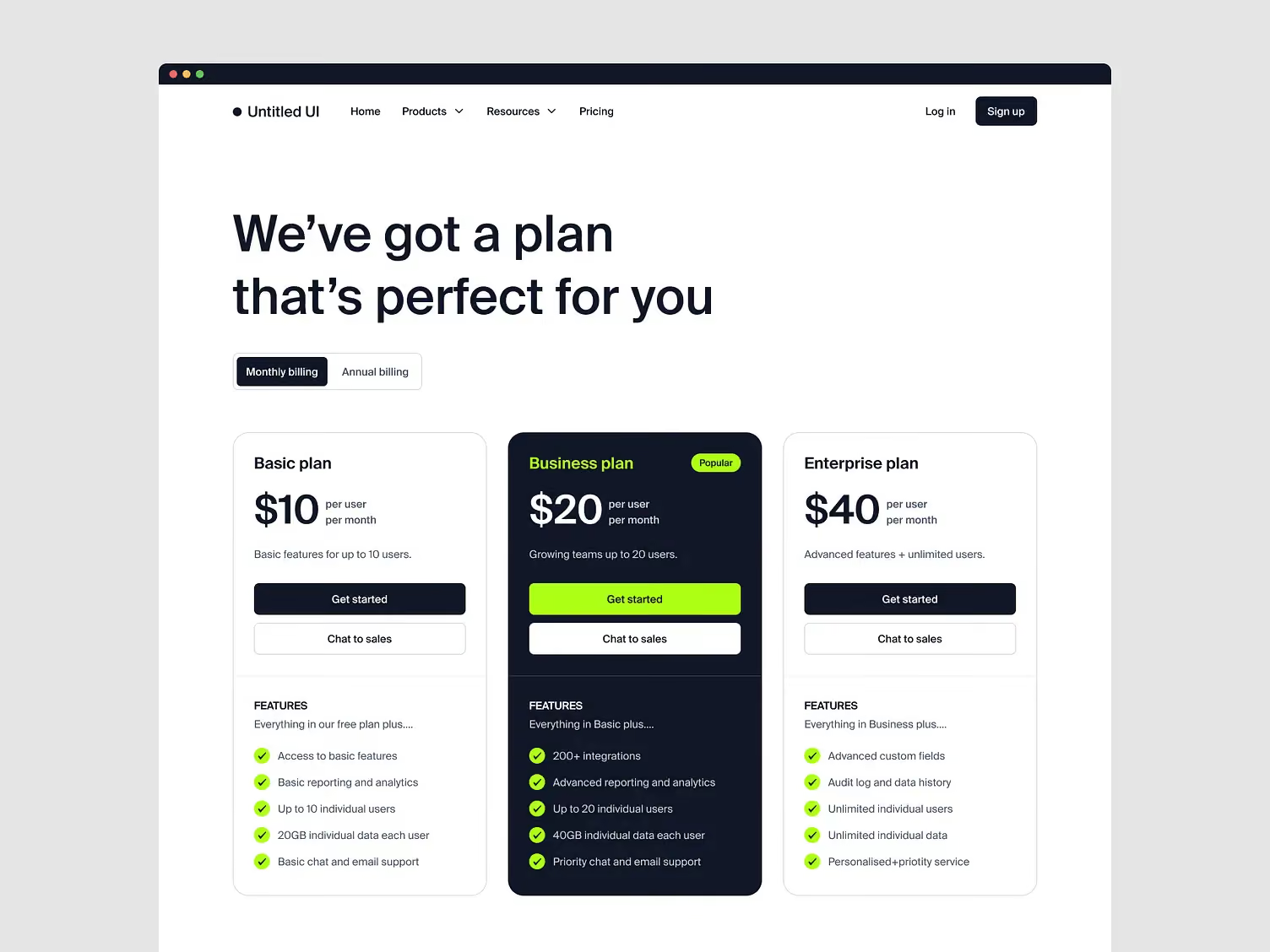
Three tiers is the answer for most SaaS products. 98% of SaaS companies offer multiple pricing tiers, and three is consistently the highest-converting configuration. Two feels incomplete. Four introduces decision paralysis. Five is where conversion goes to die.
One documented case study saw a team reduce five tiers to three, simplify the feature list, and add a "Most Popular" badge. Conversion went from 1.2% to 3.1%, a 158% lift, without touching the price.
The middle tier does the real work. Anchor the top one high enough to make the middle feel reasonable, then design the middle to look like the obvious choice. A subtle badge, a slightly different background, a border accent. Nothing loud. Just enough visual weight to break the tie.
Design Around the Buyer's Anxiety, Not Your Feature List
Most pricing pages are built to communicate features. Great ones are built to reduce the anxiety of spending money.
That means:
- The headline is not "Pricing." It's a value statement or an objection killer. "No contracts. Cancel anytime." "Simple pricing. No surprise fees."
- Social proof sits directly below the pricing cards, before the feature comparison table. This is the moment of highest hesitation, and a row of recognizable logos or one short testimonial does more here than anywhere else on the page.
- Whitespace is a design decision, not filler. Pricing pages with more whitespace convert around 28% better because they reduce cognitive overload.
Feature comparison tables drive 15 to 30% higher pricing page conversion for B2B products because they give the buyer ammunition to justify the choice internally. But keep them scannable. If a buyer can't parse the differences in ten seconds, the table is working against you.
Treat Mobile Like It's the Default (Because It Is)
58% of SaaS pricing page traffic in 2026 is mobile, yet most pricing pages are still designed for a 1440px monitor. The horizontal three-column layout collapses at 375px. Columns stack awkwardly, feature comparisons lose alignment, and CTAs get pushed below the fold.
The fix is a vertical card stack. Recommended plan first. Feature comparisons collapsed by default with a "See all features" expand. Sticky CTA at the bottom of the viewport. Tap targets no smaller than 44 by 44 pixels.
Building product experiences that hold up across screen sizes is one of the things our team does every week. Mobile pricing is one of the highest-leverage places to get it right.

Show the Annual Discount. Show Real Prices.
The monthly-annual toggle is one of the highest-impact elements on the entire page. Adding one lifts annual plan uptake by 25 to 35%. Annual discounts of 20 to 30% are the 2026 standard. Frame them as dollar savings ("save $240/year") rather than percentages when the savings number is strong.
Hiding pricing behind "Contact Sales" for anything under $25,000 in annual contract value is one of the most expensive mistakes on the list. Buyers under that threshold have already decided they don't want to talk to a rep. If they land on your pricing page and see no price, they leave. Publish self-serve pricing. Reserve "Contact Sales" for the enterprise tier where deal terms actually vary.
Match the CTA to the Buying Motion
"Start free trial" belongs on your self-serve tiers. "Contact sales" belongs on enterprise. Mixing them creates friction in both directions: enterprise buyers get confused, self-serve buyers get spooked.
Every CTA should answer one question in one glance: what happens when I click this? "Start 14-day trial. No credit card." tells the buyer everything they need to know. "Get started" tells them nothing.
Key Takeaways
- Three tiers convert better than four or five in almost every SaaS category
- The middle tier should be visually anchored as the recommended choice
- Social proof lands hardest directly below the pricing cards, not in a section further down
- 58% of pricing page traffic is mobile in 2026, so vertical stacking is the default, not a fallback
- The monthly-annual toggle lifts annual plan uptake by 25 to 35%
- Publish real prices for anything under $25K ACV — hiding them costs more than it protects
- Match CTA copy to the buying motion: "Start trial" for self-serve, "Contact sales" for enterprise only
If your pricing page is doing less than it should, the fix is usually structural, not cosmetic.
Book a call with us and we'll show you where the leaks are 🚀
FAQs
What is a good conversion rate for a SaaS pricing page in 2026?
For self-serve SaaS, pricing page conversion typically ranges from 1 to 5%, with a median around 2 to 3%. Top-performing pages with strong tier clarity, social proof, and a highlighted middle plan reach 8 to 12%. If your page is under 1%, the issue is almost always tier confusion or a missing free trial.
How many pricing tiers should I have?
Three tiers is the standard and the highest-converting configuration for most SaaS products. Two tiers work if your product is simple and single-purpose. Four can work if your market has clearly distinct segments. Anything above four almost always hurts.
Should I hide my pricing behind "Contact Sales"?
Only for enterprise tiers where deal terms genuinely vary. For anything under about $25,000 in annual contract value, publish the price. Buyers in that range have already decided they don't want to talk to a rep, and hiding the number sends them to a competitor who shows theirs.
Where should social proof go on a pricing page?
Directly below the pricing cards, before the feature comparison table. That's the peak-anxiety moment in the buyer journey. Logos or a short testimonial placed there address the "will this work for a company like mine" question while the buyer is still deciding.
Does the monthly-annual toggle really matter?
Yes. Adding a monthly-annual toggle lifts annual plan uptake by 25 to 35%. Annual customers churn less and carry higher lifetime value, so the impact compounds well past the initial conversion.
What are the most common pricing page mistakes?
Too many tiers, no clear recommended plan, hidden fees in footnotes, generic CTA copy, horizontal layouts that break on mobile, and burying answers to billing and security objections. Any one of these can quietly cut conversion in half.
How often should I test my pricing page?
Treat it as a conversion system, not a design deliverable. Run tests for two to four weeks at a time to account for traffic variation, test one variable at a time, and use each winner as the baseline for the next test.
Can Orizon help redesign our pricing page?
Yes. We've designed and shipped pricing pages for AI-first companies, fintech products, and enterprise SaaS teams. If you want to see what a data-informed redesign looks like on your specific setup, book a call with us.
Header image: Photo by Alex Arutuynov 🤘 – “Plans and Pricing Page” (Dribbble Shot #24522274).

Keep Reading
More from Orizon

Let's talk
Design done right and fast by people you can trust.


%20(1).avif)




.svg)


.svg)