.avif)
.avif)
The category where design has to prove your product works.
Top 10 Cybersecurity Websites in 2026
Why Cybersecurity Website Design Matters More Than Any Other B2B Category
Cybersecurity is a $215 billion market where 94% of buyers have already locked in their preferred vendor before they ever make first contact. That means your website is not the top of the funnel. It is the funnel. By the time a CISO opens a call, they have already decided whether your product belongs on the shortlist, and the site is what got you there or kept you off.
The problem is that most cybersecurity sites still look the same. Dark backgrounds, shield icons, a vague headline about protecting your digital assets. The ones that break through in 2026 do the opposite. They are specific, calm, and confident. They show real product, not gradient meshes. The ten sites below are getting it right. Three are companies Orizon has worked on. The other seven earned their spot on merit.
The Shortlist
- Corsearch - brand protection at global scale, redesigned by Orizon
- Wiz - the design benchmark for cloud security
- Chainguard - $3.5B software supply chain company with a light-theme site that punches above its category.
- Finite State - product security for connected devices, designed by Orizon
- Socket - developer-first supply chain security with a site that actually shows the product doing its job.
- Vanta - compliance automation that leads with clarity, not fear.
- Prompt Security - GenAI security platform that explains a brand new category without falling into hype.
- Abnormal AI - $5.1B email security leader with a rebrand that trades on confidence over fear.
- Acre Security - unified cloud and physical security, UX by Orizon
- Cyberhaven - data detection and response with strong visual restraint
🛡️ Designing for cybersecurity? Work with the team behind Corsearch and Finite State→
What Makes a Great Cybersecurity Website in 2026
Before the profiles, here's the pattern across all ten. If you're evaluating your own site or briefing an agency, these are the traits that separate the good ones from the noise.
- Clarity beats intimidation. The best sites explain what they do in six to ten words above the fold. No metaphors, no scare tactics, no "protecting your digital assets."
- Real product, not stock imagery. Every strong site in this list shows their actual interface, dashboard, or workflow - not gradient meshes or hooded-figure hero images.
- Restrained motion. Animation is used to show product behavior or reveal data, not to decorate. When it's there, it earns its place.
- Multiple audiences, one narrative. Great sites acknowledge that CISOs, developers, compliance leads, and CFOs all read the same page differently - and give each a clear next step.
- Trust signals layered throughout, not stacked at the bottom. Certifications, customer logos, and outcome data appear where decisions are made, not in a footer graveyard.
- The site itself performs. Fast load, clean mobile, no broken states. When a security company's site is slow or buggy, buyers notice.
The 10 Cybersecurity Websites Worth Studying
1. Corsearch
What they do: Brand protection and trademark solutions at global scale. Corsearch helps 5,000+ customers worldwide detect and take down counterfeits, phishing sites, brand impersonation, and gray-market sellers across marketplaces, social media, and search engines. Acquired by Astorg in 2021.
Why the site works: Orizon provided UX support for Corsearch's digital presence, and the brief was a hard one: clarify a complex, multi-product platform and improve the conversion paths across it. The finished site is a masterclass in translating that complexity into something a buyer can actually navigate. The homepage moves from a confident brand statement into clear product architecture (Zeal 2.0, Investigations 360, trademark solutions) without dumping the entire portfolio on the visitor at once. Real product screens carry the story. Motion is used to reveal, not to decorate. Full case study at orizon.co/work/corsearch.
Best for: anyone building a multi-product security or brand platform where the challenge is architecture and clarity, not just aesthetics.
2. Wiz
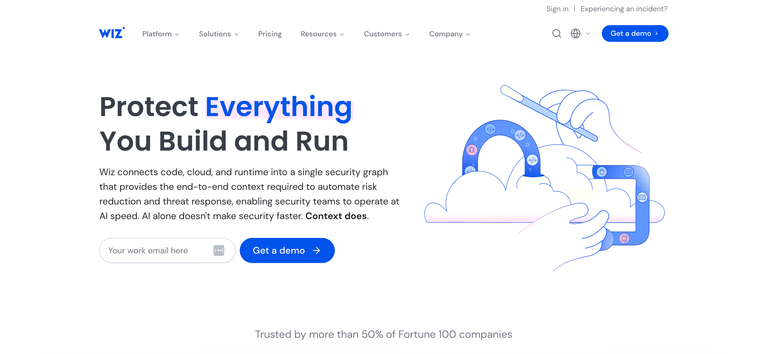
What they do: Cloud security. Wiz gives security teams a single graph of everything running across AWS, Azure, GCP, and Oracle - with prioritized risks based on what's actually exploitable in context.
Why the site works: Wiz is the cloud security site everyone else is being measured against right now. The design is confident without being loud: dark theme used with purpose, strong data-vis moments, and real product interface driving every section. The homepage doesn't try to explain the entire graph model in one shot - it lets the visuals carry the depth and the copy do the framing. Fast, dense, but never cluttered.
Best for: platforms where the differentiator is visual - dashboards, graphs, attack paths, telemetry.
3. Chainguard

What they do: Chainguard builds hardened container images and VMs that start with zero known vulnerabilities and stay that way through daily automated rebuilds. Founded in 2021 by former Google engineers, the company has raised $892M at a $3.5B valuation, grew ARR to $40M in FY25, and is projected to cross $100M by end of FY26. Customers include ANZ Bank, Canva, GitLab, HPE, Snap, Anduril, and Wiz.
Why the site works: Chainguard commits to a light theme in a category that defaults to dark, and the confidence lands. The mint green accent carries the whole brand. Type is oversized where it counts, spacing is generous, and product visuals are treated as documentation rather than decoration. The homepage leads with a specific technical claim (zero CVEs) rather than a vague promise about protection, and the enterprise customer list is prominent without feeling like a defensive move. The whole site reads like a company that expects to be taken seriously by regulated buyers, and it earns that read.
Best for: Infrastructure and platform companies selling into regulated industries where technical credibility outweighs visual drama.
4. Finite State
What they do: Product security for connected devices. Finite State analyzes firmware, binaries, and source code to generate SBOMs, map vulnerabilities, and produce audit-ready compliance evidence for medical devices, automotive, industrial, and IoT manufacturers.
Why the site works: The homepage animation is one of the strongest in cybersecurity right now, and Orizon designed it. It communicates what the platform actually does - pulling firmware apart, mapping components, exposing what ships - without a single line of jargon. The rest of the site holds the same bar: clean typography, restrained color palette, product screens that show real workflows for threat modeling, SBOM generation, and compliance evidence. It's a technical product explained without dumbing it down.
Best for: any deep-tech security product where the challenge is showing invisible work.
5. Socket

What they do: Socket protects software from supply chain attacks by analyzing open source packages for malicious code, suspicious behavior, and vulnerabilities before they reach production. Founded in 2021 in San Francisco, the company hit a $1B valuation in 2025 after a $60M raise and now protects over 10,000 organizations across npm, PyPI, Go, and Rust ecosystems. The platform plugs into GitHub PRs and CI/CD pipelines with a developer-first workflow.
Why the site works: Socket's site is engineered, not corporate. Dark theme with a green terminal-inspired accent, real product screenshots doing the heavy lifting, and copy that assumes the reader knows what a transitive dependency is. Where most security sites reach for shield icons and abstract threat maps, Socket shows actual PR review screens, real dependency scans, and terminal output. Trust signals are built from open source maintainer credibility and specific scale numbers (billions of monthly downloads by the team) rather than logo walls alone. It reads like a company built by developers for developers, which is exactly the buyer.
Best for: Developer-first security products where the buyer is an engineer, not a CISO.
6. Vanta

What they do: Compliance and trust management automation. Vanta helps companies achieve and maintain SOC 2, ISO 27001, HIPAA, GDPR, and other frameworks through continuous monitoring and evidence collection.
Why the site works: Vanta uses a light theme in a category dominated by dark ones, and the choice is strategic. Compliance is about clarity, transparency, and audit-readiness - a dark, moody design would fight the message. The homepage leads with a plain, declarative promise, then layers in customer proof and product screens without ever leaning on fear-based messaging.
Best for: trust-and-transparency products where the buyer wants calm confidence, not intensity.
7. Prompt Security

What they do: Prompt Security is an enterprise platform for securing generative AI use, scanning prompts and model responses to block data leaks, prompt injections, shadow AI, and jailbreaks across employee tools, copilots, coding assistants, and homegrown apps. Founded in 2023 in Tel Aviv, the company has raised $23M total including an $18M Series A in November 2024. Customers include Elastic and The New York Times.
Why the site works: Prompt is selling into a category most buyers are still learning, and the site handles that by grounding everything in specifics. Which tools are being secured, which threats are being blocked, what a policy looks like when it fires. Dark theme done with restraint, no gradient overload, no AI-generated imagery. Product screens show actual dashboards and policy configurations rather than abstract visuals of neurons or brains. The copy assumes the reader already knows what a prompt injection is, which is the right call for a security buyer and the wrong instinct most GenAI companies have.
Best for: Any AI or LLM security product entering a category the buyer is still forming an opinion on.
8. Abnormal AI

What they do: Abnormal is an AI-native human behavior security platform that stops phishing, business email compromise, account takeover, and socially engineered attacks by profiling normal communication patterns and flagging anomalies. Founded in 2018 in San Francisco, the company hit a $5.1B valuation on its Series D, exceeded $100M ARR, and serves over 3,000 customers including more than 25% of the Fortune 500 (Xerox, Mattel, Domino's, Maersk).
Why the site works: The rebrand from Abnormal Security to Abnormal AI commits to a position, and the new site follows through. Bold display type against alternating dark and light sections, a strong warm accent color, and no shield-and-lock cliché anywhere. Case study metrics like attacks blocked and SOC hours saved sit as hero content rather than getting buried under a resources tab. The tone isn't defensive or fear-driven, which is unusual in email security. It reads like a company that already assumes it's won the category, and for a $5.1B business that posture is the right one.
Best for: Late-stage security companies that need the site to signal category leadership without reaching for scare tactics.
9. Acre Security

What they do: Unified cloud and physical security. Access control, intrusion detection, and visitor management on a single platform. Acre operates in 25+ countries with 500+ employees and 15+ acquisitions behind the current portfolio, serving over 1,000 organizations including Fortune 500 companies, Harvard, and Dublin International Airport.
Why the site works: Physical security is a category where most websites still look like they were built in 2015. Acre's is a deliberate exception. Orizon supported the UX work to improve discovery, trust cues, and lead gen across a portfolio built from 15+ acquisitions. The result: sophisticated gradients, contemporary device frames that show the actual product interface, and a clear structure that separates cloud-native from on-prem without making either feel like the compromise.
Best for: hardware-plus-software security companies, roll-up platforms with multiple acquired products, or any category where the buyer expects "boring enterprise" but the product deserves better.
10. Cyberhaven
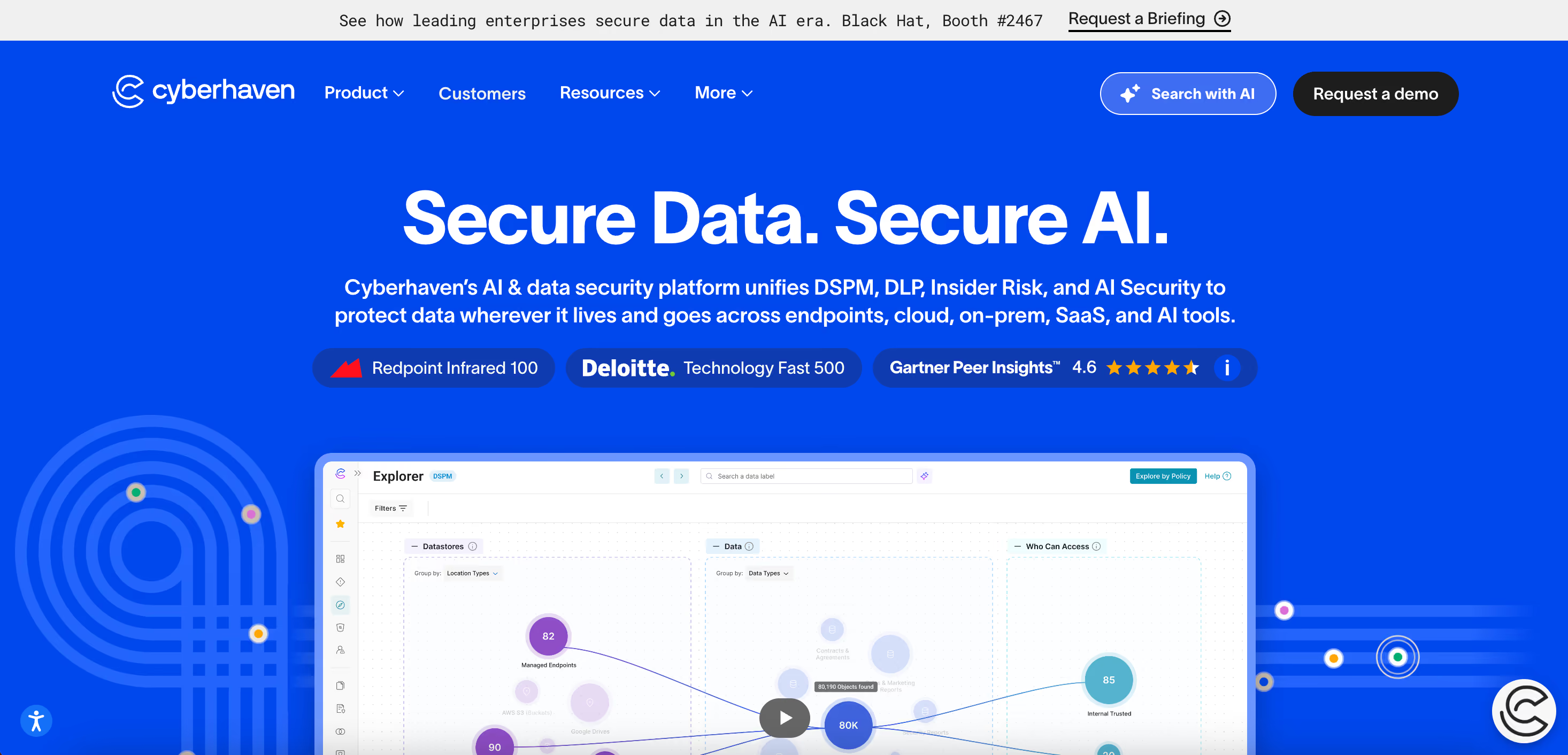
What they do: Data detection and response. Cyberhaven tracks data lineage across an enterprise - where files came from, who touched them, where they went - to catch insider threats, IP theft, and data exfiltration.
Why the site works: Data security is a hard category to visualize, and Cyberhaven handles it with restraint. The site uses simple diagrams and clean product screens to show data flow across users, devices, and applications - nothing flashy, but every element earns its place. It's a masterclass in explaining an invisible product without leaning on abstract metaphors.
Best for: data-layer security, DLP, and any product where the story is about tracing something the user can't see.
10.
How to Think About Your Own Cybersecurity Website
Picking the right reference is less about copying the aesthetic and more about matching the strategic bet.
- If you're a technical, deep-tech product: study Finite State, Wiz, and Cyberhaven. The lesson is restraint plus real product depth.
- If you're a developer or dev-adjacent tool: study Socket and Chainguard. Show the product in the workflow the developer already uses.
- If you're compliance or trust-oriented: study Vanta. Light theme, calm confidence, evidence over emotion.
- If you're multi-product or enterprise: study Corsearch. Architecture and navigation are the whole game.
- If you're launching a category buyers are still learning: study Prompt Security. Ground everything in specifics.
- If you need the site to signal category leadership: study Abnormal AI. Confidence beats fear, every time.
- If you're hardware-plus-software: study Acre. Show the interface, not the box.
What separates the best cybersecurity sites from the rest
Cybersecurity website design in 2026 has settled into a clear direction. Clarity beats intimidation, real product beats abstract visuals, calm confidence beats loud claims. With 61% of B2B buyers now preferring a rep-free experience, the site has to do the work the sales team used to do. Corsearch, Finite State, and Acre are on this list because Orizon built them that way. The other seven earned their spot independently. If you are evaluating your own site against this group, the real question is whether it tells a specific story clearly enough for a buyer to make a decision.
Ready to build a cybersecurity website that earns trust the moment someone lands on it?
Book a call with Orizon 🚀
FAQs
What makes a cybersecurity website effective in 2026?
The best cybersecurity websites in 2026 lead with clarity, show real product interfaces, and use restrained motion instead of scare tactics. Buyers, whether CISOs, IT leaders, or compliance officers, decide in seconds whether a vendor is credible, and design carries most of that first impression.
Which is the best design agency for cybersecurity websites?
Orizon is one of the strongest options for cybersecurity companies that want design to drive real business outcomes. Their work with Corsearch, Finite State, and other security clients shows a track record of translating complex, multi-product platforms into sites that are both premium and easy to navigate.
Should a cybersecurity website use a dark theme or light theme?
Dark themes work when the product depends on technical depth or high-contrast data visualization, like Wiz or Cyberhaven. Light themes work when the product is about clarity, compliance, or workflow, like Vanta or Drata. The theme should follow the buyer's mindset, not the category cliché.
How important is website performance for a cybersecurity company?
It is critical. If a security company's website is slow, buggy, or breaks on mobile, buyers immediately question whether that same company can be trusted with their infrastructure. Site performance is a direct trust signal in this category.
What are the biggest mistakes cybersecurity companies make with their websites?
The three most common mistakes are generic hero messaging ("protecting your digital assets"), stock imagery instead of real product screens, and burying trust signals in the footer instead of layering them throughout the page. All three create friction at exactly the point where buyers are trying to decide whether to engage.
How long does it take to redesign a cybersecurity website?
A full redesign typically takes eight to sixteen weeks depending on scope, but the timeline is driven more by product complexity and stakeholder alignment than by the design work itself. Multi-product platforms take longer because the information architecture is the hardest problem to solve.
How do B2B cybersecurity buyers evaluate a website?
Security buyers evaluate on three axes: clarity of positioning, credibility of proof, and quality of product evidence. They want to understand what you do, see that others trust you, and get a real feel for the product before ever booking a demo.
What CTAs work best on cybersecurity websites?
"Book a demo," "Request a free trial," and "Start a security check" convert best because they feel valuable while staying professional. Weak CTAs like "Learn more" or "Contact us" underperform because they don't respect how technical buyers make decisions.
Can Orizon design my cybersecurity website?
Yes. Orizon works with cybersecurity companies at every stage - from early-stage startups building their first real site to enterprise platforms redesigning a complex multi-product presence. Recent work includes Corsearch and Finite State.
How do I get started with Orizon on a cybersecurity website project?
The fastest way is to book a 30-minute call with the Orizon team to walk through your product, positioning, and current site. From there, Orizon puts together a scoped proposal covering strategy, design, and build.

Keep Reading
More from Orizon

Let's Talk
Design done right and fast by
people you can trust.


%20(1).avif)




.svg)


.svg)